Note: Descriptions are shown in the official language in which they were submitted.
CA 02320615 2000-09-20
Description of the Invention
A graphical system for decision support and portfolio analysis uses a computer
implementation
of a modified version of a "coxcomb diagram" coupled to a relational database
of decision
criteria, allowing the user to visually compare choices available within a
portfolio of decision
options. A single modified coxcomb diagram is used to represent each decision
option. Both the
relative merit of that option for each given criterion, and the relative
importance (weighting) of
each criterion are shown graphically. The graphical representation thus
obviates strengths and
weaknesses of particular potential choices, and facilitates the selection of
the best choice. A
scoring system is used to rank the decision options, and additional graphical
reports consisting of
composite modified coxcomb diagrams and other graph types are typically used
to illustrate the
results. The invention is applicable, for example, to standard business
decision-making in areas
such as investment portfolio analysis, purchasing decisions, hiring decisions,
employee
performance analysis, human resources, customer satisfaction surveys (customer
relationship
management) and general business strategy decisions. Further details of an
embodiment of the
invention are as follows and are illustrated in figure 1-4 below.
Each choice or option in a multiple-choice decision is represented by a
particular rose graph in
the following way.
1. Each sector of the modified coxcomb graph represents either a single
criterion within a
given decision, or a grouping or hierarchy of such criteria.
2. The merit of a given choice in a multiple-choice decision with respect to a
particular
criterion is illustrated by the area of a graph sector such that the relative
merit is directly
related to the area of the sector by a monotonic "scoring" fiulction.
3. The relative importance of a given criterion or group of criteria is
criterion is illustrated
by the angle subtended by the corresponding graph sector or sector group such
that the
relative importance is directly related to the angle of the sector or sector
group by a
monotonic "weighting" function (typically a proportionality).
4. A specific choice is ranked among a set of possible choices by a
calculation of the area
contained within the corresponding rose graph, or by a direct calculation
using the
scoring and weighting functions.
5. Similar criteria or sets of criteria or criteria groups are represented
with the same hue
(colour) but different intensity (saturation) to allow the user to visibly
distinguish
between criteria. Different criteria groups are shown with different hues.
6. Special colors are used to highlight criteria for which a given option did
not meet a
minimum degree of merit (e.g. a passlfail indicator).
7. A method of curve fitting (for example, a cubic spline fit) is used to
smoothly connect
adjacent sectors. This aids the user in seeing trends within a given decision
option.
8. An interactive user interface is implemented such that hovering a cursor
over a particular
sector causes the text of the associated criterion to be displayed, and
"clicking" a pointing
device with the cursor over a particular sector enables editing of the
attributes of the
sector, including the relative merit of the criterion associated with the
sector.
CA 02320615 2000-09-20
9. The state of a particular rose graph at any point in time can be saved
(serialized) by the
user, allowing a history of rose graphs to be produced for monitoring the
progress of a
choice over time (such as monitoring changes in employee performance or
investment
performance over time).
CA 02320615 2000-09-20
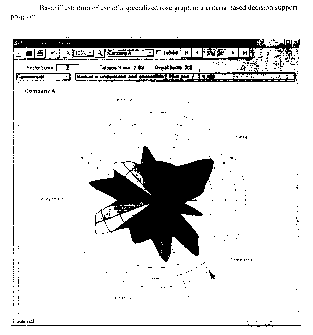
Figure 1. Basic illustration of use of a specialized rose graph in a criteria-
based decision support
program.
_ __..__ .___~_.._.. _~.__.~__~__..___~.__.__
i~
r-~ <~ ~ oo~ - !~,.
Sectcx Score , Cake
Co~n~cial I~A~kst ix and
I:ompanx A
Management
.~.~a~.~.
3
CA 02320615 2000-09-20
Figure 2: Identical data to figure I, but with the Commercial category given
twice the weight of
the o .her cate omes.
Company A recnnica~
4
CA 02320615 2000-09-20
Figut:e 3:
Satne data as figure 2, but with one critet~ion in the technical sector
assigned a weight of five
times that of the other criteria in the sector.
Company A
Technical
CA 02320615 2000-09-20
Figure 4: "Failed" sectors "flagged" in red.- -_
Company A
Technical
6
CA 02320615 2000-09-20
Supporting information:
General Information Visualization Reference:
Edward Tufte, The Visual Display of Quantitative Information, 1989, ISBN
096139210X
Links to "Nightingale Rose" / "Coxcomb Diagram" /"Bat's Wing" diagram sites:
Florence Nightingale - Statistical Links
http://www.math.yorku.ca/SCS/Gallery/flo.html
"Florence Nightingale's Statistical Diagrams" http://www.florence-ni.
tin~ale.co.uk/small.htm
"Coxcomb Plot" http://www.maths.may.ie/ima~:es/coxcomb.html
7
CA 02320615 2000-09-20
Florence Nightingale - Statistical Links Page 1 of 2
Florence Nightingale - Statistical Links
~~~:~,w
~~
"To understand God's thoughts we must study statistics, for these are the
measure of His
purpose". Florence Nightingale
Florence Nightingale's role in the history of statistics and statistical
graphics is of interest for many
reasons. Of greatest interest here, was her role as a social activist and view
that statistical data,
presented in charts and diagrams, could be used as powerful arguments for
medical reform.
Influenced perhaps by Quetelet in Belgium, she developed the idea that social
phenomena could be
objectively measured and subjected to mathematical analysis. She was an
innovator in the collection,
tabulation, interpretation, and graphical display of descriptive statistics.
~%r..Ir~ren nfdia~~cx~ L~r».rrx..a dvi ~rxr.Wwl 6
tfis~wnt~r rdt. a~n.wr. ~.~,yr
l7ix ~Kra rr#~ee wr~ai k~w Dig snip wr86snrhxc rf~te~ss! Rvc
~a~-.~rs~pr..el::na~w.rIe.,~.,.ro~~o~rrtc~.
~w~w~t~.dfr.~~ J~.,QwaSX~6ix
~.mE ai.r~.rJfv~ tJ4 ~.~.#.d~nFwwY~l4~~
~ i~tmvE~w. ~, yiw ~~n'4~3fwmrtr llrt.r~6,~.x
ItAc ~Arw rht .6ti~-eerur~,~~Sie~ ~A
.bw ~fads'flW h.~.~T .et~t ~y ~ra3 wnw .~snai~.~rrb4 AG ,i~J
~a~J~!Y~'1x l~Ed~ f44~ ~I ~t6r AG~i
1'~x rs~trnmawr inryr I~r nw~yrral ~~n°!' ~9A,..~drs, Ii~ x.J,rMr
gu, pWs, ..
Here are some links to further sources of information:
. The coxcomb dial
. Florence Ni tingale's mathematical education
http://www.math.yorku.ca/SCS/Gallery/flo.html 9/19/2000
x E~L3t sz ~x ~U~&x ~r ~I~11=Y
hran.»ss~.xmarx~ n xHr~kRlir ~nt'~J~~~~l~T ~~~t
.. ,...
CA 02320615 2000-09-20
Florence Nightingale - Statistical Links Page 2 of 2
. The Collected Works of Florence Nightingale, by Lynn McDonald, University of
Guelph.
. Florence Ni tingale Museum
o Florence Ni tin~ale - The Passionate Statistician
o Florence Ni tingale's Statistical Diagrams
Other references:
Kopf, E. W. ( 1916), "Florence Nightingale as Statistician," Journal of the
American Statistical
Association, 15, 388-404.
http://www.math.yorku.calSCS/Gallery/flo.html 9119/2000
CA 02320615 2000-09-20
~'J~'lus~ i~
Florence Nightingale's Statistical Diagrams
By Hugh Small. Paper from Stats & Lamps Research Conference organised by the
Florence Nightingale
Museum at St. Thomas' Hospital, 18th March 1998. Hugh Small is the author of
Florence Nirhdnpale:
Aver:pink,.-tyl published by Constable
It has been said that Florence Nightingale was the first to use diagrams for
presenting statistical data This is
not true, of course, but she may have been the first to use them for
persuading people of the need for change.
Edward Tufte does not mention Nightingale in his book on the history of
graphical, and he says that this
famous 1869 chart by Miaard of Napoleon's dwindling army as it marched to
Moscow and back in 1812/13
may be the best statistical graphic ever drawn:
«~x~~,m.,.,~ ..nt,-~ ,.,~,.~,...H.""<,~r.~~~": Mioard's diagram includes a
temperatare chart which
",~","~",~"~ ,....."".,..~.....~..~ misleadingly suggests that Napoleon's army
froze to death.
"'"° It shows the falling temperature during the retreat from
Moscow, but most of the army was lost during the advance
(300,000 men, vs. 90,000 in the retreat). Nightingale
herself studied this catastrophe, and concluded that
Napoleon's army - like most others - had died of dlsease2.
,= E
("."~," ~ .w ",p ~_,~, .~ -~. Like Mlnard's, Nightingale's most famous
graphics
_ ' "''- -~ illustrated what she called the "loss of an army" - the
"~°°'. ~-M "~'~'- British army sent to the Crimea. She published
them ten
years before Minard's. Hers also were more topical and conveyed a call to
action - they were prescriptive
rather than descriptive. She used recent data to persuade the Goveroment to
improve army hygiene.
Although she was before Minard, there were others before her. The best-known
pioneer of statistical graphics
was William Playfair, who published what must be the first "pie chart" in
18013. It was in a graphic showing
that, by comparison with other countries, the British paid more tax. The
vertical line to the left of each clrele is
the population (left scale) and the vertical line to the right is the tax
revenue (right scale). in this selection of
four of Playfair's countries, Britain is the only one in which the tax line 1s
higher than the population line:
Playfair used this graphic to argue for lower taxes. So you p""","",~ T.x
could say that, unlike Minard, his graphics are <m'a'°~'~ ~=°~2
prescriptive. But Playfair's graphics are merely ~ r
comparisons. They do not demonstrate what would
happen if you reduced taxes. They look good but make you 'a~ i s~ f
ask "so what?" They do not illustrate cause-and-effect
what Nightingale called a "law". ~ \
Before going into Nightingale's graphics, let's look at the
state of statistical science In her day. There was a great r.,r:.r ~e
revolution in this area in Nightingale's time. In 1837 the '°'""""
~"""'' &""r"' f °rm'°
General Registry Office at Somerset House, led by
William Farr who later helped Nightingale with her Crimean statistics, began
to systematically record births,
deaths, and marriages in the UK. This gave people the opportunity to examine
new cause and effect
relationships using registration statistics.
The years of struggle and the visit to Kaiserswerth
For example, Florence Nightingale and her sister Parthenope attended the 1847
meeting of the British
Association for the Advancement of Science in Oxford. There, they may have
seen a report from a Government
Actuary, F. G. P. Nelson, which showed that counties in which people were
better educated had a lower crLne
rate. This was an argument is favour of higher taxes to finance public
education, countering the propaganda of
Plavtair against high taxes. Nelson knew that opponents of his theory would
claim that it was prosperity, not
Page 1 of 4
http://w~vw.florence-nightingale.co.uk/small.htm 9/19/2000
CA 02320615 2000-09-20
education, that reduced the crime rate. So he found counties that had both a
relatively high income and a
relatively low education, and showed that at least a part of the variation in
crime rates was due to education:
Education rCduCes CeisnC (184'7 Nelson estimated the level of education in
each county by
counting the proportion of people getting married there
"~. dtlierenc' In crintc rate Irotn who were able to write their name on the
marriage
w'r in ~wundex nf: certificate. Statistics relied much more on Ingenuity and
Wor°r 'duG~eie~n Bear 'duc~eiun less on complicated formulae in
1847!
lHure
""'1~ + g~ ' Social Lnprovers like Florence Nightingale eagerly seized
on results like Nelson's which showed how mankind could
L'sa
wealth +l ~.3 - 13.J~' combat social evils. Part of her interest in statlatks
was
related to her Unitarian faith. Unitarians believed that
.~.:F.r..r.w,...~.,n..ac.ca,~w.ma~4ed..r...,~av.., mankind has the power to
continuously improve itself by
observation and the use of reason.
After the Crimean War (1854-Sti), Nightingale created a number of spectacular
graphics designed to show how
improvements in building hygiene could save many lives. These appear in flue
different documents:
1. Appendix 72 of the report of the Royal Commission that Nightingale
organised after the war,
published in 1858.
2. Mortality of the British Army (1858), a private edition by Nightingale of
the above Appendix, with
exactly the same content but with better layout than that used by Government
printers. She produced
2000 copies of this book. P>
3. A Contributiote to the Sanitary History of the British Army (1859).
Nightingale published this
anonymously to answer a pamphlet4 that claimed that she had exaggerated the
number of deaths in
the war. She showed that the Army's own figures, released in late 1858, showed
that on the contrary
she had underestimated. The graphics in the Contribution used the same
statistics as in No. 2 but with
different graphic presentation, as we shall see.
4. Notes on Matters A,jy'ecting the Health of the British Army (1858). This
was a confidential report to the
Government, that Nightingale printed privately and sent to a number of people.
This contains two of
the three graphics from No. 3.
5. England and fler Soldiers (1859) by l3arriet Martineau. Nightingale
encouraged Martineau to write
this book about the war and gave her copies of the graphics used io No. 3.
Most of the graphics used in Nos. 1 and 2 are similar to
those previously used by her adviser William Farr in his
"1~'~' ~x~" Registrar-General's Annual Reports. They are mostly
what we might call "100% area" or "100% stacked bar".
There is also one "honeycomb" graphic showing how
densely soldiers are packed in camp (a device which Farr
"lbli'fi grrit~'bpt-" had already used far illustrating urban density), and
two
other graphics that are highly original. The first is what
Nightingale called the "bat's wing" which is very gloomy
to look at and also misleading.
The circle on the right has 12 sectors going clockwise ~xs,v Ewrmr. gar
representing the first 12 months of the war. The circle on
the left is the second 12 months. The superimposed dark ' ~ ~' ~ r
shapes show the monthly death rates. The diagram ~ , -% t ~ ' t~ x-
illustrates how the Sanitary Commission, sent out in the _
middle of the war, dramatically reduced the death rate. , _ ,
'&
The length of the radial line in each month is proportional a,
to the death rate, but both the text and the appearance w,.: ;
imply that it is the shaded area that is proportional to the ~'
death rate, rather than the length of the radial lines.
Florence recognised this error and inserted an erratum slip, but then replaced
this diagram in later documents
(nos. 3, 4, and 5 listed above) with what 1 will call the "wedges" diagram.
This "bat's wing" and its successor are so different from any diagrams that
Farr did before that they may be
Nightingale's own invention. The other highly original chart is what I will
call the "Lines" - a bar chart
showing how soldiers in peacetime, living in their barracks in England, were
dying at a faster rate than
civilians in the cities around them.
Page 2 of 4
http://www.florence-nightingale.co.uk/small.htm 9/19/2000
CA 02320615 2000-09-20
s. ~ r n s There is a black bar in each of four age ranges, and a
T . , .. ~.._ ....,W . . .,., . .....~ , .. .,"... . _ ~. .. Longer red bar.
The black bar is the number of civilians
who die each year, and the red is the number of soldiers.
__............__; There are a number of curious overtones to this graphic,
". ~-~ .~ -,.~W.. which may just be a coincidence.
. , ....e...
,° """"'"' ~ First, the title "Lines" (in ornate script in the
original)
~~ ,'; ~ makes it sound like a poem as in Lines on the Death of
~", "~,"" ~ Bismarck. There are four pairs of bars when actually the
....,~,~.~. message is clear from one pair alone. There seems to be a
--~ ~ -~ - - kind of repetition, as in a chorus. This effect is increased
by the words, repeated at the end of each line, English
Men, English Soldiers ... It sounds like a funeral march.
Second, the red bar for the soldiers would certainly make some people think of
the "Thin Red Line" which had
become famous in the Crimean War when a two-deep row of red-jacketed British
infantrymen stopped a
Russian heavy cavalry charge, something that was thought to be impossible. The
thin red lines on Nightingale's
chart represented these same heroic soldiers who were now dying unnecessarily
because of bad hygiene in their
barracks.
Perhaps this graphic is a visual poem by Arthur Hugh Clough, who was
Nightingale's secretary at the time that
she produced its.
The variation of death rates due to differences in hygiene was very important
to reformers like Nightingale
because it showed that even the civiliax death rate could probably also be
Lnproved by better hygiene. One of
Farr's rules of thumb was that if something varied widely from place to place,
it could probably be reduced to
zero. This is an example of the army being used as a controlled environment
for testing social theories, which
was very common in Victorian times.
This "Lines" graphfc is probably the most influential of Nightingale's
diagrams because 1t dealt with a
situation that was still going on. The "bat's wing", on the other hand,
described a wartime catastrophe which
was now history so that the army could claim that it wouldn't happen next
time. It was probably the "Lines"
diagram that Nightingale particularly wanted to frame and send for hanging in
the offices of the Army High
Command, as a rebuke6.
However, it is the last graphic - the successor to the "bat's wing" which I
will call the "wedges" - that
Nightingale is most famous for. Strangely enough, the name that many people
give it is wrong. This graphic is
not what Nightingale referred to as the "coxcomb"!
In this diagram, Nightingale
resolved the problem of
the
"bat's wing" by using areasracCAUSES or MOBTAIaTV
to represent the variation
in
the death rate, instead ~Nn:eaaeav
of the length of radial
lines. The
blue wedges, representing
death by sickness, are
Tar bigger
than those representing
wounds. The message of
this
graphic is twofold: first,
most of the fatalities
during the
war were from sickness and '
second, improvements in
hygiene dramatically reduced' ..r".,r,N
the death rate.
ircxYrrmur wa:.uw
Nightingale used this diagram' ~ea~KK~A,~.
instead of the "bat's wing"
in documents 3, 4, and 5.
But why do I say that this
is not
the "coxcomb"? What did
Nightingale mean by the
word
"coxcomb"?
A coxcomb is the ostentatious red crest on the top of a cockerel's head.
Nightingale used the word to describe
the 2000 copies she had printed of No. 2 - her Mortality of the British Army.
This booklet, a reprvtt of an annex
containing diagrams, text, and tables, was the "coxcomb" of the enormous Royal
Commission report, the
colourful and ostentatious part that people would actually take notice of. In
her letter of Christmas Day 1857 to
Sidney Herbert (the President of her Royal Commission) Nightingale used the
word "coxcomb" in this more
thoughtful sense, referring to a book consisting of text, tables, and
graphics:
"Dear Mr. Herbert,
I send you one of the "coxcombs" There are
300 of these
1700 of the vulgar sort
2000
I have also the proof of the Appendix copy of it for your report. In this
form, printed Tables & all in double
Page 3 of 4
http: //www. florence-nightingale. co.uk/small.htm 9/ 19/2000
' CA 02320615 2000-09-20
columns I do not think anyone will read it. None but scientific men ever look
into the Appendix of a Report.
And this is for the vulg$r public. The only good of having it in the Appendix
at all is for the sake of the last line
on the cover of the coxcomb: "Reprinted from the ... [sk]"7
She never used the word to refer to a diagram. The "coxcomb" booklet that she
was referring to in December
1857 did not even include the colourful "wedges" diagram, because that didn't
appear until late in 1858. The
booklet to which she was referring, published at the beginning of 1858,
included the old bat's wing diagram
which was erroneous and which she replaced by the wedges Ister that year.
Sir E. T. Cook's biography of Nightingale in 1914 first used the word
"coxcomb" for the late 1858 "wedges"
diagram:
"England and her Soldiers, by Harriet Martinesu, 1859. Miss Nightingale's
"coxcomb" diagrams were
reproduced in this volume..."8
It is easy to see why the error has persisted: the diagram resembles the crest
of a helmet.
In briefly surveying Nightingale's statistical diagrams this paper is guBty of
the snpertlcislity whkh
Nightingale predicted, because it has focused on the coxcomb of her report and
ignored the real issues of
substance. For example: was her conclusion justified? Did sanitary
improvements reduce the mortality, or was
it the reduction of trench duty ss some army doctors claimed? And the most
important question of all: did she
achieve real success with these arguments, in terms of reducing the mortality
of the population as a whole?
These questions will eventually be answered by a more thorough evaluation of
material in Nightingale's
archives and elsewhere.
1. The Visual Display of Quantitative Information. Graphics Press UK, P.O. Box
8, Godalmhig, Surrey, GU7
3HB
2. BL Add. MSS 43394, f116
3. Playfair, William, The Statistical Breviary, London, 1801
4. [Hall, Sir John, and others] Observations of a Non-Commissioner, n.p., n.d.
(1858]
4. Mulhauser, Frederick L., The Correspondence of Arthur Hugh Clough. Oxford:
Clarendon, 1957
6. Bishop, W. J., and Sue Goldie, A Bio-Bibliography of Florence Nightingale.
London, 1962
7. BL Add. MSS 43394, f210. 25112/1857. ff 215 and 219 also refer to the
"coxcombs" as books. Appendix 72 of
the Royal Commission report was printed in double columns, but her Mortality
of the British Army is single
column. From her letter, it appears that there were 300 deluxe copies.
8. Cook, Lite of Florence Nightingale, vol. 1, p. 386. Possibly the only book
which more correctly associates the
word "coxcomb" with the "bat's wing" diagram is Sue Goldie's Florence
Nightingale in the Crimean War
(1987), p. 94.
~ The Florence Nightingale Museum Trust, 1999
2, Lambeth Palace Road, London SE1 7EW, UK
Page 4 of 4
http: //w~~w. florence-nightingale. co.uk/small.htm 9/ 19/2000
CA 02320615 2000-09-20
Department of Mathematics, NUI Maynooth: Coxcomb plot Page 1 of 1
Coxcomb plot Department of Mathematics
NUI, Maynooth
Causes of Mortality in the Army in the E
April, 1854 to Marchl i 855
Non-Battle
B a ttl a
Jung July .~.~gust
Sept
A pi
M arcl
pct
a
5Y
Erlorence Ni htin ale Fabruai
{ 1820-1910 )
From. F. NightingalB, "Notes on Matters Attacting the F
Etticiency and Hospital Administration otths British J4rmy
OK, sc> you already know that Florence Nightingale is known as the mother of
modern
nursing, but did you know that she is also known for innovation in the
graphical portrayal of
statistics? Shown here is a type of plot that she called a "Coxcomb". This one
brings home
in ar7 Emphatic manner how many more soldiers died off the battlefield than on
it.
In a Coxcomb graph, frequency (here, number of deaths in a month) is
proportional to the
area cf the corresponding segment, and the angles of the segments (one for
each month)
are all equal. Consequently, the frequency is proportional to the square of
the radius of the
segmf~nt.
http://w~Nw.maths.may.ie/images/coxcomb.html 9/19/2000
Jan 1855