Note: Descriptions are shown in the official language in which they were submitted.
CA 02944499 2016-10-04
Gallery Application for Content Viewing
Background
1. Field
[0001] The present disclosure relates generally to graphical user
interfaces and more
specifically to browsing, viewing, and/or interacting with content items.
2. Description of the Related Art
[0002] An image browser is a software application that enables a user to
browse multiple
images. A conventional image browser displays images arranged in rows and
columns,
sometimes referred to as a grid, table, or list. If the source images are
large relative to the
available screen space, it is difficult to display several of the source
images simultaneously. In
this situation, a conventional image browser displays "thumbnail" versions of
the source images
rather than the source images themselves. A thumbnail version of a source
image is smaller
and/or of a lower resolution than the source image.
[0003] Sometimes, the image grid is larger than the window that is used to
display the grid.
The window acts like a "viewport" on top of the image grid that allows certain
parts of the grid
(those parts that are underneath the viewport) to be displayed. In this
situation, more images exist
than are currently displayed. In order to view these images, the image grid is
kept stationary, and
the user moves the viewport relative to the image grid, thereby allowing
different parts of the
grid (those parts that are underneath the viewport based on the viewport's new
position) to be
displayed. Alternatively, the viewport is kept stationary, and the user moves
the image grid
relative to the viewport, thereby allowing different parts of the grid (those
parts that have moved
to be underneath the viewport) to be displayed. This navigation functionality
is commonly
referred to as scrolling.
Summary
100041 A gallery software application enables a user to browse, view, and
interact with
various content items. A content item is an electronic file of any sort. In
one embodiment, the
gallery application has four main modes: album mode, grid mode, cluster mode,
and full-screen
tnode. A fifth mode (executable mode) is available for some content items. A
user can navigate
from one mode to the other.
- 1 -
I
CA 2944499 2017-04-12
[0005] In album mode, grid mode, cluster mode, and full-screen mode, a
content item is
represented by an image. In album mode, grid mode, and cluster mode, the image
is small
(relative to the screen size), so it is referred to as a "thumbnail" image. In
full-screen mode, the
image is about the size of the screen. Executable mode is available if a
content item can be
executed in some way. In executable mode, an appropriate player is launched
that plays the
content item full-screen.
[0006] Album mode, grid mode, and cluster mode can each display multiple
objects. In
album mode, the objects are album stacks. In grid mode, the objects are
thumbnail images. In
cluster mode, the objects are cluster stacks. In each of these modes, the
objects can be scrolled
through. When the user attempts to scroll before the first item or after the
last item, feedback is
provided to indicate that an edge has been reached. In one embodiment, when
the device is tilted,
the camera angle onto the displayed objects rotates around to show slightly
different angles onto
the album stacks, cluster stacks, or grid thumbnails. This is similar to the
tilted view that occurs
when the user tries to scroll past an edge.
[0007] In one embodiment, there is provided a method. The method involves
displaying, by
a processor, a plurality of images in a stack mode, wherein the images are
divided into groups,
and wherein a group is represented by a stack of images, where an image for a
first content item
is at a top of the stack and oriented parallel to an edge of a display, and
subsequent images in the
stack are centered a random amount away from a center of the image for the
first content item
and subsequent images in the stack are rotated a random amount relative to the
image for the first
content item. The method further involves receiving, by the processor, a first
user input that
indicates a first stack that represents a first group of images, and in
response to receiving the first
user input, displaying, by the processor, the first group of images in a grid
mode, wherein the
images in the first group are displayed in a grid of one or more rows and one
or more columns.
[0007a1 In another embodiment, there is provided a non-transitory computer-
readable storage
medium storing computer program code that when executed by a processor causes
the processor
to execute the method described above.
[0007b] In another embodiment, there is provided a system including at
least one processor
and the non-transitory computer-readable storage medium above, configured to
cooperate to
cause the at least one processor to execute the method above and/or variations
thereof.
-2 -
CA 2944499 2017-04-12
Brief Description of the Drawings
[0008] The
patent or application file contains at least one drawing executed in color.
Copies
of this patent or patent application publication with color drawings will be
provided by the U.S.
Patent and Trademark Office upon request and payment of the necessary fee.
-3 -
CA 02944499 2016-10-04
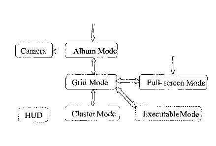
[0009] FIG. 1 shows a block diagram of various modes of a gallery
application and the user
interface flow between them, according to one embodiment.
[0010] FIG. 2 shows a screenshot of an initial view in album mode
(landscape oricntation),
according to one embodiment.
[0011] FIG. 3 shows a screenshot of an album mode heads-up display (I IUD)
with one
album (Munich, Germany) selected (landscape orientation), according to one
embodiment.
[0012] FIG. 4 shows a screenshot of an album mode HUD after a Share region
has been
activated (landscape orientation), according to one embodiment.
[0013] FIG. 5 shows a screenshot of an additional feature "Details" being
displayed
(landscape orientation), according to one embodiment.
[0014] FIG. 6 shows a screenshot of an album mode details (portrait
orientation), according
to one embodiment.
[0015] FIG. 7 shows a screenshot of an initial view in grid modc (portrait
orientation),
according to one embodiment.
[0016] FIG. 8 shows a screenshot of grid mode where the middle image in the
bottom row
has been pressed (portrait orientation), according to one embodiment.
100171 FIG. 9 shows a screenshot of a grid mode HUD with one content item
(the image in
the upper-left) selected (landscape orientation), according to one embodiment.
[0018] FIG. 10 shows a screenshot of an initial view in cluster mode
(portrait orientation),
according to one embodiment.
[0019] FIG. 11 shows a screenshot of a cluster mode HUD with one cluster
(Dec 30, 2008)
selected (landscape orientation), according to one embodiment.
[0020] FIG. 12 shows a screenshot of a full-screen mode HUD (landscape
orientation),
according to one embodiment.
[0021] FIG. 13 shows a screenshot of a secondary full-screen mode HUD
(landscape
orientation), according to one embodiment.
[0022] FIGS. 14A-D show screenshots of various points in time (in
chronological order)
during an animation of a transition from album mode to grid mode (portrait
orientation),
according to one embodiment.
[0023] FIG. 15 shows a screenshot of selection of multiple content items
(represented by
thumbnail images) in grid mode (portrait orientation), according to one
embodiment.
- 4 -
CA 02944499 2016-10-04
[0024] FIG. 16 shows a screenshot of selection of a single album in album
mode (landscape
orientation), according to one embodiment.
[0025] FIG. 17 shows a screenshot of a stack (Munich, Germany) whose
thumbnails have
been "spread out" due to a user pressing down on the stack (landscape
orientation), according to
one embodiment.
[0026] The figures depict various embodiments of the present invention for
purposes of
illustration only. One skilled in the art will readily recognize from the
following discussion that
alternative embodiments of the structures and methods illustrated herein may
be employed
without departing from the principles described herein.
Detailed Description
1. Overview
[0027] A gallery software application enables a user to browse, view, and
interact with
various content items. A content item is an electronic file of any type (e.g.,
still image, video,
document, web page, or executable).
[0028] The gallery application can be executed on any processor-based
device. In one
embodiment, the gallery application executes on a handheld device that
includes a touchscreen, a
camera, and an accelerometer. The handheld device could also include
additional devices and
functionalities, such as a GPS chip, a pointing device (e.g., a trackball,
joystick, or 5-way
button), and a "Back" button.
[0029] The content items can be stored locally (i.e., on the device) or
remotely (e.g., on a
networked server). A content item could be stored remotely using, for example,
the Google
Picasa service or the Yahoo! Flickr service. Note that where a content item is
stored and/or
where a content item comes from has no effect on how the item appears and
behaves in the
gallery application. ln one embodiment, the gallery application maintains a
mapping from its
own content descriptors and actions to content descriptors and actions defined
by third-party
systems.
[0030] In one embodiment, the gallery application has four main modes:
album mode, grid
mode, cluster mode, and full-screen mode. A fifth mode (executable mode) is
available for some
content items. In album mode, grid mode, cluster mode, and full-screen mode, a
content item is
represented by an image. The word "image" is meant to include any type of
visual content. An
- 4a
CA 02944499 2016-10-04
image can be, for example, a photograph, a drawing, a frame of video, or text
(e.g., a web page
or other document or portion thereof). In album mode, grid mode, and cluster
mode, the image is
small (relative to the screen size), so it is refeiTed to as a ''thumbnail"
image. In full-screen mode,
the image is about the size of the screen. Album mode, grid mode, cluster
mode, and full-screen
mode can be used when the device is in either a portrait orientation or a
landscape orientation.
The device's accelerometer detects the orientation of the device and displays
the images
accordingly (i.e., with or without rotation).
[0031] Executable mode is available if a content item can be executed in
some way.
Executable content items include, for example, videos, web pages, and Adobe
FLASH
applications. In executable mode, an appropriate player is launched that plays
the content item
full-screen. For example, a video player (such as RealPlayer from RealNetworks
or Quicklime
from Apple) is launched to play a video content item (such as an .mp3 file). A
web browser
(such as Firefox from Mozilla or Chrome from Google) is launched to display a
- 4b -
CA 02944499 2016-10-04
web page (so that the hyperlinks are operative). Executable mode is not
available for a still
image.
[0032] A user can navigate from one mode to the other. FIG. 1 illustrates
the user
interface flow between modes. In FIG. 1, an arrow that points from a first
mode to a second
mode signifies that a user can directly navigate from the first mode to the
second mode using
the touchscreen. For example, the user can directly navigate from album mode
to grid mode
using the touchscreen. The user can also directly navigate from grid mode to
album mode
using the touchscreen. Navigation between modes can also be performed using a
"Back"
button or tapping an icon in a path bar (described below).
[0033] Two modes (album mode and full-screen mode) have arrows pointing to
them
from empty space. These arrows indicate that the gallery application can be
launched into
album mode or into full-screen mode. If the gallery is activated without
specifying a
particular content item, then the gallery launches into album mode. If the
gallery is activated
with a particular content item specified, then the gallery launches into full-
screen mode with
that particular content item displayed.
[0034] In FIG. 1, "HUD" refers to a heads-up display (HUD) that is part of
the gallery
application. The HUD is available from album mode, grid mode, cluster mode,
and full-
screen mode and will be further described below. "Camera" refers to a camera
application
that is present on the device and is not part of the gallery application.
[0035] Album mode, grid mode, and cluster mode can each display multiple
objects. In
album mode, the objects are album stacks. In grid mode, the objects are
thumbnail images. In
cluster mode, the objects are cluster stacks. In each of these modes, the
objects can be
scrolled through. Scrolling is performed using a gesture (e.g., a horizontal
finger swipe or
flick) and the touchscreen or using a pointing device. The gesture can be
located over the
objects or over the background behind/around the objects. A quick gesture will
scroll past
more columns than a slow gesture. The number of columns scrolled past will
depend on the
speed of the gesture and the length of time the finger is held down when
performing the
gesture.
[0036] When the user attempts to scroll before the first item or after the
last item,
feedback is provided to indicate that an edge has been reached. One type of
feedback is tilting
the view away from the plane of the screen at an angle proportional to the
overflow width
(i.e., the requested scrolling that cannot be performed because the edge has
been reached).
The tilting makes the view appear like it has perspective distortion. The
tilting is brief, after
which the view returns to its normal orientation parallel to the plane of the
screen. Another
- 5 -
CA 02944499 2016-10-04
type of feedback is a "rubber band" effect where the list of items appears to
hit the side of the
display and bounce back in the opposite direction. Yet another type of
feedback is tactile
(e.g., a slight vibration in the device).
[0037] In one embodiment, when the device is tilted, the camera angle onto
the displayed
objects rotates around to show slightly different angles onto the album
stacks, cluster stacks,
or grid thumbnails. This is similar to the tilted view that occurs when the
user tries to scroll
past an edge.
[0038] Path bar ¨ In the upper-left corner in album mode, grid mode, and
cluster mode
(and the full-screen mode HUD) is a path bar that indicates a folder hierarchy
that tells the
user where the displayed images are stored with respect to various folders,
etc. Each node of
the hierarchy is shown by an icon (and also by text, if there is room). The
root of the
hierarchy is on the left and represents the gallery application. The next
level of the hierarchy,
which is shown to the right of the root, is the album. The next level of the
hierarchy, which is
shown to the right of the album, is the content item. The folder hierarchy is
not longer than
one line. As much text is shown as possible, starting from the current
location (i.e., farthest
right element) and moving to the next higher element if there is room. When
content is being
loaded, the icon of the rightmost element changes to a spinner to indicate the
loading. In one
embodiment, during loading, the path bar indicates the loading progress (e.g.,
"75 of 100
items loaded").
[0039] The following sections describe the four main modes (album, grid,
cluster, and
full-screen), transitions between modes, and additional features.
2. Album Mode
[0040] An album is a set of one or more content items. The content items
are ordered in
some way (e.g., chronologically based on timestamps). In album mode, a content
item is
represented as a thumbnail image. An album thumbnail has an inner shadow, a 2-
pixel white
rectangular frame, and an outer shadow. An album is represented by a stack of
thumbnail
images. The stack includes thumbnail images for the first few content items in
that album. In
this way, a stack represents the contents of an album.
[0041] The thumbnail images are stacked so that the image for the first
content item in
the album is on top of the stack, the image for the second content item in the
album is second
from the top of the stack, and so on. The stack appearance consists of one
picture that is the
foreground, and the other pictures are randomly placed underneath the first
picture with
centers within a certain region and randomly oriented to be roughly upright.
For example, the
- 6 -
CA 02944499 2016-10-04
first image is not rotated, while the other images are rotated a random amount
within a small
degree range. The second and subsequent images are also centered a random
amount away
from the first image's center. The random rotation and random centering of the
second and
subsequent images creates a "messy" stack effect.
[0042] In one embodiment, the number of thumbnails present in a stack
depends on the
number of content items in that album (more thumbnails indicates more content
items). A
stack includes, for example, images for the first four content items in the
album.
[0043] Album mode displays a scrollable list of albums (i.e., a scrollable
list of stacks).
The list can be displayed in portrait orientation or in landscape orientation,
depending on the
orientation of the device. In portrait orientation, the albums are arranged in
three rows and
can be scrolled horizontally left and right. The display accommodates two
albums in each
row, for a maximum of six albums displayed. In landscape orientation, the
albums are
arranged in two rows and can be scrolled horizontally left and right. The
display
accommodates three albums in each row, for a maximum of six albums displayed.
1[0044] FIG. 2 shows a screenshot of an initial view in album mode
(landscape
orientation). In FIG. 2, four albums (stacks) are displayed. After this
initial view, whenever
the album stack list is scrolled and then stops moving, the stack placement is
automatically
adjusted so that one column is in the center of the display.
[0045] Each album stack is labeled with the title of the album (e.g.,
"Camera" or "01-20-
07 Sunol") and the number of content items in the album (e.g., 20 or 8). A
stack can also
include an icon that conveys information about the album. For example, the
camera icon
signifies that the album contains content items that were captured using the
device's camera.
The folder icon signifies that the album is stored locally. A "play" icon (not
shown) signifies
that the top-most content item in the stack is a video. Other icons can convey
different
information, such as the source of a remote album (e.g., Picasa or Flickr).
[0046] FIG. 2 also shows a camera icon in the upper-right comer of the
screen. This
camera icon is a virtual button (or soft key) that, when activated, launches
the device's
camera application.
[0047] In one embodiment, some default albums are present. If the device
includes a
camera, then one album (entitled "Camera") is the default location for
pictures or videos
taken using the device's camera. If the device includes a web browser, then
one album
(entitled "Downloads") is the default location for content items downloaded
from the web. In
one embodiment, in album mode, the Camera album is listed first, followed by
local albums
and the Downloads album, followed by albums that are stored remotely. Among
multiple
- 7 -
CA 02944499 2016-10-04
albums of the same type (e.g., local albums or remote albums), albums are
listed based on
their most recent capture dates, from newest to oldest.
[0048] HUD ¨ A user can select one or more albums and manipulate them.
Touching one
album for longer than one second selects that album. That action also launches
a heads-up
display (HUD) that enables a user to select additional albums and manipulate
the selected
albums. FIG. 3 shows a screcnshot of the album mode HUD with one album
(Munich,
Germany) selected (landscape orientation). When the HUD is shown, each album
stack
includes a chcckbox icon. If the checkbox icon is grayed out, then that album
is not selected.
If the checkbox icon is green, then that album is selected.
[0049] The HUD is divided into six regions: top-left, top-center, top-
right, bottom-left,
bottom-center, and bottom-right. The top-left region (labeled "Select All")
enables a user to
select all albums with a single tap. The top-center region indicates the
number of content
items that are currently selected. (Here, the album entitled "Munich, Germany"
is selected
and contains 141 items, so the top-center region is labeled "141 items.") The
top-right region
(labeled "Deselect All") enables a user to deselect all albums with a single
tap.
[0050] The bottom-left region (labeled "Share") enables a user to share
selected items.
FIG. 4 shows a screenshot of the album mode HUD after the Share region has
been activated
(landscape orientation). The Share options enable the user to share content
items with other
people. Options include, for example, sharing services (such as Picasa), data
transfer
protocols (such as Bluetooth), messaging protocols (such as XMPP), and email
applications
(such as Gmail).
[0051] The bottom-center region (labeled "Delete") enables a uscr to delete
selected
items.
[0052] The bottom-right region (labeled "More") gives the user access to
additional
features. When the More region is activated, one or more additional features
are displayed.
FIG. 5 shows a screenshot of the additional feature "Details" being displayed
(landscape
orientation). Activating the Details region causes the album mode details to
be displayed.
FIG. 6 shows a screenshot of the album mode details (portrait orientation).
[0053] These details include the number of albums selected (1), the number
of items
selected (141), the timestamp of the earliest selected item (5:09am Dec 30
2008), the
timestamp of the latest selected item (9:13am Dec 30 2008), and the location
of the items
(e.g., the geographical location that is shown in an image content item; here,
AventinstraBe 1-
11).
- 8 -
CA 02944499 2016-10-04
3. Grid Mode
[0054] Grid mode displays content items of one album in a scrollable grid
pattern. Each
content item is represented by a thumbnail image. In one embodiment, a grid
thumbnail has a
more subtle border style than an album thumbnail. For example, a grid
thumbnail has an
inner shadow, a 1-pixel translucent white inset border, and an outer shadow.
[0055] The grid can be displayed in portrait orientation or in landscape
orientation. In
portrait orientation, the images are arranged in four rows and can be scrolled
horizontally left
and right. The display accommodates three images in each row, for a maximum of
twelve
images displayed. In landscape orientation, the albums are arranged in three
rows and can be
scrolled horizontally left and right. The display accommodates four images in
each row, for a
maximum of twelve images displayed.
[0056] FIG. 7 shows a screenshot of an initial view in grid mode (portrait
orientation).
FIG. 7 shows four rows of thumbnail images arranged in a grid pattern. Two
columns of
images are shown fully, and a third column of images is shown partially. After
this initial
view, whenever the grid is scrolled and then stops moving, the grid placement
is
automatically adjusted so that no columns are clipped on either sidc. This
automatic
adjustment occurs in both portrait orientation and landscape orientation.
[0057] Grid mode shows images from an album. Thus, in FIG. 7, the path bar
shows only
the root of the hierarchy and the album level. The content item level is shown
in full-screen
mode, which will be discussed below. In FIG. 7, the root of the hierarchy is
shown by an icon
that represents the gallery application. The album level is shown by an icon
that represents
the album (here, a Picasa icon) and the beginning of the title of the album
(here, "Many
ph...").
[0058] In the upper-right corner is a user interface control that is used
to transition
between grid mode and cluster mode. This control will be described in a later
section.
[0059] If an image in the grid represents an executable content item, then
the user can
switch to executable mode to "play" that item. For example, if the content
item is a video,
then the user can switch to executable mode (e.g., by tapping the image) to
play the video
full-screen. In one embodiment, the image includes an icon that indicates the
type of
executable item (e.g., a "play" icon for a video).
[0060] If a thumbnail image in the grid is pressed, then the image appears
to move
upwards towards the user. FIG. 8 shows a screenshot of grid mode where the
middle image in
the bottom row has been pressed (portrait orientation).
- 9 -
CA 02944499 2016-10-04
[0061] Scroll bar ¨ In addition to the scrolling methods described above,
grid mode also
includes a scroll bar that can be used for scrolling. In FIG. 8, the scroll
bar is located below
the grid. The scroll bar can be dragged horizontally using the touchscreen. As
the scroll bar is
being dragged, the grid moves in the opposite direction as the dragging. For
example, if the
scroll bar is dragged to the right, then the grid scrolls to the left, thereby
showing new images
on the right side of the screen. The speed of the scrolling is proportional to
the speed of the
dragging. After the scroll bar is released, the scroll bar re-centers itself
in the middle of the
screen. The scroll bar is lit up when it is being dragged.
[0062] As mentioned above, an album is a set of ordered content items. In
one
embodiment, as the scroll bar is being dragged, the "ordering" meta-data for
the currently-
displayed images is shown. For example, assume that the images are ordered in
the album
chronologically based on timestamps. When the scroll bar is being dragged, the
timcstamp
for the currently-displayed images is shown. If all images are timestamped
February 3, 2007,
then "February 3, 2007" will be shown. As scrolling progresses, if the
currently-displayed
images are timestamped February 4, 2007, then "February 4, 2007" will be
shown. Showing
the ordering meta-data during scrolling helps the user navigate to the desired
portion of the
grid. The meta-data can be shown in various places, such as overlaid on the
grid.
[0063] In another embodiment, multiple values of ordering meta-data are
shown. For
example, the meta-data for thc currently-displayed images is shown along with
meta-data for
the off-screen images that arc adjacent to the currently-displayed images to
the left and/or to
the right. Showing the ordering meta-data for off-screen images tells the user
information
about these images that are "ahead" or "behind" the current location in the
grid. Clicking on
meta-data for off-screen images scrolls the grid to that location. The meta-
data can be shown
in various places, such as below the grid.
[0064] In yet another embodiment, various date markers are shown
chronologically. A
date marker that is associated with one or more content items appears bright,
while a date
marker that is not associated with any content items appears dull or grayed
out.
[0065] HUD ¨ A user can select one or more content items and manipulate
them.
Touching one thumbnail image for longer than one second selects the content
item
represented by that image. That action also launches a heads-up display (HUD)
that enables a
user to select additional content items and manipulate the content items. FIG.
9 shows a
screenshot of the grid mode HUD with one content item (the image in thc upper-
left) selected
(landscape orientation).
- 10-
CA 02944499 2016-10-04
[0066] When the HUD is shown, each thumbnail image includes a checkbox
icon. If the
checkbox icon is grayed out, then that image is not selected. If the checkbox
icon is green,
then that image is selected.
[0067] The HUD is divided into six regions: top-left, top-center, top-
right, bottom-left,
bottom-center, and bottom-right. The top-left region (labeled "Select All")
enables a user to
select all content items with a single tap. The top-center region indicates
the number of
content items that are currently selected. (Here, one image is selected, so
the top-center
region is labeled "1 item.") The top-right region (labeled "Deselect All")
enables a user to
deselect all images with a single tap.
[0068] The bottom-left region (labeled "Share") enables a user to share
selected items.
The grid mode Share region functions similarly to the album mode Share region,
which was
described above. The bottom-center region (labeled "Delete") enables a user to
delete
selected items.
[0069] The bottom-right region (labeled "More") gives the user access to
additional
features. When the More region is activated, one or more additional features
are displayed.
FIG. 9 shows the additional features "Details", "Set as", "Crop", "Rotate
Left", and "Rotate
Right" being displayed (landscape orientation).
[0070] Activating the Details region causes the grid mode details to be
displayed.
Activating the Set as region causes a selected image to be used as wallpaper.
Activating the
Crop region enables the user to crop a selected image. Activating the Rotate
Left region
rotates a selected image to the left. Activating the Rotate Right region
rotates a selected
image to the right.
4. Cluster Mode
[0071] Cluster mode is similar to grid mode, in that both modes display the
content items
of one album. Also, each content item is represented by a thumbnail image.
However, cluster
mode displays the items in stacks, whereas grid mode displays the items in a
grid pattern. In
this way, cluster mode is similar to album mode, since both modes use a
"stack"
representation.
[0072] Cluster mode automatically groups items based on time and/or
location (e.g.,
based on a timestamp or a geographical tag ("geotag") associated with an item,
referred to as
"geocoding"). The geotag might be stored in an exchangeable image file format
(EXIF)
header associated with the content item.
- 11 -
CA 02944499 2016-10-04
[0073] Each cluster is displayed as a stack of thumbnails chosen from the
contained
items. FIG. 10 shows a screenshot of an initial view in cluster mode (portrait
orientation). In
one embodiment, a cluster thumbnail has an inner shadow, a 2-pixel white
rectangular frame,
and an outer shadow (the same as an album thumbnail).
[0074] FIG. 10 shows three rows of cluster stacks arranged in a grid
pattern. One column
of cluster stacks is shown fully. Under each cluster stack is a time string,
the number of items
in the cluster, a geotag icon, and a geotag location.
[0075] Regarding the time string, an appropriate text length is selected
based on how
much space is available. If the cluster content items are older, then maybe
only the month
range or year range is shown. If the content items are more recent, then maybe
the entire date
range is shown. For example, if the cluster spans multiple years, then display
the time string
as "Feb 2008 - Mar 2009" (only month and year are shown). If the cluster is
from a single
year but not from the same day in the current year, the time string is "Mar 3-
4, 2009" or "Feb
3 - Mar 6, 2009" or "Feb 28, 2008" (display date, month, and year). If the
cluster is from a
single day and from the current year, pick the midpoint of the cluster and
display the time,
date, and month, the time string is "2:54pm, Oct 16."
[0076] The location information appears asynchronously below stacks. The
location that
is displayed for a cluster is the most specific location that accurately
describes all geotagged
items in that cluster. The most specific level of location is street name
(e.g., "Harrison St"),
followed by city name/state (e.g., "Palo Alto, CA"), "near" city name/state
(e.g., "near Palo
Alto, California", which is based on a radius distance threshold from the
named city), and
state/country (e.g., "California, US"). Tapping the geotag icon will launch
grid view and filter
the album so that only content items with the geotag location are displayed.
In one
embodiment, geotag functionality uses the Google Maps Reverse-Geocoding
service.
[0077] In the upper-left corner is the path bar that was described above.
Cluster mode
shows images from an album. Thus, in FIG. 10, the path bar shows only the root
of the
hierarchy and the album level. The root of the hierarchy is shown by an icon
that represents
the gallery application. The album level is shown by an icon that represents
the album (here,
a Picasa icon) and the beginning of the title of the album (here,
"Hallowe...").
[0078] In the upper-right comer is a user interface control that is used to
transition
between grid mode and cluster mode. This control will be described in a later
section.
[0079] Cluster stacks are similar to album stacks, in that the first image
is not rotated,
while the other images are rotated a random amount within a small degree
range. The second
and subsequent images are also centered a random amount away from the first
image's
- 12 -
CA 02944499 2016-10-04
center. The random rotation and random centering of the second and subsequent
images
creates a "messy" stack effect. Cluster stacks with more items may occupy more
space than
stacks with fewer items.
[0080] In one embodiment, the number of thumbnails present in a stack
depends on the
number of content items in that cluster (more thumbnails indicates more
content items). For
example, a stack includes three to five thumbnails.
[0081] Cluster mode displays a scrollable list of clusters (i.e., a
scrollable list of cluster
stacks). Cluster stacks are listed in chronological order. The list can be
displayed in portrait
orientation or in landscape orientation, depending on the orientation of the
device.
[0082] In one embodiment, the thumbnails selected from each cluster (to
form the stack)
are representative of the cluster as a whole. For example, the thumbnails are
selected based
on the following criteria (listed in order from most important to least
important, where a more
important criterion is weighted more heavily than a less important criterion):
= Whether thc item is starred/flagged (starred/flagged items are
prioritized)
= How many times the item has been viewed in full-screen mode (items
accessed on
more occasions are prioritized)
= The item's capture date (more recent items are prioritized)
[0083] In one embodiment, a thumbnail from roughly the middle of the
cluster is picked
for the top of the stack, and a few other random thumbnails are chosen for the
rest of the
stack.
[0084] HUD ¨ A user can select one or more clusters and manipulate them.
Touching one
cluster for longer than one second selects that cluster. That action also
launches a heads-up
display (HUD) that enables a user to select additional clusters and manipulate
the selected
clusters. FIG. 1 1 shows a screenshot of the cluster mode HUD with one cluster
(Dec 30,
2008) selected (landscape orientation).
[0085] When the HUD is shown, each cluster includes a checkbox icon. If the
checkbox
icon is grayed out, then that cluster is not selected. If the checkbox icon is
green, then that
cluster is selected.
[0086] The HUD is divided into six regions: top-left, top-center, top-
right, bottom-left,
bottom-center, and bottom-right. The top-left region (labeled "Select All")
enables a user to
select all clusters with a single tap. The top-center region indicates the
number of content
items that are currently selected. (Here, one cluster is selected, and that
cluster contains 18
items, so the top-center region is labeled "18 items.") The top-right region
(labeled "Deselect
All") enables a user to deselect all clusters with a single tap.
- 13 -
CA 02944499 2016-10-04
[0087] The bottom-left region (labeled "Share") enables a user to share
selected clusters.
The grid mode Share region functions similarly to the album mode Share region,
which was
described above. The bottom-center region (labeled "Delete") enables a user to
delete
selected clusters.
[0088] The bottom-right region (labeled "More") gives the user access to
additional
features. When the More region is activated, one or more additional features
arc displayed.
FIG. 11 shows the additional features "Details", "Rotate Left", and "Rotatc
Right" bcing
displayed (landscape orientation).
[0089] Activating the Details region causes the cluster mode details to be
displayed.
Activating the Rotate Left region rotates a selected image to the left.
Activating the Rotate
Right region rotates a selected image to the right.
[0090] Clustering algorithm ¨ Clustering automatically divides a stream of
content items
into clusters of "events" as best as possible. The clustering algorithm
employed is loosely
based on agglomerative clustering but does not require pre-specifying the
number of clusters
to generate. The clustering can be computed in one linear scan over the
collection of content
items in a streaming fashion ¨ so not all of the content items have to be
processed before the
first clusters are determined (and then displayed).
[0091] A set of clusters that have already been determined is stored.
Initially, an empty
cluster is created. When the call is made to cluster the next content item, we
check if the item
is timestamped within X time units of the previous item (adaptive between 1
minute and 2
hours in our case - this is the cluster_split_time). If the next item is
within this
cluster_split_time of the previous item, then the next item is added to the
current existing
cluster. On the other hand, if geotag location data is available and the next
item is over Y
distance units from thc previous item (25 miles in our case), then the next
item is placed as
the start of a new cluster of its own.
[0092] Now, if neither of those conditions is met (within time range or
exceeding location
range), we examine the following - is the current cluster too big and should
we split it in two
or is the current cluster too small and should we merge it with the cluster
before it provided
the 2 clusters are not geographically separated by more than 25 miles. If the
current cluster is
too big (adaptive between 20 - 50 items in our heuristic), we attempt to split
into two by
looking for the point in time with the biggest frequency change in photo
taking. Let A, B, C
be 3 consecutive points in time order. Consider (C - B) and (B - A). The ratio
between these 2
differences must be at least 2 in order for it to be a frequency split
candidate - that is, (C - B)
must be greater than twice that of (B - A) or less than half of (B - A) - that
qualifies as
- 14 -
CA 02944499 2016-10-04
enough of a frequency difference. In order to not split if the frequency in
photo taking goes
from 1 sec to 5 sec, we split only if one of (C - B) or (B - A) is over half
that of the already
computed cluster_split_time. We pick the largest frequency change that
satisfies the factor of
2 ratio constraint and the at least half cluster_split_time constraint as the
point to split. If no
such point exists, we don't split and settle for having made the best effort.
We then add the
current item to the second cluster if there was a split or to the 1 large
cluster if there was no
split.
[0093] Similarly, in the merging case, we merge the current cluster with
the previous
cluster if they both have fewer than Z items (adaptive between 8 and 15) and
they are not
geographically separated by the 25 mile heuristic. We then add the current
item to the end of
the merged cluster or the current cluster if no merge was possible.
[0094] The splitting and merging of clusters results in clusters that are
roughly of sizes
that people care about (it makes it easy for people to scan quicker and they
can easily tell
what event a cluster corresponds to). The time constraint, thc location
constraint and the
frequency heuristic try to capture common photo taking behavior.
[0095] Adaptive nature of the parameters: We get 2 input points - the time
range that the
original set spans and the number of items in the set - based on that, we set
the
cluster_split_time threshold, the min_cluster_size, and the max_cluster_size.
Each of these 3
variables has a range and we pick the appropriate number in that range. For
example,
min_cluster_size ranges from 8 to 15. If the input has only 50 items in it, we
may set the
min_cluster_size to 8 but if the input has 500 items, we will set the
min_cluster_size to 15.
Similar logic governs the 3 parameters. It enables the clustering algorithm to
adapt better to
the set of content items we are dealing with and creates more appropriately-
sized clusters.
5. Full-Screen Mode
[0096] In full-screen mode, a content item is represented by an image that
is about the
size of the screen. One image is displayed at a time.
[0097] Zoom ¨ Double-tapping the image will zoom in to the image. Double-
tapping the
zoomed-in image will zoom back out to the original image. A swipe gesture on
the image can
also be used to zoom in (upward swipe) and zoom out (downward swipe). Zooming
in and
out can also be accomplished using the HUD (see below).
[0098] HUD ¨ When full-screen mode is first entered, the full-screen mode
HUD and the
path bar are visible for a short amount of time (e.g., one second). After the
time has passed, if
- 15 -
CA 02944499 2016-10-04
there has been no user activity, then the HUD and the path bar fade away.
After the HUD and
the path bar have disappeared, they can be recalled by single-tapping the
image.
[0099] FIG. 12 shows a screenshot of the full-screen mode HUD (landscape
orientation).
The full-screen HUD includes a zoorn-in region and a zoom-out region (upper-
right), a
Slideshow region (bottom-left), and a Menu region (bottom-right). Activating
the zoom-in
region zooms in to the displayed image. Activating the zoom-out rcgion zooms
out of the
displayed image. Activating thc Slideshow region starts a full-screen
slideshow of images in
the current album.
[0100] Activating the Menu region will display a secondary full-screen mode
HUD. FIG.
13 shows a screenshot of the secondary full-screen mode HUD (landscape
orientation). The
secondary HUD operates on the displayed item. The HUD is divided into three
regions:
bottom-left, bottom-center, and bottom-right. The bottom-left region (labeled
"Share")
enables a user to share the displayed content item. The full-screen mode Share
region
functions similarly to the album mode Share region, which was described above.
The bottom-
center region (labeled "Delete") enables a user to delete selected content
item.
[0101] The bottom-right region (labeled "More") gives the user access to
additional
features. When the More region is activated, one or more additional features
are displayed.
FIG. 13 shows the additional features "Details", "Set as", "Crop", "Rotate
Left", and "Rotate
Right" being displayed (landscape orientation).
[0102] Activating the Details region causes the full-screen mode details to
be displayed.
The Set as region, Crop region, Rotate Left region, and Rotate Right region
function similarly
to the grid mode regions, which were described above.
6. Transition between Album Mode and Grid Mode
[0103] When the gallery application is in album mode, a single tap on an
album stack
transitions the gallery application to grid mode. Grid mode displays the
content items of the
tapped album (represented by thumbnail images) in a grid pattern.
[0104] When going from album mode to grid mode, the representative
thumbnails used in
the album stack animate to their grid positions. Transitions between modes
attempt to reuse
as many on-screen thumbnails as possible to provide a direct manipulation
feel.
[0105] When grid mode is first launched from album mode, the grid is
positioned so that
the content items at the beginning of the album are shown. FIGS. 14A-D show
screenshots of
various points in time (in chronological order) during the animation of a
transition from
album mode to grid mode (portrait orientation).
- 16 -
CA 02944499 2016-10-04
[0106] The animation of the transition from grid mode to album mode is
similar to the
animation of the transition from album mode to grid mode, except that the
movements are
reversed chronologically. For example, FIG. 14D (album mode) would be followed
by FIG.
14C, then FIG. 14B, and then FIG. 14A.
7. Transition between Grid Mode and Cluster Mode
[0107] In the upper-right corner of FIG. 14D is a user interface control
that is used to
transition between grid mode and cluster mode. The control includes a grid
mode icon, a
slider with a knob, and a cluster mode icon. To switch from grid mode to
cluster mode, toggle
the slider by dragging the knob to the right. To switch from cluster mode to
grid mode, toggle
the slider by dragging the knob to the left. Or, to switch to a particular
mode, single tap the
associated icon (i.e., the grid mode icon or the cluster mode icon).
[0108] Alternatively, a swipe gesture on the cluster or grid can be used to
switch from
cluster mode to grid mode (upward swipe) and from grid mode to cluster mode
(downward
swipe).
[0109] When going from cluster mode to grid mode, the representative
thumbnails used
in the cluster animate to their grid positions. Transitions between modes
attempt to reuse as
many on screen thumbnails as possible to provide a direct manipulation feel.
In one
embodiment, transitions between grid mode and cluster mode cross-fade border
styles to
ensure continuity.
8. Transition between Grid Mode and Full-Screen Mode
[0110] Once in grid-mode, a single tap on an item takes you to full-screen
mode. If the
tapped item is executable, then the item will be executed (e.g., a video will
be played). If the
tapped item is an image, then the image will be displayed full-screen. A
single tap in fall-
screen mode brings back the contextual menus.
9. Additional Features
[0111] Multiple selection ¨ In album mode, grid mode, and cluster mode,
pressing an
object and holding down for over one second will trigger multi-select mode. In
multi-select
mode, single-tapping an object will select the object. In this way, the user
can select any
number of objects. The HUD can then be used to perform an action on all
selected objects.
FIG. 15 shows a screenshot of selection of multiple content items (represented
by thumbnail
images) in grid mode (portrait orientation). FIG. 16 shows a screenshot of
selection of a
- 17 -
CA 02944499 2016-10-04
single album in album mode (landscape orientation). Note that FIG. 16 is not
is not fully
indicative of the screen state. Since the screenshot was captured during an
animation, the
screen is in the process of being re-rendered and is not fully accurate.
[0112] Back button ¨ In one embodiment, each tap-initiated navigation
pushes onto the
back of the gallery application's run-time stack, so that there is no risk of
rewinding past
expectations.
[0113] Stack feedback and spread animation ¨ When a user presses down on a
stack
(either an album stack or a cluster stack), the user receives tactile feedback
from the device.
The tactile feedback gets stronger if thc user presses down for a longer time.
Eventually, if
the press is long enough, multi-select mode will be entered (described above).
Also, when a
stack is pressed, the stack appears to move downwards (as if it had been
physically pressed),
and the thumbnail images in the stack spread out a bit to give the user a
better idea of what is
contained in the stack. FIG. 17 shows a screenshot of a stack (Munich,
Germany) whose
thumbnails have been "spread out" due to a user pressing down on the stack
(landscape
orientation).
10. Adaptive Backgrounds and Depth Effects
[0114] The following effects apply to album mode, grid mode, and cluster
mode:
[0115] In album mode and cluster mode, the background starts with a
filtered version of
the top item of the leftmost visible stack (Gaussian blur lOpx, saturation -
35, brightness -35).
If the top item of the leftmost visible stack is not yet loaded, then the
background starts with a
filtered version of the icon for the gallery application. The image is cropped
and zoomed to
be wider than the display. When scrolling, the background moves with a
parallax effect
inspired by the Android home screen. When the edge of thc background image is
reached, it
smoothly fades into the next background image. Alternatively, a single
background image
such as a dark gradient or wood grain can be used.
[0116] Darkened Gaussian Box Blur ¨ In album mode and cluster mode, we pick
the top
item in the leftmost visible stack. In grid view, we pick the center image in
the visible range.
We then compute a box blur of that image. (A box blur is an image filter in
which each pixel
in the resulting image has a value equal to the average value of its
neighboring pixels in the
input image - the 10 neighboring pixels in our case.) We then darken the image
by a constant
amount (just subtract RGB values).
[0117] StitehinR - We then stitch 2 backgrounds together as the user
scrolls to create a
continuous effect. In portrait orientation, a background image represents 2
columns. In
- 18 -
CA 02944499 2016-10-04
landscape orientation, the background image represents 3 columns. 75% of the
irnage is as-is. In
the last 25% of the image, we add an alpha ramp to go from opaque to
transparent. The next
background image is then stitched after that.
[0118] Cross-Fading Animation - When scrolling, the background image will
change every
2-3 columns. We cross-fade between the existing and the to-be-displayed
background over some
time duration (e.g., half a second).
[0119] Parallax Effect - The background scrolls at half the speed of the
content, similar to
the Android main page, to give prominence to the foreground.
[0120] The adaptive backgrounds are useful for giving the user a quick
sense of the mood of
the albums/clusters/content items being viewed and help make the background
less dull.
[0121] Reference in the specification to "one embodiment" or to "an
embodiment" means
that a particular feature, structure, or characteristic described in
connection with the
embodiments is included in at least one embodiment. The appearances of the
phrase "in one
embodiment" in various places in the specification are not necessarily all
referring to the same
embodiment.
[0122] Some portions of the detailed description are presented in terms of
algorithms and
symbolic representations of operations on data bits within a computer memory.
These
algorithmic descriptions and representations are the means used by those
skilled in the data
processing arts to most effectively convey the substance of their work to
others skilled in the art.
An algorithm is here, and generally, conceived to be a self-consistent
sequence of steps
(instructions) leading to a desired result. The steps are thosc requiring
physical manipulations of
physical quantities. Usually, though not necessarily, these quantities take
the form of electrical,
magnetic or optical signals capable of being stored, transferred, combined,
compared and
otherwise manipulated. It is convenient at tirnes, principally for reasons of
common usage, to
refer to these signals as bits, values, elements, symbols, characters, terms,
numbers, or the like.
Furthermore, it is also convenient at times, to refer to certain arrangements
of steps requiring
physical manipulations of physical quantities as modules or code devices,
without loss of
generality.
[0123] However, all of these and similar terms are to be associated with
the appropriate
physical quantities and are merely convenient labels applied to these
quantities. Unless
specifically stated otherwise as apparent from the following discussion, it is
appreciated that
- 19 -
CA 02944499 2016-10-04
throughout the description, discussions utilizing terms such as "processing"
or "computing" or
"calculating" or "determining" or "displaying" or "determining" or thc like,
refer to the action
and processes of a computer system, or similar electronic computing device,
that manipulates
and transforms data represented as physical (electronic) quantities within the
computer system
memories or registers or other such information storage or display devices.
[0124] Certain aspects of the present disclosure include process steps and
instructions
described herein in the form of an algorithm. It should be noted that the
process steps and
instructions could be embodied in software, firmware or hardware, and when
embodied in
software, could be downloaded to reside on and be operated from different
platforms used by a
variety of operating systems. Embodiments can also be in the form of a
computer program
product which can be executed on a computing system.
[0125] The present disclosure also relates to an apparatus for performing
the operations
herein. This apparatus may be specially constructed for the required purposes,
or it may comprise
a general-purpose computer selectively activated or reconfigured by a computer
program stored
in the computer. Such a computer program may be stored in a tangible computer-
readable (or
machine-readable) storage medium, such as, but not limited to, any type of
disk including floppy
disks, optical disks, CD-ROMs, magnetic-optical disks, readonly memories
(ROMs), random
access memories (RAMS), EPROMs, EEPROMs, magnetic or optical cards,
application specific
integrated circuits (ASICs), or any type of media suitable for storing
electronic instructions, and
each coupled to a computer system bus. Furthermore, the computers referred to
in the
specification may include a single processor or may be architectures employing
multiple
processor designs for increased computing capability.
[0126] The algorithms and displays presented herein are not inherently
related to any
particular computer or other apparatus. Various general-purpose systems may
also be used with
programs in accordance with the teachings herein, or it may prove convenient
to construct more
specialized apparatus to perform the required method steps. The required
structure for a variety
of these systems will appear from the description. In addition, the present
invention is not
described with reference to any particular programming language. It will be
appreciated that a
variety of programming languages may be used to implement the teachings of the
present
invention as described herein, and any references to specific languages are
provided for
disclosure of enablement and best mode of the embodiments described.
- 20 -
CA 02944499 2016-10-04
[0127] As will be understood by those familiar with the art, embodiments
may be provided
in other specific forms. Likewise, the particular naming and division of the
modules, features,
attributes, methodologies, managers and other aspects are not mandatory or
significant, and the
mechanisms that implement any embodiment or its features may have different
names, divisions
and/or formats. Furthermore, as will be apparent to one of ordinary skill in
the relevant art, the
modules, features, attributes, methodologies, managers and other aspects can
be implemented as
software, hardware, firmware or any combination of the three. Of course,
wherever a component
of an embodiment is implemented as software, the component can be implemented
as a
standalone program, as part of a larger program, as a plurality of separate
programs, as a
statically or dynamically linked library, as a kernel loadable module, as a
device driver, and/or in
every and any other way known now or in the future to those of skill in the
art of computer
programming. Additionally, the embodiments described herein are in no way
limited to
implementation in any specific programming language, or for any specific
operating system or
environment.
[0128] In addition, the language used in the specification has been
principally selected for
readability and instructional purposes and may not have been selected to
delineate or
circumscribe the inventive subject matter. Accordingly, the disclosure herein
is intended to be
illustrative, but not limiting. The scope of the invention is set forth in the
following claims.
-21 -