Note: Descriptions are shown in the official language in which they were submitted.
FRONT-FACING CAMERA AND
MAXIMIZED DISPLAY SCREEN OF A MOBILE DEVICE
TECHNICAL FIELD
The present invention relates to mobile electronic devices and, in particular,
to methods
and systems that increase the size of a display screen.
BACKGROUND
Common smartphones, phablets, tablet computers, or comparable mobile
electronic
devices contain a front-facing camera placed on the front side of these mobile
electronic devices.
The front side of the mobile electronic devices also contains a display
screen, using a display
technology such as liquid-crystal display (LCD) or active-matrix organic light-
emitting diode
(AMOLED). The display screen may be oblong, with an aspect ratio of, for
instance, 16:9, 2:1,
19.5:9, or 21:9.
The user may orient a mobile electronic device with an oblong display screen
horizontally
or vertically, which may result in operating modes known as "landscape mode"
and "portrait
mode," respectively. The page orientation can also be described with the terms
"landscape
orientation" and "portrait orientation." For example, a user may hold a
smartphone horizontally
(landscape mode) and may watch a video or movie displayed in full screen mode
on the display
screen.
The front-facing camera of a mobile electronic device may be used for video
telephony or
to take a self-portrait photograph, commonly known as a "selfie." In recent
years, the resolution
on front-facing cameras has increased, and it is likely that the resolution
will continue to increase
in the future (e.g., from 8 megapixels to 13 nnegapixels) to enable the user
to take "selfies" of the
highest quality and record high-quality 4K videos. Therefore, in some
embodiments, high-quality
camera lenses for the front-facing camera and an undisturbed light path are
essential.
Patent applications US2017/0123454 Al, US2017/0123453 Al, and U82017/0123452
Al ,
titled "Camera integrated into a display," patent application US2017/0123575
Al, titled "Optical
sensors disposed beneath the display of an electronic device," patent
application
US2017/0124933 Al, titled "Mobile device with display overlaid with at least a
light sensor,"
patent applications US2017/0126979 Al and US2017/0126937 Al, titled "Apparatus
and method
to maximize the display area of a mobile device," and patent application
US2015/0271392 Al,
titled "System and method for coordinating image capture in a camera hidden
behind a display
device" suggest disposing the front-facing camera beneath the display screen
of mobile
CA 3010307 2018-06-29
2
electronic devices. However, depending on the display technology of the screen
(e.g., LCD,
OLED, Micro-LED, etc.), small, opaque, or semi-transparent structures that may
be necessary
for the operation of the display screen may blur or cloud the resulting
picture of the front-facing
camera because the light path must pass through the display screen.
Furthermore, LCD panels
often also require removing a diffuser layer to adapt them for use as
transparent displays, and
the polarizing filters of the LCD panels inherently limit the transmission
efficiency of unpolarized
light. This may reduce the light sensitivity of a front-facing camera located
beneath the display
screen, especially in low-light conditions.
SUMMARY
Embodiments of the present invention are directed to mobile electronic devices
with a
display screen and at least one front-facing optical sensor or optical emitter
(e.g., a front-facing
camera, an optical image sensor, an IR-LED, or another optical component).
Examples of mobile
electronic devices are smartphones, phablets, tablet computers, smartwatches,
subnotebooks,
or laptops. The scope of the embodiments is set forth by means of the features
of the
independent claims. Advantageous embodiments, alternatives, and optional
features are
specified in the dependent claims.
In some embodiments, a mobile electronic device features thin borders at the
left, right,
top, and/or bottom edge of the display screen. To accommodate optical
sensor(s) and/or optical
emitter(s) in spite of a border that is too thin (e.g., too thin for a front
camera module and lens),
two or more corners of the display panel have a cutout or recess, and the
optical sensor(s)
and/or optical emitter(s) are disposed, at least in part, in the areas of
these cutouts (at the
corners of the display panel). Optionally, the cutouts may have a convex shape
for the most part,
thereby maximizing the remaining screen area. For example, a mobile electronic
device may be
made so that the screen area of the device is enlarged for scrollable screen
content and may
comprise:
a) a display panel having at least a first cutout at the upper-left corner and
a second cutout
at the upper-right corner,
b) at least one front-facing optical sensor disposed, at least in part, in the
area of said first
cutout or in the area of said second cutout, wherein at least within the area
of said first or
second cutout, said front-facing optical sensor has an unobstructed light
path,
c) a computer system connected to said display panel and said front-facing
optical sensor,
said computer system being configured or programmed to:
i) display, on said display panel, a scrollable screen content that seamlessly
extends
over the entire height of said display panel, such that the uppermost part of
said
screen content is displayed between said first cutout and said second cutout,
ii) determine, based on an user input, that said screen content is to be
scrolled vertically,
CA 3010307 2018-12-18
3
iii) determine, based on the current vertical scrolling position of said
screen content,
object categories of one or more screen objects that overlap with the area of
said first
cutout or said second cutout, said object categories comprising at least text
lines and
pictures,
iv) render, while scrolling, a repeatedly updated screen content, wherein:
each screen object that belongs to the text line category and overlaps with
the area
of said first cutout or said second cutout is modified by reducing the
character width
while keeping the original height of the characters and the original line
spacing, the
length of each text line being tailored to a predetermined shape derived, at
least in
part, from the shape of said first cutout or said second cutout,
and
each screen object that belongs to the picture category is rendered unchanged,
such that parts of the screen object that overlap with the area of said first
cutout or
said second cutout are invisible.
The aforementioned and many further aspects, variants, objectives, and
advantages of
the invention will be comprehensible to those skilled in the art after reading
detailed descriptions
of the embodiments.
BRIEF DESCRIPTION OF THE DRAWINGS
Further features, advantages, and potential applications will be apparent from
the
drawings. All described and/or illustrated features, alone or in any
combination, independent of
the synopsis in individual claims, constitute the subject matter of the
invention.
FIG. 1 shows a conventional smartphone.
FIG. 2 is a diagrammatic representation of the computer system of the
smartphone.
FIG. 3 shows the front side of a first embodiment (upper part of the casing).
FIG. 4 shows a sectional view of the first embodiment of FIG. 3.
FIG. 5 shows another sectional view of the first embodiment of FIG. 3.
FIG. 6 shows further aspects of the front side of the first embodiment.
FIG. 7 is a perspective view of a second embodiment.
FIG. 8 shows the front side of a third embodiment.
FIG. 9 shows the front side of a fourth embodiment.
FIG. 10 shows the front side of a fifth embodiment.
FIG. 11 shows the rear side of the fifth embodiment.
FIG. 12 is a top plan view of the fifth embodiment.
FIG. 13 is a bottom plan view of the fifth embodiment.
CA 3010307 2018-06-29
4
FIG. 14 is a side view of the fifth embodiment.
FIG. 15 shows the front side of a sixth embodiment.
FIG. 16 is a perspective view of a seventh embodiment.
FIG. 17 shows a sectional view of the seventh embodiment of FIG. 16.
FIG. 18 is a perspective view of an eighth embodiment.
FIG. 19 shows the front side of a ninth embodiment.
FIG. 20 is a flowchart used by embodiments of the present invention.
FIG. 21 is another flowchart used by embodiments of the present invention.
FIG. 22 is a flowchart showing further aspects of the present invention.
FIG. 23 shows screen objects displayed on a display panel.
FIG. 24 shows screen objects changed in position and size.
FIG. 25 shows screen objects reduced in size and shifted diagonally.
FIG. 26 shows an e-book.
FIG. 27 shows an e-book with an adjusted length of the text lines.
FIG. 28 shows a scrollable HTML web page or an e-book/app with scrollable
pages.
FIG. 29 shows the HTML web page (or e-book/app) scrolled down by one line.
FIG. 30 shows a scrollable screen content with text lines and pictures.
FIG. 31 shows the screen content of FIG. 30 scrolled down by a few lines.
FIG. 32 shows an embodiment with an uninterrupted status bar at the top.
FIG. 33 shows an approach how to maximize the size of a wide-screen movie.
FIG. 34 is another example of the approach shown in FIG. 33.
FIG. 35 is yet another example of the approach shown in FIG. 33.
FIG. 36 shows an embodiment with a status indicator (quarter circle) next to
the front camera.
FIG. 37 shows an embodiment with a computer game and acoustic emitters at all
four corners.
FIG. 38 is a perspective view of a further embodiment with curved edges.
FIG. 39 is a top plan view of the embodiment of FIG. 38.
FIG. 40 is a front elevation view of the embodiment of FIG. 38.
FIG. 41 is a right side elevation view of the embodiment of FIG. 38.
FIG. 42 shows an embodiment with a mechanical keyboard below the display
screen.
FIG. 43 shows a foldable smartphone.
CA 3010307 2018-06-29
5
DETAILED DESCRIPTION
FIG. 1 shows a conventional smartphone 100 as an example of a mobile
electronic
device. The drawing illustrates a display screen 101 with touchscreen
functionality, the lens 102
of a front-facing camera, an earpiece 103 (speaker for telephone calls), a
combined proximity
and light sensor 104, and an LED indicator 105 (e.g., on/off state of the
smartphone 100,
charging of the battery). A graphics sub-system 108 (integrated into the
device 100 and shown in
dotted lines in FIG. 1) is responsible for generating the screen content
displayed on the display
screen 101.
As can be seen in FIG. 1, conventional smartphones 100 typically feature a
thin border
106 at the left edge of the display screen 101 and a thin border 107 at the
right edge of the
display screen 101. It can also be seen that in the example of FIG. 1, a wide
border is required,
at least at the top of the front side of the smartphone 100, to accommodate
the lens 102 (front
camera), the earpiece 103 (for the ear speaker), the proximity/light sensor
104, and the LED
indicator 105.
FIG. 2 is a diagrammatic representation of the computer system 200 of the
smartphone
100 or a similar device (e.g., tablet computer, smartwatch, or game console).
The computer
system 200 may consist of a processor 201 (CPU), a main memory 202 (RAM), at
least one
non-volatile memory 203 (e.g., flash memory, SSD, or memory card), an I/O
interface 204, a
network interface (e.g., VViFi , mobile communications), sensors and emitters
(e.g., proximity
sensor, camera, accelerometer, loudspeaker, LEDs, etc.), a display screen 101
with touchscreen
functionality, and other familiar devices. The components of the computer
system 200 can be
coupled together via a bus system 205 or through some other known or
convenient devices.
Instructions 206 for the execution on the processor 201 and data (e.g., text
data, vector
data, and bitmap image data) may be stored in the main memory 202 and/or non-
volatile
memory 203. For example, the processor 201 may execute instructions 206
(stored in main
memory 202 and/or non-volatile memory 203) to process bitmap image data (also
stored in main
memory 202 and/or non-volatile memory 203) that is displayed on the display
screen 101 via the
graphics sub-system 108. The main memory 202 and/or non-volatile memory 203
may contain,
inter alia, sensor processing instructions, media processing instructions, and
other instructions
that are required for the tasks described below. Touchscreen input (e.g., a
gesture for scrolling a
page) may be detected by the touchscreen of the display screen 101 and may be
reported to the
processor 201 via the bus system 205.
The computer system 200, as per FIG. 2, is intended to illustrate a hardware
platform on
which any of the subsequent embodiments (and any other components described in
this
CA 3010307 2018-06-29
6
specification) can be implemented. It is to be expressly noted that the
computer system 200
integrated into the mobile electronic device (e.g., smartphone 100) can be of
any applicable
known or convenient type.
FIG. 3 through FIG. 6 show a first embodiment in accordance with the present
invention.
FIG. 3 shows the front side of the upper part of a smartphone 100. FIG. 4
shows a sectional
view of the smartphone 100 taken at the sectioning plane and in the direction
indicated by
section line 4-4 (in FIG. 3). Another sectional view of the smartphone 100 is
shown in FIG. 5,
which is taken at the sectioning plane indicated by section line 5-5. FIG. 6
is a view of the front
side of the smartphone 100 showing further aspects of the first embodiment. As
indicated by
curved break lines, the smartphone 100 and the display screen 101 can have a
different, e.g.,
larger, aspect ratio. For instance, the display screen 101 may have an aspect
ratio of 16:9,21:9,
2:1,3:1, etc.
Referring to the sectional views shown in FIG. 4 and FIG. 5, the smartphone
100 may
consist of several layers: the front side of the casing of the smartphone 100
may consist of a
cover glass 405. An oblong display panel 401 may be disposed beneath the cover
glass 405,
and a printed circuit board 404 (PCB) equipped with ICs may be disposed
beneath the display
panel 401. Optionally, a transparent touchscreen panel (e.g., capacitive
touchscreen) may be
disposed between the cover glass 405 and the display panel 401, or the layer
that detects touch
may be integrated into the display panel 401, rather than overlaid on top of
it. As illustrated in
FIG. 4 and FIG. 5, the printed circuit board 404 may be equipped, inter alia,
with a graphics
sub-system 108 (e.g., a GPU), a front camera module 402 (e.g., with a CCD or
CMOS sensor),
a proximity/light sensor 104, an LED 105, and an ear speaker 403. The ear
speaker 403 may be
of any applicable known or convenient type, including piezoelectric speakers.
In FIG. 4 and FIG. 5, the remaining casing of the smartphone 100 (e.g., rear
side) is
indicated as a dotted line. More information about the assembly of a
smartphone 100 may be
found in patent application US2014/0135071 Al, titled "Mobile terminal." More
information about
a camera module may be found in patent application US2015/0077629 Al, titled
"Camera
module." More information about a proximity sensor may be found in patent
US8996082 B2,
titled "Proximity sensor arrangement having a cold mirror in a mobile device."
The display panel 401 (shown in FIG. 4 through FIG. 6) forms images by
receiving
electric signals (e.g., from the graphics sub-system 108). The images
generated by the display
panel 401 are visible on the display screen 101. It is to be expressly noted
that the display panel
401 can be of any applicable known or convenient type, including, but not
limited to, liquid-crystal
displays, micro-LED displays, and organic light-emitting devices.
CA 3010307 2018-06-29
7
For example, the display panel 401 may be an LC panel. The LC panel may
include a
thin film transistor (TFT) substrate, a color filter substrate, and LC
molecules injected between
the TFT substrate and the color filter substrate. The TFT substrate may
include gate lines and
data lines implemented as matrices. Thin film transistors (TFTs) may be formed
at crossing
points of the gate lines and the data lines. A signal voltage is applied to a
common electrode
disposed between a pixel electrode and the color filter substrate. Liquid
crystal molecules are
aligned between the pixel electrode and the common electrode according to the
signal voltage,
thereby controlling light transmittance. The color filter substrate may
include a color filter and a
common electrode, the color filter having red, green, and blue filters
repeatedly formed in a state
in which black matrices are disposed therebetween. The common electrode may be
formed of a
transparent conductive material such as indium tin oxide (ITO) or indium zinc
oxide (IZO).
A pair of polarizers may be arranged on the upper and lower surfaces of the LC
panel.
The polarizers may be arranged to cross each other. The polarizer disposed
under the LC panel
serves to polarize light incident onto the LC panel, and the polarizer formed
on the LC panel
serves as an analyzer. A backlight unit may be disposed beneath the LC panel.
The backlight
unit may include a diffusion sheet, reflection sheet, and prism sheet.
Alternatively, the display panel 401 may be implemented as an active-matrix
OLED
display consisting of several layers, e.g., cathode layer, organic active
layers, thin-film transistor
(TFT) array, and substrate. An active matrix of OLED pixels generates light
(luminescence) upon
electrical activation. The active matrix of OLED pixels may be deposited or
integrated onto the
thin-film transistor (TFT) array, which functions as a series of switches to
control the current
flowing to each individual pixel. Known TFT backplane technologies, such as
polycrystalline
silicon (poly-Si) and amorphous silicon (a-Si), may be used. More information
may be found in
patent application US2017/0162111 Al, titled "Display Apparatus." Optionally,
the display panel
401 may have an in-cell touch panel that integrates a capacitive sensor array.
Referring to FIG. 3, the housing of the smartphone 100 is characterized by a
thin edging
or border 301, 106, 107 at the upper edge, left edge, and right edge of the
display screen 101. In
particular, in the present example, the border 301 at the top of the display
screen 101 is very
thin. The benefits are, inter alia, a bigger screen and/or smaller phone
dimensions. For example,
the borders 301, 106, 107 may have a width of 4mm, 2mm, 1.5mm, 1mm, 0.5mm, or
less.
Optionally, each border 301, 106, 107 may have a different width. The first
embodiment features
an earpiece 103 (for the ear speaker 403 shown in FIG. 4) that is a long,
narrow gap. For
example, the gap of the earpiece 103 may have a width of 1mnn, 0.5mm, or less.
CA 3010307 2018-06-29
8
In order to accommodate optical sensors/emitters and/or the lens 102 of the
front-facing
camera ¨ in spite of the very thin border 301 at the top of the display screen
101 ¨ the upper
left-hand and right-hand corners of the display panel 401 each have a cutout
601. This is
illustrated in FIG. 6 as an example: A cutout 601 at the top left-hand corner
and a cutout 601 at
the top right-hand corner have been "removed" from the display panel 401. In
the present
example, the cutouts 601 at the corners of the display panel 401 have a convex
shape as
opposed to a conventional display screen with rounded corners (which have
concave cutouts).
Cutouts 601 that have mainly a convex shape may be advantageous, because this
maximizes
the remaining area of the display panel 401 while still accommodating the lens
102 of the front-
facing camera (and/or other sensors/emitters). For illustrative purposes, the
display panel 401,
as shown in FIG. 6, is emphasized by means of standard drafting symbol
patterns. The depicted
drafting symbol pattern "gray" (or "dark gray") of the display panel 401 could
represent the
display screen 101 in the switched-off state.
Referring to FIG. 4, which shows the sectioning plane 4-4 at the top of the
display screen
101, the front camera module 402 and affiliated lens 102 are disposed beneath
the cover glass
405 at the location of the cutout 601 on the left, such that, in the present
example, the front
camera module 402 and the lens 102 fill the void at the level of the display
panel 401. The dotted
line 406 shows the unobstructed light path of the front camera module 402,
which must only pass
through the cover glass 405. As a result, the camera system (camera module 402
and lens 102)
may use the entire height of the casing of the smartphone 100. Depending on
the embodiment,
this may be advantageous, because, compared to disposing the front-facing
camera beneath the
display panel 401 (as suggested in the prior art), the length of the lens
system of the camera
module 402 can be maximized. The length of a lens system can be a limiting
factor for taking
high quality pictures, and disposing the front-facing camera beneath the
display panel 401 may
reduce the maximum length of the lens system by the thickness of the display
panel 401.
With continued reference to the example shown in FIG. 4, the proximity/light
sensor 104
and LED indicator 105 are disposed beneath the cover glass 405 at the location
of the cutout
601 on the right, such that they fill the void at the level of the display
panel 401, at least partially.
Dotted lines 406 show the light paths of the proximity/light sensor 104 and
LED indicator 105.
Both, the display panel 401 and the optical sensors/emitters (lens 102,
proximity/light
sensor 104, LED indicator 105) may be covered by a continuous transparent
material, such as
transparent plastic or glass 405, as shown in FIG. 4 and FIG. 5, for purpose
of example only, and
indicated in FIG. 3 by means of shading lines slanted at an angle of 45
degrees.
Comparing the sectional views shown in FIG. 4 and FIG. 5, it can be seen that
the width
of the display panel 401 is reduced at the locations of the cutouts 601. This
is indicated by
CA 3010307 2018-06-29
9
dot-dash projection lines. Optionally, in other embodiments, only opaque
and/or semi-transparent
layers of the display panel 401 may be cut out, that is, transparent layers of
the display panel
401 may remain. This may depend on the technology used by the display panel
401 (e.g., LC
panel or AMOLED).
The front-facing camera (front camera module 402 and lens 102) and other
optical or
acoustic sensors and emitters (e.g., proximity/light sensor 104, LED indicator
105, flashlight,
optical infrared emitter, IR or UV sensor, fingerprint sensor, iris scanner,
or sensor(s) for face
recognition, face tracking, or eye tracking) may be located in all four
corners of the casing of the
smartphone 100, in the two upper corners, in the two lower corners, in the
corners on the left or
right side of the casing, in diagonally located corners, or in one corner
only. Also, the cutout(s)
601 and the casing of the smartphone 100 may have different shapes, i.e., each
cutout 601 and
the casing may have a shape that is different from the shapes shown in the
drawings of the
present specification. For example, the shape of the cutouts 601 may vary
between a quarter
circle (as shown in FIG. 6) and a square or rectangle. In some embodiments,
the cutouts 601
may have the shape of a square or rectangle with rounded edges, the shape of a
square or
rectangle with sharp edges, or any other suitable shape. The following
drawings illustrate
different locations for sensors and emitters and different shapes of the
cutouts 601, for purpose
of example only.
FIG. 7 shows a perspective view of a second embodiment. The second embodiment
corresponds to the first embodiment, except that there is a second front-
facing camera to support
self-portrait photographs ("selfies") taken in stereoscopic 3D, to record
videos in stereoscopic
3D, or to generate other data based on stereoscopic information. (E.g., depth
data, bokeh effect,
etc.) The lens 701 of the second front-facing camera is located in the upper
right-hand corner of
the display screen 101. The width of the casing of the smartphone 100 is
suitable for the
interaxial separation between the two lenses 102, 701. Interaxial separation
refers to the
distance between the centers of two camera lenses. The interocular separation
or interpupillary
distance technically refers to the distance between the centers of human eyes.
Alternatively, the second front-facing camera may have a wide-angle lens 701,
or ultra
wide angle lens 701, while the first front-facing camera may have a "normal"
front camera lens
102. In one non-limiting example, the wide-angle lens 701 may have an angle of
view (AOV) of
120 degrees, which may simplify taking "group selfies." In other embodiments,
the second front-
facing camera may be used to gain information about the depth of field (DOF),
e.g., to generate
"selfies" with a background that is out of focus (shallow focus or bokeh
effect). In yet another
embodiment, the second front-facing camera may be an iris scanner or an
infrared camera for
face recognition used for unlocking the smartphone 100.
CA 3010307 2018-06-29
10
FIG. 8 shows the front side of a third embodiment in which screen content is
displayed on
the display screen 101 as an example. Compared to the first embodiment, the
lens 102 of the
front-facing camera is located in the upper right-hand corner of the display
screen 101. Instead,
an electronic flash unit 801 (or another optical emitter) is disposed at the
upper left-hand corner
of the display screen 101, at least in part in the area of the cutout 601. The
electronic flash unit
801 may be a flash LED, an electronic flashlamp, or an IR-LED, e.g., to
support taking "selfies" in
low light conditions. An LED flash or IR-LED can also be used for illumination
of video recordings
or as an autofocus assist lamp in low light conditions. In other embodiments,
a warning light,
caution lamp, or anti-theft alert signal may be disposed at the location of
the cutout 601 in the
upper left-hand corner (or any other corner) of the display screen 101.
FIG. 9 shows the front side of a fourth embodiment featuring a front-facing
camera (lens
102) in the upper left-hand corner, a light guide 901 (which combines several
optical sensors and
emitters) in the upper right-hand corner, an ultraviolet (UV) sensor 902 in
the lower left-hand
corner, and a fingerprint sensor 903 in the lower right-hand corner of the
display panel 401.
Many technologies are known in the prior art for capturing a live scan of the
fingerprint
pattern, including optical, capacitive, RF, thermal, piezoresistive,
ultrasonic, or piezoelectric
fingerprint sensors. For example, the fingerprint sensor 903 may be an
optical, ultrasonic, or
capacitance fingerprint sensor.
The light guide 901 may transmit a light beam between the environment outside
and the
sensors and emitters inside the smartphone 100. By this means, the light guide
901 may combine,
by way of example, a proximity sensor, a light sensor, an LED indicator
(indicating "on," "off," and
"charging of accumulator"), and a flash LED. The proximity sensor and/or the
light sensor may be
deactivated or ignored for the short period of time during which the flash LED
brightly lights up. A
light guide 901 may have the advantage that the visual impression of the upper
left-hand corner
(lens 102) and of the upper right-hand corner (light guide 901) appear similar
to the user, because
there is only one optical element in each corner. More information about light
guides may be found
in patent applications US2017/0126868 A1 and US2017/0124377 A1, titled "System
and method
for reducing the number of ports associated with a mobile device."
With continued reference to the example shown in FIG. 9, a tweeter 905 (a
loudspeaker
designed to reproduce high frequencies) is disposed beneath the display panel
401, such that
the tweeter 905 is close to a narrow gap 904 at the upper border of the
smartphone 100.
Furthermore, a woofer or midrange speaker 906 (a loudspeaker designed to
reproduce lower
frequencies) is disposed beneath the display panel 401, such that the woofer
or midrange
speaker 906 is near the tweeter 905. An audio crossover or frequency crossover
may be used to
CA 3010307 2018-06-29
11
connect the tweeter 905 and the woofer 906 (or midrange speaker) to the I/O
interface 204, as
per FIG. 2. The audio crossover may split up an audio signal into two (or
more) frequency ranges,
so that the signals can be sent to loudspeakers that are designed for these
frequency ranges.
Compared to the earpiece 103 as per FIG. 3, the narrow gap 904 as per FIG. 9
may be
even smaller, because only high frequencies must pass through this opening.
For example, a few
small holes (instead of a gap) may be sufficient. No opening may be required
for the lower
frequencies produced by the woofer 906 (or midrange speaker).
Optionally, a second pair of tweeters 905 and woofers 906 (or midrange
speakers) may
be disposed close to a second narrow gap 904 at the lower border of the
smartphone 100. This
may allow for playing audio in stereo if the user holds the smartphone 100
horizontally, e.g.,
while playing a movie in landscape mode.
FIG. 10 shows the front side of a fifth embodiment characterized by a "point
symmetrical"
arrangement, that is, in this example, a front-facing camera (lens 102) is
located both in the
upper left-hand corner and lower right-hand corner of the display screen 101.
Furthermore, an
optical infrared emitter 1001 (e.g., IR-LED) is located both in the upper
right-hand corner and the
lower left-hand corner of the display screen 101. The optical infrared emitter
1001 (IR-LED) may
illuminate the user's face, e.g., in low light conditions, to support face
recognition, face tracking,
or eye tracking by means of the front-facing camera (lens 102). For example,
the optical infrared
emitter 1001 may project dots, patterns, or spots on the face of the user to
facilitate determining
the shape of the user's face.
Due to the symmetry, the user can rotate the smartphone 100 by 180 degrees,
and a
front-facing camera is still available in the upper left-hand corner. (The
upper part of the
smartphone 100 typically is the preferred location for the front-facing
camera, e.g., when taking
a "selfie" or for video telephony.) An orientation sensor or accelerometer,
connected to the I/O
interface 204 (as per FIG. 2), may measure the direction of gravity. By
determining the current
orientation of the smartphone 100, the computer system 200 may activate the
presently upper
front-facing camera for capturing images. Accordingly, depending on the
orientation, the screen
content may be rotated by 180 degrees, e.g., as soon as the user rotates the
"symmetric'
smartphone 100 by approximately 180 degrees.
FIG. 11 shows the rear side of the "symmetric" smartphone 100 as per FIG. 10.
Two rear-
facing cameras (lens 1101) may be located near the upper and lower edges of
the rear side of
the smartphone 100. The upper camera may be the active camera, or both cameras
may be
used to take stereoscopic 3D images in landscape mode. Alternatively, a single
rear-facing
camera may be located at the center, as indicated by the lens 1102 (shown in
dotted lines).
CA 3010307 2018-06-29
12
FIG. 12 shows a top plan view, FIG. 13 shows a bottom plan view, and FIG. 14
shows
a side view of the "symmetric" smartphone 100 in accordance with the fifth
embodiment.
Furthermore, instead of a flat display screen 101, as shown in FIG. 7 by way
of example, all
embodiments disclosed in this specification may be designed with a slightly
curved display
screen 101, as shown in FIG. 14.
FIG. 15 is a top plan view of a sixth embodiment. A front-facing camera (lens
102) is
located in the upper left-hand corner, a proximity/light sensor 104 is located
in the upper right-
hand corner, an LED indicator 105 is located in the lower left-hand corner,
and a fingerprint
sensor 903 is located in the lower right-hand corner of display screen 101.
The LED indicator
105 may indicate the operating states "on," "off," and "battery is charging,"
i.e., the accumulator
of the smartphone 100 is charging.
The occupied space of these sensors and/or emitters at the corners of the
display screen
101 may additionally be used as touch keys. As soon as a touch key is tapped,
a defined
function may be triggered.
In the sixth embodiment, the touch keys at the corners of the display screen
101 are
used for navigation functions of a user interface, thereby gaining additional
space on the display
screen 101 for other applications ("apps"). The user interface may be part of
an operating system
running on the computer system 200 of the smartphone 100.
For example, in the prior art, a conventional smartphone typically displays a
navigation
bar with soft keys (e.g., "Home," "Back," "Recent apps") at the bottom of the
touchscreen display,
similar to the screen content shown in FIG. 10. With regard to the sixth
embodiment shown in
FIG. 15, the space needed for the navigation bar now is available for other
purposes (such as
the speech bubbles of a chat or messenger app).
The touch keys, as per FIG. 15, located in front of the sensors and/or
emitters 104, 105,
903, may operate using the touchscreen functionality of the regular display
screen 101. For
example, as soon as a touch or tap gesture is detected at a corner of the
touchscreen ¨ on the
location of a sensor or emitter 104, 105, 903 ¨ this is interpreted as an
input for the dedicated
touch keys "Home," "Back," or "Recent apps." For this purpose, a transparent
touchscreen panel
that extends to the entire front side of the smartphone 100 may be disposed
between the cover
glass 405 and the display panel 401.
Alternatively, in other embodiments, each touch key (located in front of the
optical
sensors and/or emitters 104, 105, 903) may have its own dedicated touch
sensor. The dedicated
touch sensors may be connected to the I/O interface 204 (as per FIG. 2) and
may be realized as
CA 3010307 2018-06-29
13
transparent capacitive touch sensors, as transparent resistive touch sensors,
or may work by
means of optical imaging. In the case of optical imaging, the existing optical
sensors (e.g., front
camera 102, light sensor 104, fingerprint sensor 903) may be repurposed as
touch sensors for
the touch keys; for example, in accordance with FIG. 15, the proximity/light
sensor 104, which
can also measure the distance to a finger, can be repurposed as a touch sensor
for the "Recent
apps" touch key.
Printed symbols 1501, 1502, 1503 for the navigation functions of the user
interface or
operating system may surround the optical sensors and emitters 104, 105, 903,
as shown in
FIG. 15: printed symbol 1501 (schematic house) for "Home key," i.e., exit
application and go
back to home screen; printed symbol 1502 (schematic arrow) for "Back key,"
i.e., go back to the
previous screen; printed symbol 1503 (square) for "Recent apps key," i.e.,
recently used
applications and favorites. The printed symbols 1501, 1502, 1503 may surround
the optical
sensors and/or emitters 104, 105, 903 entirely, as shown in FIG. 15, or only
partially. For
example, instead of the schematic arrow 1502, which surrounds the LED
indicator 105 entirely, a
U-turn arrow may be printed that surrounds the LED indicator 105 only in part.
The printed symbols 1501, 1502, 1503 may be printed (e.g., in white color) on
the front .
surface of the cover glass 405 or preferably back-to-front on the inside of
the cover glass 405.
Alternatively, the printed symbols 1501, 1502, 1503 may be printed on a
transparent layer that is
disposed beneath the cover glass 405 and located in front of the sensors
and/or emitters 104,
105, 903; e.g., a transparent touchscreen panel or a dedicated layer such as a
plastic film.
Furthermore, the printed symbols 1501, 1502, 1503 should have a suitable shape
and
position, such that the light path of the optical sensors and/or emitters 102,
104, 105, 903 is not
blocked. For instance, a gear icon consisting of the outer shape of the gear
may represent a
setup screen or setup function of the operating system. Furthermore, the
printed symbols 1501,
1502, 1503 should not hide any part of the active screen area of the display
panel 401. It is to be
expressly noted that the printed symbols 1501, 1502, 1503 are not displayed by
the display
panel 401 to maximize the available space on the display screen 101 for other
screen content.
FIG. 16 is a perspective view of a seventh embodiment of the smartphone 100. A
front-
facing camera (lens 102) is located in the upper right-hand corner, and a
light guide 901 that
combines several optical sensors and emitters (e.g., proximity/light sensor)
is located in the
upper left-hand corner. FIG. 17 shows a sectional view of the smartphone 100
taken at the
sectioning plane and in the direction indicated by section lines 17-17 (in
FIG. 16). As can be
seen in the drawings, the display screen 1601, or rather the display panel
1702, has a curved
edge on the left, a curved edge 1602 on the right, and a curved edge 1603 at
the top.
CA 3010307 2018-06-29
14
The display panel 1702 may be a flexible display, which enables the display
panel 1702
to be bent, rolled, or curved at the edges. For example, a flexible OLED-based
display may
comprise a flexible substrate on which the electroluminescent organic
semiconductor is
deposited.
It can cause problems to bend a flat display panel at more edges than the left
and right
edges. Bending a flat display panel at the top edge ¨ in addition to the left
and right edges ¨ may
crumple, crease, or kink the display panel at the corners or may cause
problems with the
lamination process.
Regarding the seventh embodiment, to avoid that the display panel 1702 gets
crumpled,
creased, or kinked at the corners, the upper left and right corners of the
display panel 1702 have
a cutout 601 substantially in a convex shape, e.g., a rectangular shape, an
oval shape, a curved
shape, or a quarter circle; see convex cutout 601 in FIG. 6. This effectively
prevents the
problems described above: the cutouts 601 at the upper corners allow the
display panel 1702 to
be bent at two orthogonal edges 1602, 1603 at the same time. The lens 102 and
the light guide
901 are disposed at the locations of the cutouts 601, and thus the cutouts 601
serve two
purposes at the same time.
Referring to FIG. 17, which shows the sectioning plane 17-17, a flexible
display panel
1702 (e.g., a flexible OLED-based display) is disposed beneath a cover glass
1701. As can be
seen in the sectional view, the cover glass 1701 has a curved edge 1603 at the
top, and the
display panel 1702 is bent to the rear at the upper edge. In FIG. 17, the
remaining casing of
smartphone 100 (e.g., lower part, bottom side) is indicated as a dotted line.
Bending a flexible display panel 1702 to the rear of the display panel 1702 at
the left,
right, and upper edge makes it possible to reduce the outer horizontal and
vertical measurement
of the smartphone 100 while keeping the original (utilizable) surface area of
the display panel
1702. In other words, the smartphone 100, as per FIG. 16 and FIG. 17, features
a maximized
screen surface and minimized outer dimensions. In some embodiments, the
flexible display
panel 1702 may have cutouts 601 at all four corners, and the lower edge of the
display panel
1702 is bent to the rear ¨ similar to the upper edge.
Optionally, as shown in FIG. 17, a piezoelectric speaker 1703 (e.g., piezo
film speaker
with piezo actuator) may be disposed beneath the display panel 1702. The
piezoelectric speaker
1703 may serve as an earpiece for telephone calls.
FIG. 18 is a perspective view of an eighth embodiment. The eighth embodiment
corresponds to the seventh embodiment (as per FIG. 16 and FIG. 17), except
that, instead of the
CA 3010307 2018-06-29
15
piezoelectric speaker 1703, two ear speakers 1802, 1803 are disposed beneath
(or close to) the
cutouts 601 in the upper left and right corners, i.e., near the light guide
901 and the lens 102 of
the front-facing camera. As shown in the drawing, the earpiece for each ear
speaker 1802, 1803
(on the left and right) may consist of a plurality of small holes or openings
1801 that partially
surround the light guide 901 on the left and the lens 102 on the right,
wherein the small holes or
openings 1801 are still located in the areas of the two convex cutouts 601 of
the display panel
1702, so that the sound waves are not blocked by the adjacent display panel
1702.
This approach maximizes the remaining area of the display screen 1601 while
providing
the necessary openings for the ear speakers 1802, 1803. The small holes or
openings 1801 may
have any suitable arrangement or shape. For example, the small holes or
openings 1801 may be
arranged in a quarter circle. Furthermore, instead of a plurality of small
holes 1801, each opening
(on the left and on the right) may consist of a single curvilinear slot or
slit.
In effect, the smartphone 100, as per FIG. 18, features two earpieces for
telephone calls:
one earpiece 1801 in the upper-left corner and one earpiece 1801 in the upper-
right corner of the
display screen 1601. During a telephone call, while holding the smartphone 100
to the ear, the
user may use the uppermost earpiece 1801 of the smartphone 100. In this
context, "uppermost
earpiece" means the earpiece 1801 with a higher position while holding the
smartphone 100 like
a telephone receiver. Expressed differently, for convenience, the user may
hold or press the
uppermost corner of the smartphone 100 to his/her ear, while the lower corner
of the smartphone
100 is at the level of the neck.
Depending on whether the user holds the smartphone 100 to the left or right
ear, the
smartphone corner with the light guide 901 (on the left in FIG. 18) or the
smartphone corner with
the lens 102 (on the right in FIG. 18) may be the location of the uppermost
ear speaker, and
since the user holds the uppermost ear speaker to his/her ear, the lower ear
speaker (at the level
of the neck) may be switched off.
An orientation sensor or accelerometer 1804 may be used to determine the
current
orientation of the smartphone 100. The accelerometer 1804 may be connected to
the I/O
interface 204 (as per FIG. 2) and may measure the direction of gravity. For
example, with
reference to the coordinate system 1805 shown in FIG. 18, if the gravity
primarily points in the
positive direction of the X-axis, the ear speaker 1803 (close to lens 102 on
the right) may be
switched off. If the gravity primarily points in the negative direction of the
X-axis, the ear speaker
1802 (close to light guide 901 on the left) may be switched off. Optionally,
in other embodiments,
both ear speakers 1802, 1803 (on the left and right) may operate
simultaneously and may
possibly focus the sound on the ear.
CA 3010307 2018-06-29
16
The approach described above with respect to the eighth embodiment, is not
limited to
smartphones 100 with curved edges. Likewise, a smartphone 100 with a flat
display screen 101,
such as the smartphone 100 shown in FIG. 7, may feature two ear speakers
disposed at the
location or near the location of the cutouts 601, wherein the presently lower
ear speaker may be
switched off, or wherein both ear speakers are outputting the sound of the
telephone call.
FIG. 19 shows the front side of a ninth embodiment, namely a smartwatch 1900
as a
further example of a mobile electronic device. The smartntatch 1900 and the
display screen 101
can have any suitable aspect ratio. In this example, the display screen 101
(or rather the display
panel 401) has a convex cutout 601 in the upper right-hand corner and a convex
cutout 601 in
the lower left-hand corner. Accordingly, a lens 102 of a front-facing camera
is located in the
upper right-hand corner, and an LED flashlight 1901 is located in the lower
left-hand corner.
Alternatively, the two cutouts 601 and the sensors/emitters 102, 1901 may be
located in the
upper left-hand corner and lower right-hand corner, or any other combination
of corners. The
LED flashlight 1901 may serve as a flashlight for taking photos or as an
emergency flashlight,
pocket torch, or pocket lamp. The front-facing camera (lens 102) may be used
to take a "selfie."
In the example, as per FIG. 19, the display screen 101 displays a picture or
photograph that
seamlessly extends over the entire width and over the entire height of the
display screen 101.
Optionally, with continued reference to FIG. 19, the two convex cutouts 601
(for the lens
102 and the LED flashlight 1901) additionally may serve as touch keys for
functions of the
smartwatch 1900, as described above with regard to the sixth embodiment (FIG.
15).
The embodiments shown in FIG. 3 through FIG. 19 maximize the effective area of
the
display screen 101, 1601 or display panel 401, 1702 in relation to the outer
dimensions of the
mobile electronic device 100, 1900. However, if a conventional user interface
or a conventional
application (app) that is running on the computer system 200 displays screen
content in "full
screen" using the entire height and/or width of the display panel 401, parts
of the screen content
may be missing at the corners due to the cutouts 601. To avoid this,
embodiments of the present
invention may use the flowcharts shown in FIG. 20, FIG. 21, and FIG. 22. The
flowcharts may be
implemented as a hardware circuit or as software running on the computer
system 200. A
hardware implementation may be realized as a field programmable gate array
(FPGA) or as an
application specific integrated circuit (ASIC). A software solution may run on
the processor 201
and/or the graphics sub-system 108, as per FIG. 2; e.g., a CPU with an
integrated graphics
processing unit (GPU).
The screen content rendered by the graphics sub-system 108 and displayed on
the
display screen 101, 1601 by means of the display panel 401, 1702 may consist
of screen objects
or graphic objects, referred to herein as "objects." A coordinate system (X,
Y) may be used to
CA 3010307 2018-06-29
17
position the objects on the display screen 101, 1601 and/or to scale the size
of the objects.
Objects used by an application and/or operating system, running on the
computer system 200,
may comprise, inter alia, picture elements, icons, buttons, text lines, bars,
and boxes, etc.
The flowchart 2000, shown in FIG. 20, may be used to handle certain parts of
screen
objects or graphic objects that would be missing on the display screen 101,
1601 due to the
cutouts 601. This may be done before the objects are rendered by the graphics
sub-system 108.
In step 2001 of the flowchart 2000, it is checked whether the object in
question is affected by a
cutout 601. For example, by comparing the X and Y coordinates of the outer
shape of the object
with the corresponding X and Y coordinates of the outer shape of the cutout
601, it can be
determined whether the object and the cutout 601 are overlapping or
"colliding." If the object and
the cutout 601 are not overlapping, the object can be rendered without any
changes by graphics
sub-system 108 (i.e., position and size as originally intended). This is done
in step 2002.
Otherwise, if the object and the cutout 601 are overlapping, the object type
or category is
determined in step 2003. The objects used by the user interface and/or by
applications may be
categorized depending on their properties, such as purpose, size, relevance,
etc. For example,
there may be a category of essential elements that are required for user
interaction, such as
icons, buttons, text lines, checkboxes, drop-down boxes, sliders, and other
control elements.
Furthermore, there may be, for instance, a category of less essential
elements, such as frames,
bars, pictures, and the outer lines of dialog boxes and balloons.
Optionally, a configuration menu or setup option may allow the user to
configure the
relevance or importance level of object types or categories as a personal
preference. In this way,
the user can decide for himself/herself which screen objects (pictures, text,
etc.) are considered
to be essential or important. This option applies to all subsequent cases.
In step 2004, it is checked whether the object in question belongs to the type
of
ornamental or portioning elements (e.g., frames, bars, background color, the
outer lines of dialog
boxes or balloons). If this is the case, the object is rendered without any
changes in step 2005 by
the graphics sub-system 108 (using the original position and size), because it
is assumed that
the screen content is still intelligible even if, by way of example, the outer
line of a frame or dialog
box is interrupted by a cutout 601.
In step 2006, it is checked whether the object in question is flowing text
(continuous text
comprising several lines and wordwraps). If applicable, the flowing text is
reformatted depending
on the embodiment of the display panel 401, i.e., depending on the location of
the cutout(s) 601.
This is done in step 2007. If the display panel 401 has a cutout 601 in the
upper-left corner,
reformatting is done by indenting the uppermost line(s), and if a cutout 601
is located in the
CA 3010307 2018-06-29
18
lower-left corner, reformatting is done by indenting the lowermost line(s),
such that the flowing
text and the cutout(s) 601 no longer overlap. lithe display panel 401 has a
cutout 601 in the
upper or lower right-hand corner, reformatting is done by moving the position
of the word wrap to
the left, so that the last word(s) of the affected uppermost or lowermost
line(s) no longer overlap
with the cutout(s) 601; i.e., after reformatting, the affected line(s) are
shorter. The number of lines
that are shortened depends on the font size and the height of the cutout(s)
601.
In step 2008, it is checked whether the object in question is a full screen
video, a
computer game, or full screen 3D graphics, referred to herein as full screen
objects. Full screen
objects may extend seamlessly over the entire height and/or width of the
display screen 101. If
applicable, full screen objects are handled by the separate flowchart 2100
shown in FIG. 21 and
described below (subroutine call in step 2009).
Next, since the object in question is not a "special case" (like the
portioning elements, full
IS screen objects, or flowing text), it is checked in step 2010 whether it is
possible to move the
position of the object. This may depend on neighboring objects and the gaps
between the
elements. See FIG. 22 through FIG. 25 and the corresponding description below.
If it is possible
to move the object, the object (and possibly adjacent objects) is moved away
from the cutout(s)
601 in step 2011, such that the object and the cutout(s) 601 no longer
overlap. Typically, this
involves shifting the object (and possibly adjacent objects) horizontally,
vertically, or slightly to the
center of the display screen 101.
If it is not possible to move the position of the object for some reason
(e.g., neighboring
objects cannot be moved either), special actions must be performed depending
on the object
type. This is done in the subsequent steps, starting with step 2012.
If the object in question is a single text line, such as a title, caption, or
headline, and since
it is not possible to move this text line, the font size or the character
width of the text line is
reduced in step 2013 such that the text line and the cutout(s) 601 no longer
overlap.
Referring to step 2014, if the object in question is an essential element that
is required for
user interaction (e.g., an icon, button, checkbox, drop-down box, slider, or
other control element)
it may not be appropriate to reduce the size of this object significantly,
because this may hinder
usability. Instead, the size of other less important or less relevant objects
may be reduced.
Essential objects are handled by the separate flowchart 2200 shown in FIG. 22
and described
below (subroutine call in step 2015).
In other embodiments, the entire screen content may be resized to a smaller
size in step
2015, so that the essential element and the cutout(s) 601 no longer overlap
and, in exchange, a
CA 3010307 2018-06-29
19
margin (e.g., in black) is added to the left, right, top, and/or bottom area
of the display screen
101, depending on the location of the cutout(s) 601. As a result, the
essential element is reduced
far less in size because all other objects on the screen are reduced slightly
in size as well.
Optionally, the width and height may be scaled independently.
In step 2016, it is checked whether the object in question is a picture
element. The
picture element may be a bitmap image stored in a known file format such as
BMP, JPG, GIF, or
PNG. If the object is a picture element, a text recognition may be performed
in step 2017, that is,
the bitmap content of the picture element may be analyzed by means of optical
character
recognition (OCR). Any known techniques may be used for the OCR process,
including (but not
limited to) line and word detection, character isolation or segmentation,
character recognition
using matrix matching, and/or feature extraction.
Next, in step 2018, if the OCR process does not detect any (or any relevant)
text,
words, numbers, characters, logo designs, or other symbols that overlap with
the cutout(s) 601
= at the corner(s) of the display screen 101, the picture element can be
rendered by the graphics
sub-system 108 without any changes (position and size as originally intended;
step 2019 in the
flowchart), because it is assumed that picture sections without characters or
symbols are less
important to the user. Other embodiments may be implemented without an OCR
process, i.e., all
pictures are rendered without changes (step 2019, wherein steps 2017 and 2018
are skipped),
and it is simply assumed that pictures or photographs usually do not contain
essential
information near the picture border. It is to be expressly noted that the
picture element may
contain text or characters in the middle of the picture or at other locations
that are not
overlapping with the cutout(s) 601. In such a case (e.g., a symbol or text
near the center of the
picture), the position and size of the picture element can remain unchanged.
Otherwise, if relevant symbols or characters (e.g., the beginning of a word)
are found at
the location of a cutout 601, the picture element may be scaled to a smaller
size in step 2020.
Thanks to the smaller size, the picture element may now be moved away from the
cutout 601 (to
some extent), so that relevant symbols or characters in the picture are
viewable.
Alternatively, instead of scaling the picture element to a smaller size, the
relevant, but
(partially) invisible symbol(s) or text message found at a corner of the
image, may be copied to
an other location within the image (i.e., less close to the corner). This can
be done by means of
image processing and/or picture manipulation; for example, by means of copy
operations applied
to the bitmap image. The new location for the symbol(s) or text message
preferably is chosen in
such a way that no important picture areas are hidden or affected by the moved
symbol(s) or text
message. The symbol(s) or text message may be moved as a block, including the
background,
CA 3010307 2018-06-29
20
or may be extracted from the picture background, e.g., by means of object
recognition and/or
OCR, so that the picture background at the new location remains partially
visible.
Finally, in step 2021 of flowchart 2000, if the object in question does not
belong to any of
the categories listed above, the (unknown) object may be scaled to a smaller
size and may be
moved slightly, such that the object and the cutout(s) 601 no longer overlap.
In other embodiments, support for additional object types may be implemented.
For
example, support for vector graphics and/or graphical primitives (e.g.,
ellipse, circle, rectangle, or
polygon) may be added. The lines and/or branching points of the vector
graphics or graphical
primitives may be categorized by relevance, and the vector graphics or
graphical primitives may
be scaled accordingly so that only less important parts (e.g., a continuous
polyline) are
interrupted by the cutout(s) 601.
If the display panel 401, 1702 has more than one cutout 601, for instance,
cutouts 601 in
the upper left- and right-hand corners, the procedure described in the
flowchart 2000 (as per
FIG. 20) may be executed for each cutout 601.
Flowchart 2100, shown in FIG. 21, may be used to handle full screen objects
such as full
screen videos, computer games, and full screen 3D graphics. Full screen
objects may
seamlessly extend over the entire height and/or width of the display screen
101. For example, a
display panel 401 may have a cutout 601 at the upper-left corner and a cutout
601 at the upper-
right corner; a full screen object like a computer game may be displayed in
portrait orientation
and may extend seamlessly over the entire vertical screen height of the
display panel 401 from
the upper edge to the lower edge of the display panel 401 such that the
uppermost part of the full
screen object (e.g., the computer game) is displayed between the upper-left
cutout 601 and the
upper-right cutout 601. In an other example, a 3D graphics scene is displayed
in landscape
orientation, wherein the 3D graphics scene may extend seamlessly over the
entire horizontal
screen width of the display panel 401 from the left edge to the right edge of
the display panel
401.
Referring to FIG. 21, in step 2101 of the flowchart 2100, the object type or
category of the
full screen object may be determined. Full screen objects may be categorized,
e.g., by purpose
or relevance.
In step 2102, it is checked whether the object type is "3D graphics," for
example, a
computer game. Typically, the graphics of a computer game, generated by a 3D
engine, consists
of two parts: the 3D graphics scene (with objects such as landscapes,
buildings, vehicles,
humans, and animals) and an overlay layer (with overlaid objects such as a
score, speedometer,
CA 3010307 2018-06-29
21
status message, or text overlay). With regard to step 2103, overlaid objects
may be moved
separately and may be managed using the flowchart 2000, as per FIG. 20. (See
"single text line"
and "picture element" in step 2012, step 2013, and steps 2016 through 2020.)
The 3D graphics
scene may be rendered by the graphics sub-system 108 without changes using the
entire width
and/or height of the display screen 101. Note that in this non-limiting
example, it is assumed that
overlaid objects (like a score) should be readable, while the 3D graphics
scene is still usable
even if some areas are missing at the corners of the display screen 101 due to
the cutouts 601.
In step 2104, it is checked whether the object type is "full screen video,"
for example, a
live-stream or the playback of a video file. The video file may be stored in a
known format, such
as MP4 or AVI. In this non-limiting example, the full screen video is
displayed in "landscape
mode," that is. the user holds the snnartphone 100 horizontally.
If the present object is a full screen video, the aspect ratio of the full
screen video is
checked in step 2105. Next, in step 2106, if the aspect ratio of the full
screen video and the
aspect ratio of display panel 401, 1702 are approximately equal, the output of
the video may be
scaled to a slightly smaller size, so that the corners of the video are
somewhat more visible. This
is referred to as "windowboxing." For example, if both the full screen video
and the display panel
401, 1702 have an aspect ratio of 16:9, the video may be slightly reduced in
size while
maintaining the original aspect ratio of the video. As a result, smaller
regions of the corners of the
video are missing due to the cutouts 601. (Optionally, the user may be able to
activate or
deactivate this behavior as a preference.)
In step 2107, it is checked whether the full screen video has an aspect ratio
that is wider,
i.e., greater, than the aspect ratio of the display panel 401, 1702 ("wide-
screen aspect ratio"). For
example, this would be answered in the affirmative if the full screen video is
a feature film in the
Panavision or CinemaScopee format 2.35:1, while the display panel 401, 1702
has an aspect
ratio of 1.78:1, better known as 16:9.
In step 2108, if the aspect ratio of the full screen video is greater than the
aspect ratio of
the display panel 401, 1702, the full screen video is displayed in a new
variant of the
"letterboxing"-mode: Horizontal matte regions, typically black bars, are added
at the top and/or at
the bottom of the full screen video (which is displayed in landscape mode
using the entire width
of the display panel 401, 1702) such that the cutouts 601 of the display panel
401, 1702 are
accommodated, at least in part, in the horizontal matte regions. As a result,
no parts (or at least
fewer parts) of the full screen video are invisible due to the cutouts 601.
Otherwise, in step 2109, if the aspect ratio of the full screen video is
smaller than the
aspect ratio of the display panel 401, 1702, the full screen video is
displayed in a mode referred
CA 3010307 2018-06-29
22
to as "pillarboxing." For example, the full screen video may have a classic
aspect ratio of 4:3, and
the display panel 401, 1702 may have an aspect ratio of 16:9. In another
example, the full screen
video has a 16:9 aspect ratio, and the display panel 401, 1702 has an aspect
ratio of 21:9. In
these cases, vertical bars (e.g., in black) are added at the left and/or right
side of the full screen
video (displayed in landscape mode) such that the cutouts 601 of the display
panel 401, 1702
are located in the region of the vertical bars. As a result, no parts (or at
least fewer parts) of the
full screen video are invisible due to the cutouts 601.
Finally, in step 2110, if the full screen object in question does not belong
to the categories
discussed above, the (unknown) full screen object may be scaled to a smaller
size and, if
applicable, may be moved slightly, such that the full screen object and the
cutouts 601 no longer
overlap. In other embodiments, support for additional object types may be
implemented.
In step 2011 of FIG. 20, it is mentioned that the possibility of moving an
object may
depend on neighboring objects that may block the necessary shift of the
object. The flowchart
2200, shown in FIG. 22, handles such situations. (If no consideration of
neighboring objects
would be taken, the shifted object and neighboring objects would overlap.)
In step 2201 of the flowchart 2200, as per FIG. 22, it is checked whether
adjacent
object(s) get in the way when repositioning the current object away from a
cutout 601. If no
objects are blocking the shift, the current object is moved in step 2202, such
that no parts of the
object are overlapping with the cutout 601. The object may be moved
horizontally, vertically,
diagonally, or in any other suitable direction.
Otherwise, in the case that adjacent object(s) are blocking the shift of the
current object,
it is checked in step 2203 whether the adjacent object(s) can be moved. If
applicable, the
adjacent object(s) are moved where necessary so that the current object can be
moved as well
(away from the cutout 601). This is done in step 2204. Since the adjacent
object(s), in turn, may
be blocked by other neighboring objects, a recursive algorithm may be used for
this purpose.
Depending on the arrangement, it may not be necessary to move all adjacent
objects.
If it is not possible to make the necessary changes in position, that is, if
at least one
adjacent object cannot be moved for any reason, it is checked in step 2205
whether the current
object is more important than the inflexible adjacent object(s). For this
purpose, the objects may
be categorized by relevance, purpose, size, etc. For example, there may be
essential objects
with high relevance (e.g., a button, checkbox, drop-down box, or slider) and
ornamental objects
with low relevance (e.g., a frame or a picture). Categorizing by relevance
and/or purpose may
involve distinguishing between interactive elements and static elements, and
eventually, it may
be less problematic to reduce the size of a large object.
CA 3010307 2018-06-29
23
If the current object (e.g., a button) is more important than each inflexible
adjacent object
(e.g., pictures), then the adjacent object(s) are scaled to a smaller size in
step 2206, and the
gained space is used to move the current object away from the cutout 601 to
make it fully visible.
Otherwise, if the current object is less important than the adjacent
object(s), the size of the
current object is reduced in step 2207, so that (thanks to the smaller size)
the current object can
be moved away from the cutout 601, at least slightly.
Optionally, a list with all participating and/or affected objects on the
screen may be sorted
by relevance. In this way, the least important objects are known. The least
important objects may
be preferred candidates for a reduction in size.
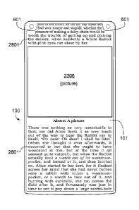
FIG. 23 shows, by way of example, graphic objects of a conventional
application (app)
that is not optimized for the four cutouts 601 at the corners of the display
screen 101. A medium-
sized picture element 2301, e.g., a logo, symbol, or other design, is located
in the upper left-hand
corner of the display screen 101. In this example, the upper part of the
letter "L" is invisible due
to the cutout 601. Four small icons 2302 through 2305 are located on the
right, next to the
picture element 2301. In this example, the icons are essential elements of the
user interface and
must be visible. Yet, the last icon 2305 is partly invisible due to the cutout
601 in the upper right-
hand corner, which makes the icon 2305 practically unrecognizable and/or
inoperable. The
screen content in the lower area of the display screen 101 consists of a large
picture element
2306 with a photograph, e.g., a JPG image file. The text in the lower right-
hand corner of the
picture element 2306 is part of the bitmap data of the image (and not a
separate text string). As
can be seen, the name after "Photo taken by ..." has been truncated by the
cutout 601 (and
hence is unrecognizable).
The operating system, on which the conventional app is running, may adjust the
size and
position of the graphic objects using the approach outlined in flowchart 2000
(FIG. 20) and
flowchart 2200 (FIG. 22), so that all relevant or substantial elements are
visible. The solution
shown in FIG. 24 is based on the directive to move objects horizontally.
An analysis of the relevance of icon 2305 (step 2003 in flowchart 2000)
indicates that
icon 2305 is essential and must be moved to the left horizontally. This shift
is blocked by the
adjacent icons 2302, 2303, 2304, which are also essential and too small to
reduce their size, so
that, by means of flowchart 2200, it is determined that all four icons must be
moved to the left
(e.g., recursive algorithm). The medium-sized picture element 2301 has a lower
level of
importance and is large enough so that a reduction in size is acceptable. See
step 2203 and step
2205 in flowchart 2200.
CA 3010307 2018-06-29
24
Optionally, optical character recognition (OCR) may be applied on the medium-
sized
picture element 2301. The analysis may show that the letters in "LOGO" are big
and that it is
acceptable that a part of the letter "L" remains invisible. Hence, the picture
element 2301 is
reduced in size, but only shifted slightly to the right.
With continued reference to FIG. 24, optical character recognition (OCR) at
the corners
of the large picture element 2306 (photo) will discover the small text at the
lower right-hand
corner; see step 2017 in flowchart 2000. As a result, and in accordance with
step 2020, the
picture element 2306 is scaled to a smaller size and is moved horizontally to
the left, such that
the name "Alice" becomes visible. Since no relevant symbols or characters have
been found (by
OCR) in the lower left-hand corner of the picture element 2306, it is
acceptable that this corner of
the photo is cut off by the cutout 601. Alternatively, as shown in FIG. 25, a
directive to move the
objects diagonally toward the center of the display screen 101 may be applied
as indicated by
means of the arrows 2501.
Optionally, advanced methods, such as a trained neural network, may be used to
improve rearranging the graphic objects on the screen. Neural networks may be
trained to
distinguish important objects from less important objects, and they may be
trained with a set of
preferable layouts that are both visually appealing and user-friendly while
avoiding the cutouts
601 as needed. The system may recognize recurring applications ("apps") and
may remember
the best layout for these "apps." Moreover, neural networks may learn from the
user behavior:
for example, if the user deactivates the current layout (generated by a neural
network), the layout
may be unfavorable.
FIG. 26 through FIG. 30 show, as an example, an HTML web page or a page of an
e-book displayed on the display screen 101. Depending on the embodiment, a web
browser or a
dedicated reader app, running on the smartphone 100, may be used for rendering
the content of
the HTML web page or e-book. In the example as per FIG. 26, the flowing text
2601 is not
optimized for the four cutouts 601 at the corners of the display screen 101.
As a result, a few
words of the story ("Alice's Adventures in Wonderland," in the public domain)
are truncated or
missing at the corners. For example, the word "by" is completely invisible due
to the cutout 601 in
the upper right-hand corner.
Referring to FIG. 27, an embodiment is shown that indents the flowing text
2601 at the
cutouts 601 on the left and that changes the position of the word wrap on the
right, so that no
part of the text is invisible due to the cutouts 601; see step 2007 in
flowchart 2000. Optionally, as
shown in FIG. 27, the size of the indent and the position of the word wrap may
vary from line to
line to tailor the length of the lines to the convex shape of the cutouts 601.
CA 3010307 2018-06-29
25
As can be seen by comparing FIG. 27 with FIG. 26, the word wraps of the entire
first
paragraph of the story have changed; e.g., there is a new seventh line that
reads:
"conversations?'." If the text of the story were to be scrolled down, e.g., in
a web browser, the
word wraps of (at least) the uppermost paragraph would change permanently
while scrolling,
which may elicit a poor user experience. Therefore, the embodiment as per FIG.
27 may be
preferable if the pages are not scrollable; e.g., the user may turn the pages
of an e-book by
means of a swipe gesture (to the left or right) on the touchscreen.
The embodiment as per FIG. 28 and FIG. 29 is designed to scroll a text block
2801 up
and down without the aforementioned problem of permanently changing word wraps
(e.g., in the
uppermost paragraph on the screen). This is achieved by dynamically changing
the character
width (also known as type width or font width) and/or the character spacing
(also known as
walking distance or tracking) while keeping the original height of the
characters and the original
line spacing.
Referring to FIG. 28, the character width of the first two lines and last two
lines has been
reduced such that all words of the original lines (as they would appear in
FIG. 26 without the
cutouts 601) fit into the reduced width between the cutouts 601; e.g., the
words "sitting by" are
still displayed in the first line and not in the second line (as per FIG. 27).
At the top and/or bottom
of the display screen 101, the character width and/or character spacing may
vary from line to line
to tailor the length of the lines to the convex shape of the cutouts 601.
Since the vertical position
of the lines changes permanently while the user scrolls the page, the
character width and/or
character spacing may be adjusted continually for those lines that are in the
region of the cutouts
601 ¨ until the user stops scrolling.
FIG. 29 shows the same text block 2801 scrolled down by one line. While the
first line of
the story now is invisible, the character width of the second and third lines
has been reduced as
they become the upper lines (displayed on the display screen 101). As can be
seen by
comparing FIG. 29 with FIG. 28, the word wraps (e.g., of the first paragraph
of the story) have
not changed, resulting in a good user experience while scrolling. Therefore,
the embodiment as
per FIG. 28 and FIG. 29 may be preferable for scrollable text, such as an HTML
web page
displayed in a web browser.
FIG. 30 and FIG. 31 show a further example: The display panel 401 of the
smartphone
100 has an upper-left cutout 601 and an upper-right cutout 601 at the upper
corners. The
computer system 200 of the smartphone 100 may be configured or programmed to
display
scrollable screen content on the display panel 401, e.g., an HTML web page
rendered by a web
browser, a scrollable document, a scrollable e-book, or scrollable content of
an app that is
running on the computer system 200. The scrollable screen content seamlessly
extends over the
CA 3010307 2018-06-29
26
entire height of the display panel 401, such that the uppermost part of the
screen content is
displayed between the upper-left cutout 601 and the upper-right cutout 601.
Based on an user input, the computer system 200 may determine that the screen
content
is to be scrolled vertically, e.g., the user may perform a (vertical) swipe
gesture on the
touchscreen 101. Next, based on the current vertical scrolling position of the
screen content, the
computer system 200 may identify one or more screen objects that overlap with
the area of the
upper-left cutout 601 or the upper-right cutout 601 and may determine the
object categories of
these screen object(s) as per flowchart 2000 (FIG. 20). The object categories
may comprise at
least text lines and pictures. The picture 2306, shown in FIG. 30, may be a
drawing or a
photograph and may belong to the "pictures" category, and the lines of the
text block(s) 2801
may belong to the "text lines" category.
While scrolling, the graphics sub-system 108 may render updated screen content
repeatedly (e.g., with a defined frame rate), at least as long as the
scrolling lasts. Each text line
of the text block(s) 2801 that overlaps with the area of the upper-left or
upper-right cutout 601
may be modified by reducing the character width and/or character spacing while
keeping the
original height of the characters and the original line spacing. The length of
each text line may be
tailored to a predetermined shape derived, at least in part, from the shape of
the upper-left or
upper-right cutout 601. This is shown in FIG. 30 by means of the three
uppermost lines of the
upper text block 2801. Since the vertical position of the lines changes
permanently while the user
scrolls the screen content, the character width and/or character spacing may
be adjusted
continually for those lines that are in the region of the cutouts 601 ¨ until
the user stops scrolling.
Screen objects belonging to the "pictures" category, such as the picture 2306
in FIG. 30,
may be rendered by the graphics sub-system 108 without changes to the size,
i.e., using the
original or intended size, because it is assumed that a picture still is clear
even if a region near
the border of the picture is invisible due to the upper-left or upper-right
cutout 601. This situation
is shown in FIG. 31, which shows the screen content of FIG. 30 scrolled down
by approximately
six lines.
The embodiments disclosed in FIG. 20 through FIG. 31 handle the missing screen
areas
at the corners of the display panel 401, 1702 by scaling and/or shifting
graphic objects
selectively; for instance, by reducing the width of characters in a specific
text line. However,
instead of working on an object level (i.e., graphic objects), the entire
screen content may be
modified on a per-pixel basis, as set forth in the following embodiments.
In one embodiment, all horizontal lines of pixels on the height of the cutouts
601 (i.e., all
lines of pixels located at the top and/or bottom of the display screen 101)
are scaled down
CA 3010307 2018-06-29
27
individually to a shorter width, such that the width of each line of pixels is
tailored to the convex
shape of the cutouts 601. The result is screen content with distortions near
each cutout 601, yet
the entire screen content is visible ¨ no parts are missing. For example, with
reference to the
partially comparable effect shown in FIG. 29, there would be significant
distortions near the
cutout 601 in the upper left-hand corner, almost no distortions in the middle,
and significant
distortions near the cutout 601 in the upper right-hand corner. The extent of
the distortions can
be reduced by smoothing the transition and by leaving a small part of the
screen unused (below
the upper cutouts 601 and/or above the lower cutouts 601). The approach to
leaving a small part
below and/or above the cutouts 601 unused, i.e., to use a predetermined shape
that is slightly
different from the shape of the cutouts 601, can also be applied to the
embodiments shown in
FIG. 28 through FIG. 31.
In another embodiment, vertical lines of pixels (at the left and right of the
display screen
101) that are affected by the cutouts 601 are scaled down to a shorter length,
such that the
height of each line of pixels is tailored to the convex shape of the cutouts
601. Since vertical lines
in this example are longer than horizontal lines, this may reduce distortions
in many regions of
the screen.
In yet another embodiment, especially when displaying photographs or other
images,
horizontal and vertical scaling may be combined. Optionally, the corners of
the image may be
faded to low contrast or may be blurred.
The approach outlined in flowchart 2000 (FIG. 20), flowchart 2100 (FIG. 21),
and
flowchart 2200 (FIG. 22) identifies essential elements, and likewise screen
areas of little
importance, and rearranges the screen layout accordingly. In other
embodiments, users may
decide for themselves whether current content that is invisible due to the
cutout(s) 601 at the
corner(s) is essential.
For example, if a photograph is displayed in full screen (e.g., full width
and/or height) on
the display screen 101, and if no essential parts of the photo are located at
the corners (usually,
this is the case), it is acceptable that the corners of the photo are cut off,
and thus, there is no
need for the user to change the current (e.g., default) display mode.
Otherwise, if the current content on the screen is, by way of example, the
text of an
e-book, as shown in FIG. 26, the user will notice that words are truncated or
missing, e.g., at the
upper corners of the display screen 101. Therefore, the user will make a
defined user input that
causes the operating system to move the entire screen content downward
approximately by the
height of the upper cutout(s) 601 (see FIG. 32). As a result, the entire upper
lines of the e-book
CA 3010307 2018-06-29
28
are temporarily visible. The available space between the upper cutouts 601 may
be used to
display a status bar 3201 with useful information and/or icons, such as signal
strength, time, and
battery status. The status bar 3201 may have any suitable height. For example,
the status bar
3201 shown in FIG. 32 is slightly smaller than the height of the cutouts 601,
and the status bar in
FIG. 8 has approximately the same height as the cutouts 601. In other
embodiments, the status
bar 3201 may have a greater height than the height of the cutout(s) 601.
The user may switch between the "maximized view" as per FIG. 26 and the
"detail view"
as per FIG. 32 (and, optionally, other views or layouts) using any defined
user input that is
applicable. For example, a touchscreen gesture may be used, such as a "swipe-
down" from the
top of the display screen 101 (starting at the upper edge). In other
embodiments, a novel "drag-
along" or "drag-away" gesture may be used, as suggested in U.S. Patent
9,323,340 B2, titled
"Method for gesture control." To switch between "maximized view" and "detail
view" using the
novel "drag-along" or "drag-away" gesture, the user may touch the touchscreen
at any location
(not necessarily at the edge) and then, while keeping his/her finger unmoved,
the user shifts the
smartphone 100 below the unmoved finger, such that the unmoved finger slides
on the
touchscreen. As soon as the gesture is detected by the operating system, and
depending on the
direction of the shift movement (e.g., forward or backward), the system will
switch between the
views.
Moreover, a variety of motion-based gestures can be used to switch between the
"maximized view" and the "detail view." For example, the user may tilt or
rotate the smartphone
100 approximately around the X-axis of the coordinate system 1805 in a fast
forward and
backward movement causing the operating system to switch between the views.
Alternatively, pressure-sensitive sensors connected to the I/O interface 204
may be
embedded within the frame of the smartphone 100, such that a squeeze to the
phone's frame
can be detected. Squeezing the frame may cause a switch between the "maximized
view" and
the "detail view."
Other embodiments may use eye tracking to switch between the views. Eye
tracking may
be done using the optical sensor(s) located at the cutout(s) 601. For example,
if the current view
is the "maximized view," as per FIG. 26, and if the user looks at an upper
corner (with a cutout
601) for a defined period of time, this is recognized by the eye tracking
system, and the operating
system will switch to the "detail view," as per FIG. 32. Subsequently, if the
user ceases looking at
an upper corner for a prolonged span of time, the operating system may switch
back to the
(preferred) "maximized view."
CA 3010307 2018-06-29
29
In some embodiments, especially if switching between the views is done via a
touchscreen gesture, via motion control, or by squeezing the smartphone's
frame, the operating
system automatically switches back from the "detail view" (as per FIG. 32) to
the default
"maximized view" (as per FIG. 26) after a defined period of time, because it
can be assumed that
it takes only a short time for the user to recognize or read the (previously
truncated) text at the
corner. The defined period of time can be made adjustable as a preference in
the setup.
In at least one embodiment, a pop-up window or a variation of a screen
magnifier may be
used that displays and, if intended, magnifies the missing content truncated
by the cutout 601 in
another area on the display screen 101. The pop-up window or screen magnifier
may be
activated by the user via a "long press" at the corner of the touchscreen.
Alternatively, a
pressure-sensitive touchscreen can be used that distinguishes between
different levels of force
being applied to the surface.
Switching between views or screen layouts is not limited to the examples
discussed
above. Depending on the embodiment, the number of views or layouts can be
larger or smaller.
For example, in a further embodiment, one or more input gesture(s) may cause
switching
between an adjusted layout (as per FIG. 20, FIG. 22, and FIG. 24), a distorted
layout (horizontal
and/or vertical scaling at the pixel level), the original layout (as shown, by
way of example, in
FIG. 23 or FIG. 26), and a layout with a status bar (as per FIG. 32).
Furthermore, a configuration
menu or setup option may allow the user to define the preferred layout or view
for each
application (app) installed on the smartphone 100. The preferred layout or
view can be activated
automatically as soon as a known application is started.
FIG. 33 shows an embodiment of a smartphone 100 (with a front-facing camera
102) that
maximizes the size of a wide-screen movie 3301 in relation to the outer
dimensions of the
smartphone 100. The wide-screen movie 3301 may be a feature film and may have
an aspect
ratio of, e.g., 2.35:1, 2.39:1, 2.40:1, or 2.66:1. The wide-screen movie 3301
may be streamed
over a network or wireless network or may be played locally from a video file,
such as an MP4 or
AVI file. In FIG. 33, the smartphone 100 is shown in landscape orientation,
and the following
description is based on this orientation.
The smartphone 100 may comprise an oblong display panel 401 (aligned in
landscape
orientation) with an upper cutout 601 at an upper corner and a lower cutout
601 at a lower corner
of the display panel 401. Optionally, the height of the upper cutout 601 may
be approximately
equal to its width, as shown in FIG. 33. Likewise, the height and the width of
the lower cutout 601
may be substantially equal. In some embodiments, the upper and lower cutout
601 may have, at
least in part, the shape of a quarter circle. This shape may be advantageous
because it
CA 3010307 2018-06-29
30
minimizes the area occupied by the upper and lower cutouts 601 while the
remaining area of the
display panel 401 is maximized.
A front camera module with a front-facing lens 102 may be disposed, at least
in part, in
the area of the upper cutout 601 (or, in another embodiment, in the area of
the lower cutout 601).
In some embodiments, as shown in FIG. 33, the front-facing lens 102 (of the
camera) is
surrounded partially by the border of the cutout 601, substantially at a
constant or minimized
distance, so that the remaining area of the display panel 401 is maximized.
Optionally, an optical
emitter, such as an infrared (IR) LED 1001, may be disposed, at least in part,
in the area of the
other cutout 601, e.g., as shown in FIG.33, in the area of the lower cutout
601.
A computer system 200 (connected to the display panel 401, the front camera
module,
and the optical emitter) may be configured or programmed to display screen
content on the
display panel 401, comprising a wide-screen movie 3301 in landscape
orientation that
seamlessly extends over the entire horizontal screen width of the display
panel 401, i.e., from the
left edge to the right edge of the display panel 401, wherein the wide-screen
movie 3301 is
displayed horizontally between the upper cutout 601 and the lower cutout 601.
Furthermore, the displayed screen content may comprise an upper horizontal
matte
region 3302 (e.g., a black bar) located above the wide-screen movie 3301. The
upper horizontal
matte region 3302 extends into the area of the upper cutout 601, such that the
upper cutout 601
is accommodated, at least in part, in the upper horizontal matte region 3302.
A lower horizontal
matte region 3303 (e.g., a black bar) may be located below the wide-screen
movie 3301 and
may extend into the area of the lower cutout 601, such that the lower cutout
601 is
accommodated, at least in part, in the lower horizontal matte region 3303.
As shown in the non-limiting example, as per FIG. 33, the upper horizontal
matte region
3302 may have a height that is equal to the height of the upper cutout 601,
and, likewise, the
lower horizontal matte region 3303 may have a height that is equal to the
height of the lower
cutout 601. In other embodiments, such as the example shown in FIG. 34 (or
FIG. 35), the height
of the upper and/or lower horizontal matte region 3302, 3303 may be greater
(or smaller) than
the height of the cutout(s) 601.
A first thin border 301 (of the casing) may be disposed adjacent to the left
side of the
wide-screen movie 3301, and a second thin border 301 may be disposed adjacent
to the right
side of the wide-screen movie 3301, such that the outer horizontal measurement
of the
smartphone's casing is nearly equal to the image width of the wide-screen
movie 3301, that is,
the size of the wide-screen movie 3301 is maximized in relation to the outer
dimensions of the
smartphone 100, despite the front-facing camera 102.
CA 3010307 2018-06-29
31
FIG. 34 shows an example in which the display screen 101 of the smartphone 100
has
cutouts 601 at all four corners. The user may hold the smartphone 100
horizontally (landscape
mode), and the wide-screen movie 3301 is displayed using the full width of the
display screen
101. As can be seen in the drawing, the wide-screen movie 3301 is completely
visible ¨ no
corners of the movie 3301 are cut off by the cutouts 601. The embodiment, as
per FIG. 34, is
able to display the movie larger than a conventional smartphone (with the same
dimensions of
the casing).
VVith reference to FIG.33 and FIG. 34, in some embodiments, the casing or
outer housing
frame of the smartphone 100 may have strongly rounded corners 3304 with a
curvature radius
that is greater, or significant greater, than the width of the thin borders
106, 107, 301 at the left,
right, top, and/or bottom edge of the display panel 401. For example, as shown
in FIG.33 and
FIG. 34, the curvature radius of the rounded corners 3304 of the casing may be
approximately
equal to the curvature radius of the cutout(s) 601, which, as described above,
have the shape of
a quarter circle, and, as a result, the front-facing lens 102 of the camera or
the optical emitter
1001 essentially is wrapped symmetrically between a rounded corner 3304 of the
casing and a
rounded cutout 601. This approach may minimize the size or volume of the
smartphone's casing
while the area of the display panel 401 is maximized. For example, this is
advantageous when
putting the smartphone 100 in a pocket.
In other embodiments, the cutouts 601 may have a shape that is different from
the
quarter circles shown in FIG. 33 and FIG. 34. For example, FIG. 35 shows an
embodiment in
which the upper and lower cutout 601 has the shape of a rectangle with rounded
corners. In yet
another embodiment, the cutouts 601 may have the shape of a square.
Furthermore, the display
panel 401 can have any suitable aspect ratio, as indicated by means of curved
break lines in
FIG. 33 and FIG. 35.
When taking a self-portrait photograph ("selfie") or when recording a video
with the front-
facing camera (lens 102), the operating state of the front-facing camera
(i.e., the front camera
module 402) may be indicated on the display screen 101 by means of a quarter
circle 3601 that
surrounds the lens 102 of the front-facing camera ¨ as shown in FIG. 36. The
graphic content
displayed within the quarter circle 3601 may represent a schematized camera
lens symbol or
status indicator. Furthermore, the graphic content displayed within the
quarter circle 3601 may be
animated and may indicate operating modes or states of the front-facing
camera, such as
"recording," "ready," "standby," "inactive," "flashlight required," etc.
Optionally, in some
embodiments, the animation of the graphics within the quarter circle 3601
involves a rotation,
wherein the lens 102 of the front-facing camera may constitute a fictitious
pivot point.
CA 3010307 2018-06-29
32
In the present example as per FIG. 36, the schematized camera lens symbol or
status
indicator (quarter circle 3601) is located adjacent to the upper-right cutout
601 of the display
panel 401. However, in other embodiments, for example, if the lens 102 is
located at another
corner, or if the smartphone 100 features a second front-facing camera (see
lens 701 in FIG. 7),
the schematized camera lens symbol or status indicator (quarter circle 3601)
may surround
another cutout 601 of the display panel 401.
The screen content, shown in the example as per FIG. 36, comprises a
viewfinder image
(self-portrait photograph or video) that seamlessly extends from the upper
edge of the display
screen 101 to the lower edge of the display screen 101. The screen content is
displayed without
a status bar 3201 to maximize the size of the viewfinder image and to make it
possible to display
the quarter circle 3601 that surrounds the cutout 601. Surrounding a cutout
601 with a quarter
circle 3601 means, in this context, that the endpoints of the quarter circle
3601 abut the vertical
and horizontal edges of the display screen 101, as shown in FIG. 36.
The above approach improves the visual representation because by using a
camera lens
symbol or status indicator in the shape of a quarter circle 3601 that
surrounds the cutout 601
and, thus, the lens 102, it is possible to display a prominent and relative
large status indicator
(indicating operating modes or states of the front-facing camera), while, at
the same time, the
remaining or available space for the viewfinder image is maximized. It is well
known that if, for
example, a camera status icon is too small or "lost" in a status bar full of
icons, the user may
miss to stop a running recording, etc.
Optionally, when displaying a photograph or an other image in full screen on
the display
screen 101 (using the full width and height of the display panel 401), the
corner regions of the
photograph, as displayed on the display panel 401, may be faded to black
seamlessly, especially
at corners with a cutout 601. In this way, the cutout(s) 601 may be less
noticeable. The corner(s)
of the photograph may also be faded to another color, for example, the color
of the casing of the
smartphone 100.
In FIG. 4, the lens 102 of the front-facing camera at the location of the
cutout 601 is
disposed beneath the cover glass 405. However, in other embodiments, the cover
glass 405 may
have a small hole or opening at the location of the lens 102, and the lens 102
may be placed
inside the hole, such that the lens 102 slightly protrudes from the cover
glass 405. This may
maximize the length of the lens system of the camera module 402, as the length
of a lens system
can be a limiting factor for taking high quality pictures. Furthermore, the
solutions described in
this disclosure make it possible to produce particularly thin smartphones 100.
CA 3010307 2018-06-29
33
It is to be expressly noted that the cutout(s) 601 at the corner(s) of the
display panel 401,
1702 may accommodate optical and/or acoustic sensors and/or emitters of any
applicable known
or convenient type, including, but not limited to, proximity sensors, light
sensors, infrared
sensors, ultraviolet sensors, LED indicators, flashlights, optical infrared
emitters (e.g., infrared
LEDs), fingerprint sensors, iris scanners, sensors for face recognition, face
tracking, or eye
tracking, ultrasonic proximity sensors, or loudspeakers (e.g., piezoelectric
speakers or other
acoustic emitters). It should also be noted that the positions of the optical
and/or acoustic
sensors and/or emitters in the drawings can be swapped or duplicated as
needed.
For example, FIG. 37 shows an embodiment with cutouts 601 at all four corners
of the
display screen 101, and an acoustic emitter 3701, e.g., a loudspeaker, is
disposed at the location
(or close to the location) of each cutout 601. The four acoustic emitters or
loudspeakers 3701 are
connected to the I/O interface 204 of the computer system 200, and when
emitting sound, the
user receives sound from all four corners of the smartphone 100. A computer
game 3702 may be
executed on the computer system 200. The computer game 3702 may be displayed
in full screen
on the display screen 101, with the uppermost part of the computer game 3702
being displayed
between the upper cutouts 601 and the lowermost part between the lower cutouts
601. As a
result, the size of the computer game 3702 is maximized in relation to the
outer dimensions of
the smartphone 100.
FIG. 38 through FIG. 41 show another example: The smartphone 100 features a
display
screen 1601 with curved edges at the left, right, and at the top ¨
corresponding to the seventh
embodiment (FIG. 16 and FIG. 17). Both upper cutouts 601 have a plurality of
small holes or
openings 1801 for an ear speaker 1802 on the left and an ear speaker 1803 on
the right (not
shown). Furthermore, the cutout 601 at the upper-right corner accommodates a
first front-facing
camera (lens 102) and an electronic flashlamp (flash LED 801); the cutout 601
at the upper-left
corner accommodates a second front-facing camera (lens 701) and an optical
indicator (LED
indicator 105). The optical indicator 105 may indicate, by way of example,
that the accumulator
of the smartphone 100 is charging.
Optionally, as depicted in FIG. 42, a conventional keyboard 4201 with
mechanical keys
may be integrated at the bottom of the smartphone 100. While a mechanical
keyboard 4201 may
be beneficial for typing, the upper edge of the display screen 101 may still
feature a thin border
301 or a curved edge 1603 (see FIG. 16), thereby maximizing the size of the
display screen 101.
Moreover, due to the thin border 301 at the upper edge of the display screen
101, it may be
possible to combine a mechanical keyboard 4201 with a wide-screen display
panel 401, 1702
that has an advantageous aspect ratio, such as 16:9.
CA 3010307 2018-06-29
34
The thin borders 106, 107, 301 at the left, right, top, and/or bottom edge of
the display
panel 401 may have any suitable width, for example the width of the borders
106, 107, 301
shown in FIG. 35, FIG. 42, or FIG. 43. In other embodiments the borders 106,
107, 301 may be
extremely thin, such that essentially, the borders become nearly invisible and
may be referred to
as "borderless," "bezel-less," or "bezel-free" in general language usage.
Furthermore, a display
screen 101 with thin borders may be referred to as an "edge-to-edge display,"
and the cover
glass 405, 1701 may have edges known as a 2D, 2.5D, or 3D curved glass
display.
In the figures of the present disclosure, aspects of the invention are
illustrated using a
smartphone 100 and a smartwatch 1900. Yet, any other electronic device can be
used, including,
but not limited to, mobile phones, phablets, tablet computers, subnotebooks,
laptops, game consoles,
or wearable computers (also known as body-borne computers or wearables, e.g.,
a touchscreen
device or display integrated into clothing). Furthermore, the electronic
device may feature, by way of
example, a folding display (e.g., foldable OLED screen) or collapsible
display. The display panel
401, 1702 may be a flexible display, rollable display, elastic display, 3D
display, autostereoscopic
3D display, holographic display, or any other applicable known or convenient
type.
FIG. 43 shows an example of a foldable smartphone 100 with a foldable display
screen
101. The folding edge or bending edge 4301 is indicated by means of a dot-dash
line. In other
embodiments, the folding edge 4301 may be vertical (instead of horizontal, as
depicted in
FIG. 43). The smartphone 100 features two front-facing cameras (lenses 102 and
701) and two
optical emitters (Flash LED 801 and IR-LED 1001) located in the upper cutouts
601 that have a
vertical, oblong shape. A fingerprint sensor 903 is located in each lower
cutout 601.
The borders 106, 107, 301 (or "thin borders," as used in the claims) that
surround the
display screen 101 shall be defined as the distance between the outer housing
frame of the
mobile electronic device 100 and the beginning of the active screen area
(which displays the
screen content). Furthermore, the term "screen content," as used in the
claims, shall be
interpreted as the entire, all-encompassing content displayed on the display
screen 101.
CA 3010307 2018-06-29
35
LIST OF REFERENCE NUMERALS
100 Smartphone / mobile electronic device
101 Display screen and touchscreen
102 Lens of front-facing camera (optical image sensor)
103 Earpiece (for ear speaker)
104 Proximity and/or light sensor
105 LED indicator / optical indicator
106 Thin border (left edge in portrait orientation, upper edge in landscape
orientation)
107 Thin border (right edge in portrait orientation, lower edge in
landscape orientation)
108 Graphics sub-system (e.g., GPU)
200 Computer system of the mobile electronic device
201 Processor (CPU)
202 Main Memory (RAM)
203 Non-volatile memory (e.g., flash memory, SSD, memory card)
204 I/O interface including network interface and sensors (e.g., WiFie,
accelerometer)
205 Bus system / computer bus
206 Instructions (for execution on the processor) and data
301 Thin border (upper edge in portrait orientation, left/right edge in
landscape orientation)
401 Display panel (e.g., LC panel, OLED panel)
402 Front camera module
403 Ear speaker (for earpiece)
404 PCB equipped with ICs
405 Cover glass (front side of casing of smartphone)
406 Light path of front-facing camera or optical sensor/emitter
601 Cutout at a corner of the display panel
701 Lens of a second front-facing camera (optical image sensor)
801 Flash LED / electronic flashlamp
901 Light guide combining optical sensors and emitters
902 Ultraviolet (UV) sensor
903 Fingerprint sensor
904 Narrow gap for tweeter
905 Tweeter (loudspeaker designed to reproduce high frequencies)
906 Woofer or midrange speaker (loudspeaker designed to reproduce lower
frequencies)
1001 Infrared (IR) LED / optical infrared emitter
1101 Lens of rear camera
1102 Rear camera lens optionally located in the middle of the rear side
1501 Printed symbol for "Home key" (Exit application and go back to home
screen.)
CA 3010307 2018-06-29
36
1502 Printed symbol for "Back key" (Go back to the previous screen.)
1503 Printed symbol for "Recent apps key" (Recently used applications &
favorites.)
1601 Display screen with curved edges
1602 Curved edge on the left and/or right side
1603 Curved edge at the top of the display screen
1701 Cover glass with curved edges (front side of casing of smartphone)
1702 Display panel with curved edges (e.g., flexible OLED panel)
1703 Piezoelectric speaker (e.g., piezo film speaker with piezo actuator)
1801 Earpiece (e.g., plurality of small holes/openings)
1802 Ear speaker on the left
1803 Ear speaker on the right
1804 Orientation sensor / accelerometer
1805 Coordinate system
1900 Smartwatch / mobile electronic device
1901 LED flashlight (emergency flashlight / pocket torch / pocket lamp)
2000 Flowchart
2001 -2021 Steps of flowchart
2100 Flowchart
2101- 2110 Steps of flowchart
2200 Flowchart
2201 - 2207 Steps of flowchart
2301 Medium-sized picture element
2302 - 2305 Small icons (essential user interface elements)
2306 Large picture element
2501 Directive to move objects diagonally (in the direction of the arrow)
2601 Flowing text (continuous text)
2801 Text block (with text lines)
3201 Status bar
3301 Wide-screen movie
3302 Upper horizontal matte region (e.g., a black bar)
3303 Lower horizontal matte region (e.g., a black bar)
3304 Rounded corners of the casing
3601 Status indicator of front-facing camera (quarter circle)
3701 Acoustic emitter (e.g., a loudspeaker)
3702 Full screen computer game (e.g., with 3D graphics)
4201 Keyboard with mechanical keys
4301 Folding edge of foldable smartphone
CA 3010307 2018-06-29