Note: Descriptions are shown in the official language in which they were submitted.
WO 2015/153039 PCT/US2015/018475
Systems and Methods for Ranking Data Visualizations
TECHNICAL FIELD
[0001] The disclosed implementations relate generally to data
visualizations and more
specifically to ranking alternative data visualizations based on a set of data
fields.
BACKGROUND
[0002] Data visualizations are an effective way to communicate data.
Information
visualization uses visual representations of data to aid in human
understanding of relationships and
patterns in the data. With the proliferation of "big data" there is increasing
demand for data analysts
familiar with visual analytics, but there is a short supply of such
individuals and tools. Making the
tools easier to use would enable a larger number of people to take charge of
their data questions
and produce insightful visual charts.
[0003] Some data visualization systems include tools to assist people in
the creation of
data visualizations, and some systems even make suggestions based on the data
types of selected
fields. For example, if two quantitative fields are selected, a scatter plot
may be recommended.
Examples of such systems are described in U.S. Patent No. 8,099,674, entitled
"Computer Systems
and Methods for Automatically Viewing Multidimensional Databases".
[0004] Some data visualization systems automatically generate marks in a
data
visualization to represent one or more data fields from a data source. For
example, some techniques
are described in U.S. Patent Application No. 12/214,818, entitled "Methods and
Systems of
Automatically Generating Marks in a Graphical View,".
SUMMARY
[0005] Disclosed implementations provide a recommendation engine for data
visualizations. The systems take a set of data fields selected by a user and
intelligently suggest
good visual representations to further the user's analysis. Implementations
identify a set of possible
data visualizations based on the selected data fields, then rank the
identified data visualizations.
Some implementations rank data visualizations based on visual aspects of
presenting the
underlying data values (e.g., clustering, outliers, and image aspect ratio).
Date Recue/Date Received 2022-06-15
WO 2015/153039 PCT/US2015/018475
[0006] With a very large number of potential data visualizations, a good
system must
present the "better" alteinatives first. For example, there may be 10,000 or
more alternative
data visualizations for a selected set of data fields. It would not be much
help to a user if the
10,000 options were listed in a random or arbitrary order. Some
implementations rank the
alternative data visualizations in a two part process. First, for each view
type (e.g., bar chart,
line chart, scatter plot, etc.) the ranking system ranks the alternatives
within that view type
(e.g., rank all of the alternative bar charts against each other). Second, the
system merges the
rankings into a single overall ranking.
[0007] Disclosed implementations typically use multiple criteria for
ranking. Some
criteria measure statistical structure in the data (e.g., visual patterns in a
visualization such as
outliers or clusters). Some criteria measure the similarity of a potential
data visualization to
previous data visualizations selected by a user (e.g., comparing the level of
detail, the x-axis
and y-axis for layout of the data, and other visual encodings, such as size or
color). Previous
selections may be from the same user who is preparing a data visualization
now, or from a
different user or set of users. Some criteria measure the aesthetic qualities
(e.g., aspect ratio)
of a potential data visualization. Some criteria use user preferences (e.g., a
preference for
certain view types or encodings within a view type). Some criteria use
aggregate preferences
based on the history of multiple users (either for the specific data fields
currently selected or
more generally). By combining these criteria, the ranking correlates with
effectiveness at
representing structures in the data and delivering insight to the user.
Implementations assign
weights to each of the criteria, and typically update the weights based on
continued feedback
from users (e.g., by comparing the data visualizations selected to the
calculated rankings).
[0008] Disclosed implementations assist users in the cycle of visual
analysis. The
cycle typically proceeds by selecting a set of data fields, visually
representing those data
fields in some way, noticing results from the visual representation, and
asking follow-up
questions. The follow-up questions often lead to more data visualizations,
which may drill
down, drill up, filter the data, bring in additional data fields, or just view
the data in a
different way. Creating views of the data can be a slow task, particularly
when a user is not
familiar with the visual analytic tool or when the task is not clear. For
example, it may not be
clear to a user what view type to create, what level of detail to select for
the data, or what
aesthetics would be useful. Disclosed implementations speed up the user's
journey to insight
by identifying good, analytically useful views of the user selected data
fields and presenting
those views in ranked order.
2
Date Recue/Date Received 2021-03-29
WO 2015/153039 PCT/US2015/018475
[0009] Providing a ranked list of meaningful views of selected data has
two main
phases. First, a system must identify a set of possible views for the selected
set of data fields.
This is sometimes referred to as the "generation" phase. Second, the system
ranks each of the
possible views. This is sometimes referred to as the "evaluation" phase.
[0010] Implementations use various criteria in the evaluation phase. For
example,
some criteria quantify the extent to which a possible data visualization
displays some
"interesting" structure or pattern that exists in the data. Some interesting
structures relate to
statistical properties of the selected data fields or relationships between
the selected data
fields. A particular visual representation is ranked higher when such
structures or patterns
are visually identifiable. Some criteria apply information visualization best
practices to
present the data in an aesthetically pleasing and clear manner. As described
in more detail
below, these criteria and others are applied together to evaluate visual
representations for the
selected set of data fields.
[0011] Some criteria depend heavily on the view type of each data
visualization
because different view types have different strengths. For example, different
view types are
better able to represent different types of data, different view types are
able to aesthetically
represent different amounts of data, and different view types facilitate
various analytic tasks.
Because of this, some implementations divide the evaluation into two parts:
rank the possible
data visualizations within each view type, then combine the ranked lists of
views of different
types together to provide a diverse list of analytically useful views of the
selected data fields.
[0012] A simple example illustrates typical processes. Consider a set of
quantitative
data with a geographic component that may be visualized as a text table, a bar
chart, or a
map. The map is the best at highlighting the geographical distribution, so it
is ranked first.
The bar chart works well to showcase the overall trend of the quantitative
variable and to
make more precise relative comparisons of values encoded as bar lengths, so it
is ranked
next. A text table has the densest display and is good for looking up precise
details, but is
ranked last. Of course the ranking could be different based on other criteria,
such as a user
preference to see data in text tables. One of the advantages of some
implementations is
providing a unified way to combine various criteria, which can result in
different rankings
depending on the user, the user's history, historical usage of the data set,
current selections by
the user, and so on.
3
Date Recue/Date Received 2021-03-29
WO 2015/153039 PCT/US2015/018475
[0013] In some implementations, the list of meaningful views presented to
the user
includes views with modified sets of data fields (i.e., the set of data fields
is not exactly the
set of data fields the user selected). For example, views may include
additional data fields,
fewer data fields, or replace a selected data field with another data field.
In addition, some
implementations add or modify filters of the data (e.g., sales data filtered
to 2015 may
provide more useful information if sales data for 2014 were included as well).
Some
implementations include these additional views in the same ranked list that
includes the
views that use exactly the data fields selected by the user. Other
implementations place these
"complementary" views in a separate ranked list.
[0014] When all of the views are presented together, some implementations
include
criteria for how to interleave the data visualizations. For example, some
implementations
include a weighting factor based on whether a data visualization uses exactly
the data fields
selected by the user. For example, a ranking score may be decreased by each
modification to
the user-selected set of data fields. Note that a really good data
visualization based on a
modified set of fields may be ranked higher than some average data
visualizations that use
the exact set of user selected fields.
[0015] In accordance with some implementations, a method executes at a
computing
device with one or more processors and memory to identify and rank a set of
potential data
visualizations. The method receives user selection of a set of data fields
from a set of data
and identifies a plurality of data visualizations based on the plurality of
user-selected data
fields. For each of the plurality of data visualizations, a score is computed
based on a set of
ranking criteria. A first ranking criterion of the set of ranking criteria is
based on values of
one or more of the user-selected data fields in the set of data. A first
ranked list of the
identified data visualizations is created, which is ordered according to the
computed scores of
the data visualizations. In some implementations, the first ranked list is
presented to the user.
[0016] In accordance with some implementations, a method executes at a
computing
device with one or more processors and memory to identify and rank a set of
potential data
visualizations. A user selects a plurality of data fields from a set of data,
and the device
identifies a plurality of data visualizations that use a majority of the user-
selected data fields.
For each of the plurality of data visualizations, the device computes a score
based on a set of
ranking criteria. A first ranking criterion of the set of ranking criteria is
based on values of
one or more of the user-selected data fields in the set of data. The device
creates a first
4
Date Recue/Date Received 2021-03-29
WO 2015/153039 PCT/US2015/018475
ranked list of the data visualizations, where the items in the list are
ordered according to the
computed scores of the data visualizations. In some implementations, the first
ranked list is
presented to the user. In some implementations, the user selects from the
first ranked list and
the computing device displays a data visualization corresponding to the user
selection.
[0017] In accordance with some implementations, a method executes at a
computing
device with one or more processors and memory to identify and rank a set of
potential data
visualizations. A user selects a set of data fields from a set of data, and
the device identifies a
plurality of data visualizations that use each data field in the user-selected
set of data fields.
In addition, the device identifies a plurality of alternative data
visualizations. Each alternative
data visualization uses each data field in a respective modified set of data
fields. Each
respective modified set differs from the user-selected set by a limited
sequence of atomic
operations (e.g., at most two). Too many changes would lead to an exponential
increase in
the number of options to evaluate, and those options would deviate further
from what the user
requested. Examples of atomic operations include: adding a single data field
that was not
selected by the user; or removing one of the user selected data fields. For
each of the data
visualizations and each of the alternative data visualizations, the device
computes a score
based on a set of ranking criteria. At least one criterion used to compute
each score uses
values of one or more of the data fields in the set of data (e.g., one of the
data fields on which
an alternative data visualization is based). Finally, a subset of the highest
scoring data
visualizations and alternative data visualizations is presented to the user.
[0018] In some implementations, the first ranking criterion scores each
respective
data visualization according to visual structure of values of one or more of
the user-selected
data fields as rendered in the respective data visualization. In some
implementations, the
visual structure includes clustering of data points. In some implementations,
the visual
structure includes the presence of outliers. In some implementations, the
visual structure
includes monotonicity of rendered data points (i.e., monotonically increasing,
monotonically
non-decreasing, monotonically decreasing, or monotonically non-increasing). In
some
implementations, the visual structure includes striation of a data field,
wherein each
respective value of the data field is substantially a respective integer
multiple of a single base
value.
[0019] In some implementations, the first ranking criterion scores each
respective
data visualization according to one or more aesthetic qualities of the
respective data
Date Recue/Date Received 2021-03-29
WO 2015/153039 PCT/US2015/018475
visualization as rendered using values of one or more of the user-selected
fields. In some
implementations, the aesthetic qualities include the aspect ratio of the
rendered data
visualizations. In some implementations, the aesthetic qualities include
measuring an extent
to which entire rendered data visualizations can be displayed on a user screen
at one time in a
human readable format.
[0020] In some implementations, the first ranking criterion scores each
respective
data visualization according to visual cncodings of one or more of the user-
selected data
fields. In some implementations, visual encoding of a user-selected data field
comprises
assigning a size, shape, or color to visual marks according to values of the
user-selected data
field.
[0021] In some implementations, each of the data visualizations has a
unique view
type that specifies how it is rendered. In some implementations, each of the
data
visualizations has a view type selected from the group consisting of text
table, bar chart,
scatter plot, line graph, and map. In some implementations, the first ranking
criterion scores
each respective data visualization according to the view type of the
respective data
visualization and the user-selected data fields. In some implementations, the
set of ranking
criteria is hierarchical, comprising a first set of criteria that ranks view
types based on the
user-selected data fields, and a respective view-specific set of criteria that
ranks individual
data visualizations for the respective view type based on the user-selected
fields.
[0022] In some implementations, the method further includes identifying a
plurality
of alternative data visualizations based on one or more modifications to the
set of user
selected data fields, and for each of the plurality of alternative data
visualizations, computing
a score based on the set of ranking criteria. In some implementations, the
first ranked list
includes the plurality of data visualizations and the plurality of alternative
data visualization,
and the first ranked list is ordered according to the computed scores of the
data visualizations
and the computed scores of the alternative data visualizations. In some
implementations, the
method further includes creating a second ranked list of the alternative data
visualizations,
where the second ranked list is ordered according to the computed scores of
the alternative
data visualizations. The first and second ranked lists are presented to the
user. In some
implementations, the modifications include adding one or more additional data
fields to the
set of data fields. In some implementations, the modifications include
removing one or more
data fields from the set of data fields. In some implementations, the
modifications include
6
Date Recue/Date Received 2021-03-29
WO 2015/153039 PCT/US2015/018475
replacing a first user selected data field with a different data field that is
hierarchically
narrower than the first user selected data field. In some implementations, the
modifications
include replacing a first user selected data field with a different data field
that is
hierarchically broader than the first user selected data field. In some
implementations, the
modifications include applying a filter to the user selected data fields,
wherein the filter was
not selected by the user. In some implementations, the modifications include
modifying a
user selected filter.
[0023] In accordance with some implementations, a method executes at a
computing
device with one or more processors and memory to generate and rank a set of
potential data
visualizations. The method receives user selection of a set of data fields
from a set of data
and generates a plurality of data visualization options. Each data
visualization option
associates each of the user-selected data fields with a respective predefined
visual
specification feature. For each of the generated data visualization options,
the computing
device calculates a score based on a set of ranking criteria. A first ranking
criterion of the set
of ranking criteria is based on values of one or more of the user-selected
data fields in the set
of data. The computing device creates a ranked list of the data visualization
options, where
the ranked list is ordered according to the computed scores of the data
visualization options.
The data visualization options in the ranked list are presenting to the user.
In some instances,
the user makes a selection from the ranked list, and the computing device
displays a data
visualization on the computing device corresponding to the user selection.
[00241 In some implementations, the computation of scores for one or more
of the
data visualizations uses historical data of data visualizations previously
created for the set of
data. For example, the historical usage of the set of data may favor certain
types of data
visualizations or certain types of encodings. For example, an organi7ation may
use a specific
color encoding for divisions or departments. As another example, users of the
data set may
prefer stacked bar charts. Historical usage data can identify features that
are preferred by
users of the data, as well as those features disfavored (e.g., if a certain
numeric field has
never been used for a size encoding, then it would probably not make a good
recommendation). Historical information about usage can be particularly
valuable when the
usage is unusual for the set of data. Historical usage information can also be
applied at a
more abstract level, and creates "best practice" heuristics when historical
usage information
is not available for a specific data source.
7
Date Recue/Date Received 2021-03-29
WO 2015/153039 PCT/US2015/018475
[0025] In addition to historical data about how a particular data set has
been used,
some implementations use historical information about the data visualizations
a specific user
has selected. For example, if a certain user has favored line graphs for
visualizations based
on various data sources, then line graphs would be more highly recommended
when
appropriate. As another example, another user may consistently use color
encodings, and
thus use of color is a good suggestion. On the other hand, for a user who
never (or rarely)
uses color encodings, a color encoded data visualization would not be a good
recommendation. Historical data can also identify preferences for certain data
visualization
variants. For example, a user may consistently create bar charts with
horizontal bars, and
thus when bar charts are ranked, horizontal bars would be ranked higher. The
historical data
used in the ranking of potential new data visualization can come from various
sources. First
there is historical data of data visualizations previously selected by the
user. Second, there is
historical data showing how a user ranked or compared previous data
visualizations. For
example, suppose the ranking system previously presented a user with a set of
data
visualization options for a data source. When the user selects a specific
option, the user has
implicitly ranked that option higher than the other options that were
presented. Some
implementations seek specific ranking feedback, particularly for new users.
For example, if
five data visualization options are presented, ask the user to rank them from
1 to 5. Whether
ranking information is collected explicitly or implicitly, it can be used in
future ranking
calculations. In some implementations, a user's data visualization history is
included in a
user profile or set of user preferences. In some implementations, user
preferences can be
identified either through historical usage, from explicitly user selection, or
both. In
particular, a user can specify which types of data visualization or features
are preferred or
disfavored. Subsequent ranking can user the preferences to compute scores for
one or more
of the data visualizations.
[0026] In some implementations, the method further includes receiving
user selection
of a filter that applies to a first user selected data field, where the filter
identifies a set of
values for the data field and the data visualizations are based on limiting
values of the data
field to the set of values. In some implementations, the set of values is a
finite set of discrete
values. In some implementations, the set of values is an interval of numeric
values.
[0027] In some implementations, a first data visualization of the data
visualizations
applies a filter to a user selected data field, thereby limiting the values of
the user selected
data field to a first set of values, where the filter is not selected by the
user.
8
Date Recue/Date Received 2021-03-29
WO 2015/153039 PCT/US2015/018475
[0028] In some implementations, the method further includes receiving
user
specification of one or more visual layout properties for layout of a data
visualization that
includes the user selected data fields, where the set of ranking criteria
includes a second
ranking criterion that measures an extent to which a data visualization of the
plurality of data
visualizations is consistent with the user specified visual layout properties.
[0029] In some implementations, the method further includes receiving
user
specification of a single view type and the plurality of data visualizations
are identified
according to the user specified single view type.
BRIEF DESCRIPTION OF THE DRAWINGS
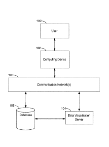
[0030] Figure 1 illustrates a context for a data visualization ranking
process in
accordance with some implementations.
[0031] Figure 2 is a block diagram of a computing device in accordance
with some
implementations.
[0032] Figure 3 is a block diagram of a data visualization server in
accordance with
some implementations.
[0033] Figure 4 illustrates the overall process flow for identifying and
ranking data
visualizations in accordance with some implementations.
[0034] Figure 5 illustrates a process flow for ranking data
visualizations in
accordance with some implementations.
[0035] Figures 6A and 6B illustrates various ways that a user-selected
set of data
fields may be modified in order to expand the set of possible data
visualizations.
[0036] Figures 7A and 7B illustrate two alternative data visualizations
that have
different aspect ratios.
[0037] Figures 8A and 8B illustrate two alternative bar graphs with
different aesthetic
properties.
[0038] Figures 9A, 9B, and 9C illustrate three scatter plots using
various
combinations of two numeric variables.
[0039] Figures 10A and 10B illustrate two maps that encode data in
different ways.
[0040] Figures 11A and 11B illustrate clustering and outliers in scatter
plot diagrams.
9
Date Recue/Date Received 2021-03-29
WO 2015/153039 PCT/US2015/018475
[0041] Figures 12A and 12B illustrate some structural patterns in line
charts.
[0042] Figure 13 illustrates a screen showing a ranked list of data
visualizations in
accordance with some implementations.
[0043] Figure 14 illustrates a data visualization history log in
accordance with some
implementations.
[0044] Figure 15 illustrates a data visualization ranking log in
accordance with some
implementations.
[0045] Figures 16A and 16B illustrate how quantitative data fields can be
rearranged
in accordance with some implementations.
[0046] Figures 17A ¨ 17C provide a flowchart of a process, performed at a
computing
device, for generating and ranking data visualizations in accordance with some
implementations.
[0047] Figures 18A ¨ 18D provide a flowchart of another process,
performed at a
computing device, for generating and ranking data visualizations in accordance
with some
implementations. Some implementations combine the process in Figures 18A ¨ 18D
with the
process in Figures 17A ¨ 17C.
[0048] Figures 19A ¨ 191) provide a flowchart of another process,
performed at a
computing device, for generating and ranking data visualizations in accordance
with some
implementations. Some implementations combine the process in Figures 19A ¨ 19D
with the
processes in Figures 17A ¨ 17C and/ or 18A ¨ 18D.
[0049] Like reference numerals refer to corresponding parts throughout
the drawings.
[0050] Reference will now be made in detail to implementations, examples
of which
are illustrated in the accompanying drawings. In the following detailed
description,
numerous specific details are set forth in order to provide a thorough
understanding of the
present invention. However, it will be apparent to one of ordinary skill in
the art that the
present invention may be practiced without these specific details.
DESCRIPTION OF IMPLEMENTATIONS
[0051] Implementations of a data visualization ranking system typically
have two
phases. In the first phase ("generation"), the system constructs instances of
view types that
are appropriate visual representations for the selected set of data fields. in
some
Date Recue/Date Received 2021-03-29
WO 2015/153039 PCT/US2015/018475
implementations, alternative modified sets of data fields are used to build
supplemental views
(e.g., a superset or subset of the user-selected data fields). In the
second phase
("evaluation"), the system ranks the data visualizations so that a smaller
number of the best
options are presented to the user. Presenting alternative views of data to
analytic users
facilitates their data exploration and increases the likelihood that they find
relevant, useful
views that help answer their data questions more quickly or effectively than
constructing
alternative data visualizations manually.
[0052] The
generation phase typically follows one of three paths: (1) generate all
possible views based on the selected set of data fields; (2) generate all
possible views, then
cull to a smaller set using a simplified evaluation process; or (3) generate a
set of
"representative" good views. Using all views may better guarantee finding the
best option,
but the cost of evaluating all options is typically too high based on the
computing devices that
are widely available.
[0053] For
large data sets, some implementations have a two phase approach. In the
first phase, identify a sample of the data from the data source (e.g., 5% or
10% of the rows),
and proceed to identify a set of good data visualizations based on the sample.
In the second
phase, the full set of data is used, but the data visualization options are
limited to the ones that
scored sufficiently high in the first phase. One skilled in the art recognizes
that there are
various ways to select the sample data, such as a random sample, the first n
rows for some
positive integer n, or every nth row for some positive integer n.
[0054] When all
possible visual representations of the selected set of data fields are
evaluated, there is an exponential number of options for mapping each of the
data fields to
visual encodings. In addition, some of the encodings can accept multiple data
fields (e.g., the
data fields used to define the X-position and Y-position of graphical marks in
the display), so
there are additional permutations of the data fields for these encodings
(e.g., the order of
fields used to specify the X-position or Y-position of graphical marks). Each
permutation
produces a different data visualization based on the ordering of data fields.
In some
implementations, the complete set is generated, then subsequently culled.
Because only the
top options will be presented to the user, many data visualization options can
be culled with
only limited analysis. For example, a quantitative field with a negative value
would not be
appropriate for size encoding, so that feature is excluded. Similarly, the
cardinality of an
ordinal field influences how it can be used effectively, as described in
examples below. For
11
Date Recue/Date Received 2021-03-29
WO 2015/153039 PCT/US2015/018475
example, if the cardinality is too large, then it would not be a good choice
for color encoding
or as an innermost field that defines the X-positions and Y-positions of
graphical marks.
[0055] Some implementations generate a limited set of good visual
representations of
the data fields to significantly reduce the number of possible data
visualizations evaluated. In
some implementations, this uses mapping rules based on data type semantics and
effectiveness of certain visual encodings to identify appropriate view type
representations.
For example, a certain set of data fields may be best represented as a map
chart or scatter plot
diagram, so only these two view types are pursued (e.g., excluding bar charts,
line charts, and
text tables). Subsequently, specific instances of each selected view type are
identified,
typically by applying information visualization best practices.
[0056] A brute force generation process iterates over all possible
mappings of the
selected set of data fields onto all visual encodings (e.g., X-position, Y-
position, color, size,
shape, and level of detail). If there are in visual encodings and k selected
data fields, there are
ink such mappings. As noted above, some encodings can handle multiple data
fields and
produce different visual representations based on the order, so the actual
number is higher
than mk. For example, the X-position can represent multiple fields (e.g.,
"dimensions") where
the order of the data fields determines the nesting order of panes or
partitions in the view.
This large set of alternatives can be culled to produce a set of
visualizations that represent
best practices in information visualization and perception. Some of these best
practices
include applying principles of effectiveness in visual representation that
favor mapping data
fields of certain types to certain encodings. This process can eliminate some
bad visual
representations quickly. For example, a line chart without a temporal
dimension is typically
not useful. Another best practice that produces good views is to use low
cardinality
categorical dimensions for color and shape encodings because a user can easily
distinguish a
small number of different sizes or shapes. A "categorical" data field is a
data field with a
limited number of distinct values, which categorize the data. For example, a
"gender" data
field is a categorical data field that may be limited to the two values
"Female" and "Male" or
"F" and
[0057] Some implementations use a constrained generation algorithm. These
implementations use information visualization effectiveness principles that
determine the set
of view types that create appropriate visual representations of a particular
set of data fields.
Once specific view types are selected, good instances of each applicable view
type are
12
Date Recue/Date Received 2021-03-29
WO 2015/153039 PCT/US2015/018475
created. Applying a set of rules (e.g., codifying best practices in
information visualization
and graphic design), the system maps the data fields to visual encodings. This
constrains the
set of alternatives within each view type. For example, categorical data
fields with small
cardinality may be mapped to color or shape encodings.
[0058] Within a single view type, alternative data visualization
instances are
generated in several ways. In some instances, alternative views are generated
by changing
the order of data fields that define the X-positions and Y-positions of
graphical marks, which
affects not just the axes but also the level of breakdown in the creation of
text tables and
small multiples. In some instances, alternative views are generated by trying
all good choices
for color, shape, and size encodings. In some instances, alternative views are
generated as
view type variants (e.g., filled maps vs. symbol maps; bar charts that are
stacked, horizontal,
or vertical; etc.).
[0059] The disclosed ranking techniques can be applied regardless of how
the
possible data visualization are identified. In addition, some implementations
use some
ranking techniques in the generation phase (e.g., using a subset of the
techniques that can be
applied quickly to reduce the number of alternative data visualizations that
proceed to the full
evaluation phase). Some ranking systems implement a "progressive" or
"hierarchical"
process with multiple passes to triage the data visualization options
piecemeal. In a
progressive ranking process, a very high percentage of the options are
eliminated in a first
level cull based on simple criteria that can be applied quickly. Each
subsequent culling uses
more detailed information to identify the options that will progress to the
next level. Some
implementations have several progressive culling steps before the complete
ranking is
applied to a small subset of the originally identified options. In a
progressive process, some
implementations compute partial ranking of data at each level, and retain the
partial ranking
information for use on subsequent levels.
[0060] Disclosed ranking methods evaluate the collection of views based
on the sets
of data fields selected (either the set of data fields selected by the user,
or a modified set of
data fields, such as a reduced or expanded set). The views are scored based on
a combination
of factors. The factors include appropriateness to the data types. For
example, if the set of
data includes a geographic component, then a map view of the data is weighted
more highly.
The factors also include the visual structure presented by the view. For
example, when there
are multiple possible scatter plot views of the data, the one with a visual
pattern such as
13
Date Recue/Date Received 2021-03-29
WO 2015/153039 PCT/US2015/018475
clustering or correlation is weighted more highly. Techniques to identify
visual patterns are
described in more detail below, including in regard to Figures 9A ¨ 9C, 11A,
and 11B. The
factors also include the aesthetics of the visual layout. For example, data
visualizations that
fit entirely within the display or avoid overlapping labels are preferred.
This is described in
more detail below, including with regard to Figures 7A, 7B, 8A, and 8B. In
addition, the
factors include similarity to the user's previously created data
visualizations. For example,
what types of data visualizations has the user selected, in what contexts are
those
visualizations selected, what types of encodings (such as color, size, or
shape) does the user
prefer, and so on. The factors also include relevant user preferences, and in
some
implementations the aggregated preferences of one or more groups (e.g., the
group of people
working in the finance department in an organization, or the group of all
users).
[0061] In some implementations, the ranking proceeds as a single step. In
other
implementations, each possible data visualization is first ranked within its
view type (e.g., for
the view type "bar chart," all of the bar charts are ranked against each
other, whereas all
scatter plot diagrams would be ranked against each other within the "scatter
plot" view type).
The views within each view type are ranked using criteria based on the
properties of the view
type, the selected data fields, and user properties (e.g., user history, user
preferences, or
aggregated history of multiple users). Finally, the system combines the ranked
lists of view
instances of different view types, applying criteria about the relative value
of chart types for
the data types in the user-selected set. For example, if the user-selected set
of data fields
includes a temporal field along with a quantitative field, a line chart is
probably more useful
than a text table view. A line chart is better at visualizing trends,
clusters, and anomalies over
time. In some implementations, the views exhibiting best practices and a
notion of diversity
of views are at the top.
[0062] The identified (or "generated") data views are scored in the
evaluation phase
using a variety of weighted criteria. One skilled in the art recognizes that
the weighting of
criteria can change over time based on feedback from users (explicit or
implicit), the addition
of new criteria, and so on. Further, the criteria identified herein are not
intended to be
exhaustive, and one of skill in the art recognizes that other similar criteria
may be used. The
criteria for evaluating identified data visualizations include statistical
properties in the data
that can be seen as visual patterns in the view (e.g., clumping, outliers,
correlation, or
monotonic graphs). The criteria for evaluating data visualizations also
include aesthetic
properties of the visual layout of the view. Of course only quantifiable
aesthetic qualities are
14
Date Recue/Date Received 2021-03-29
WO 2015/153039 PCT/US2015/018475
included in the evaluation process (e.g., aspect ratio). In addition, other
user-specific criteria
may be used. For example, a user may indicate a preference for certain types
of encoding
(e.g., a CFO may prefer to use specific color encodings for each of the
company's four sales
regions). In addition, if a user has previously worked with the same (or a
similar) data set,
the history of the previous data visualizations may indicate preferences.
Prior usage of the
same or similar data set is particularly relevant when the user selects some
of the same data
fields from the data set.
[0063] Disclosed ranking methods combine a number of ranking criteria
based on
aspects unique to each data visualization type. Some ranking systems implement
a separate
scoring function for each view type, with the scoring function tailored to the
particular data
characteristics that are visible. Below are five examples of view types and
some simple use
cases for each of these view types. Based on these examples, sample scoring
functions are
described that capture important aspects of the visualizations.
[0064] There are also some criteria that are generally applicable across
all (or almost
all) view types. Large charts are ineffective for visual data analysis when
they require scroll
bars to fit on a display device. Some implementations partially address this
problem using
automatic scaling, but scaling has limits (e.g., the text that is displayed
cannot get too small).
When only a portion of a visualization is visible, it takes longer for a user
to search and find
points of interest, to make visual comparisons, or to answer questions.
Indeed, without a
complete view, some of the benefits of a data visualization arc lost. in
addition, accuracy
suffers because the user has to keep track of virtual reference points during
scrolling actions
that shift the viewport of analysis. Therefore, views that are larger than the
canvas size are
penalized. Some implementations also distinguish between horizontal scroll
bars versus
vertical scroll bars when they are necessary. Scrolling vertically is more
comfortable for
many users than scrolling horizontally, so some implementations penalize
vertical scroll bars
less than horizontal scroll bars.
[0065] Also, when a user has created a view explicitly, selecting a
particular view
type or encoding of certain data fields, the ranking process favors views that
closely adhere to
the user's original selections. For example, if the user has already selected
a view type, then
the selected view type has a preferential ranking. In addition, when the user
has selected
some visual encodings (e.g., color is used to represent different sales
regions), there is a
preference to retain those encodings.
Date Recue/Date Received 2021-03-29
WO 2015/153039 PCT/US2015/018475
Text Tables
[0066] Text
tables are commonly used to view numeric values as text with high levels
of precision. Two kinds of text tables are commonly constructed. One kind of
text table
displays details of each record or item on a single row. This is standard
practice for
accounting purposes and is the format used in typical spreadsheet programs.
Each of the data
dimensions is placed in a column, resulting in a table whose length is based
on the number of
items in the dataset and whose width is based on the number of dimensions in
the data set.
Within that format, the only variation is how the dimensions are ordered.
[0067] A second
kind of text table is a crosstab, which summarizes categorical data
that displays the frequency distribution of the categories. A crosstab can be
created by a pivot
operation in most spreadsheet programs. The categorical dimensions define the
X-positions
and Y-positions within a two-dimensional matrix. The intersection of row and
column
categorical values forms a cell that represents a summary for that combination
of categorical
values.
[0068] Certain
observations pertain to both kinds of text tables and help identify
ranking criteria for text tables. First, tables of textual data should
facilitate reading at several
levels. At the elementary level, text tables enable quick comprehension of
numeric values
displayed as visual marks. At the intermediate level, text tables enable
perception of
regularity and patterns in the data. At the global level, text tables enable
grasping the whole
visual representation. This facilitation of reading occurs when certain
columns are colocated.
For example, placing columns with similar data types (dates, text, numbers)
together
facilitates reading.
Similarly, placing functionally dependent data dimensions (e.g.,
hierarchies) next to each other facilitates reading. In addition, placing
semantically related
columns together (e.g., sales and profit; ship date and order date)
facilitates reading.
Therefore, some ranking methods for text tables score text table views
according to these
rules. Implementations that cull or limit the set of possible data
visualizations select the text
tables that best adhere to these rules.
[0069] Tables
of text can be visually scanned quickly for patterns of strings such as
increasing or similar length strings across rows. Therefore, some ranking
criteria take this
into account. Implementations that cull or limit the set of possible data
visualizations may
order the quantitative dimensions by placing similar (e.g., correlated)
dimensions next to each
other to facilitate the visual comprehension of such quantitative data
relationships.
16
Date Recue/Date Received 2021-03-29
WO 2015/153039 PCT/US2015/018475
[0070] Crosstabs that have a fewer number of items per pane are generally
better than
crosstabs that have a large number of items in each pane because the smaller
number of items
facilitates comparison across panes. Empirical evidence indicates that people
are better at
retaining (and comparing) chunks of approximately five data elements.
Therefore, a
categorical data field with a cardinality of about 5 is preferred at the
innermost nesting level
in a text table. Implementations that cull or limit the set of possible data
visualizations may
order the categorical data fields, placing a category with cardinality close
to five as the
innermost level of the text table.
[0071] Finally, text tables that grow vertically are easier for human
understanding
because they align with most traditional web, document, and table
presentations. Scoring
functions give a higher rank to text tables with a vertical aspect ratio than
text tables with a
horizontal aspect ratio. As noted earlier, text tables that can be built
completely on a display
screen without scroll bars are ranked even higher (although it is not always
possible to avoid
vertical scroll bars).
Bar Charts
[0072] Bar charts are commonly used for visual data representations. Bar
charts are
useful because people are good at making length comparisons and locating a
position along a
common scale.
[0073] Two of the criteria identified above for text tables apply to bar
charts as well.
Similar (correlated) quantitative dimensions are preferred colocated because
it is visually
easy to detect patterns of similar length bars. Also, the ordering of
categorical dimensions
favors placing a category with cardinality close to five as the innermost
level of a bar chart.
[0074] Sorted bars visually highlight overall trends (e.g., long-tailed
distributions)
and draw attention to outliers (e.g., very large or very small values) when a
quantitative data
field is represented by bar length. In some cases, the categorical dimension
representing the
bars is of greater interest for look-up purposes, so sorting the bars (e.g.,
alphabetically)
provides a more effective representation. Because these two sorting methods
(by bar length
or by a categorical dimension) each have different advantages, user
preferences or prior data
visualizations may affect the ranking. For example, other users of the same
data fields may
have shown a preference for one or the other sorting method.
17
Date Recue/Date Received 2021-03-29
WO 2015/153039 PCT/US2015/018475
[0075] Horizontal bar lengths can be compared easily across quantitative
dimensions
that are arranged vertically. The converse is true when looking at vertical
bars. Some scoring
functions prefer a vertical aspect ratio when horizontal bars are drawn and a
horizontal aspect
ratio when vertical bars are drawn.
Scatter plots
[0076] In many cases, bivariate distributions are visually best
represented as two
dimensional point clouds, commonly referred to as scatter plots. A scatter
plot illustrates the
relationship between the two quantitative dimensions plotted against each
other on the x and
y axes.
[0077] Shapes in point clouds often correspond to interesting statistical
properties in
the data. A two-dimensional scatter plot of uniform random noise is the
baseline case
depicting no pattern at all. Scoring functions look for various interesting
shapes in the scatter
plots, such as clumps (clusters of points), monotonicity (positive or negative
correlation),
striation (presence of a variable taking on discrete values, such as
integers), or outliers.
Identifying shapes or structure within scatter plots is described in greater
detail below. The
presence of any such shapes in a scatter plot increases the score of the
scatter plot. Some
implementations use formulas or methods described in "Graph-Theoretic
Scagnostics," L.
Wilkinson et al., Proceedings of the IEEE Information Visualization 2005,
pages 157-164
[0078] Scatter plots are meaningful when they contain more than a single
point per
pane. In particular, views with fewer than five points per pane are generally
ineffective.
Therefore, ineffective views are scored much lower, resulting in early
culling. In
implementations that generate only "good" views from the outset, such
ineffective views are
excluded.
[0079] Scatter plots have a different aspect ratio preference from other
visual charts.
In particular, roughly square aspect ratios are favorable for perceiving
correlations between
variables in scatter plots. Like other view types, scatter plot views that
have no scroll bars
are preferred.
Line Graphs
[0080] Line graphs (also called "line charts") are commonly used to
represent
quantitative data against a temporal variable. Line charts with only flat
horizontal lines are
the baseline cases that depict a lack of pattern. Thus, the rank of a line
graph is based on
18
Date Recue/Date Received 2021-03-29
WO 2015/153039 PCT/US2015/018475
showing some variability or trend. Examples include peaks or troughs in the
trend lines,
clusters of lines with similar trends, or outlier trend lines. Some
implementations identify
repeating patterns of peaks and/or troughs. Scoring functions quantify the
amount of
variability and extent of a trend.
[0081] Line charts with too many lines that intersect, overlap, or are
too closely
spaced are harder to read. On the other hand, line charts with only a few
lines more
effectively display patterns and trends. Therefore, scoring functions rank
more highly those
views with fewer lines per pane. For example, when the lines correspond to a
categorical
data field, the score is related to the cardinality of the data field. In some
implementations, a
cardinality of 5 receives the highest score. Some implementations also measure
the extent to
which the lines cross each other or are spaced apart (e.g., even three lines
can produce a poor
data visualization if the lines are close together and crisscross each other
frequently). Figures
12A and 12B below illustrate some of these features of line graphs.
Maps
[0082] Symbol maps are generally preferred over filled maps because
people are
better able to perceive size variation than color differences. In some
implementations, a
scoring function for maps ranks small multiples of filled maps in the same way
as pie charts
on maps. Both options reveal structure in the data for different analytical
tasks, so in the
absence of knowledge about the user's task, both types are useful. In some
implementations,
the pie charts have a small number of splitting categories. In particular,
when the cardinality
of the category forming the basis for the pie chart is large, the pie-map view
is not as useful.
[0083] In addition, map views with vertical aspect ratios and views that
do not have
scroll bars are preferred. In some implementations, scoring functions look at
the data
distribution to determine how well particular visual encodings work for the
selected data
fields. Size is the most restrictive encoding. Encoding data based on size is
roughly
equivalent to applying a square root transform and representing the result. If
the transform
results in uniformly distributed data, then it is generally not a good measure
to encode with
size. Also, since the size is proportional to the data value, it is preferable
to encode data with
a range closer to zero for size encoding because it results in a bigger range
of sizes. In some
implementations, a numeric range for a measure is transformed (e.g., using a
linear
transformation) to make size encoding more useful.
19
Date Recue/Date Received 2021-03-29
WO 2015/153039 PCT/US2015/018475
[0084] Size encoding is generally not appropriate when a numeric field
can take on
negative values. For example, if a numeric field represents a company's
monthly profit, there
would be a problem if the company lost money during some months. In some
instances,
however, negative values can be avoided by a transformation, such as
converting temperature
readings on the Celsius scale to the Kelvin scale.
[0085] Color is a very flexible encoding method because it can represent
measures
regardless of range, including ranges that straddle zero. Color encoding may
not be
particularly useful for highly skewed data because few values are represented
by the highest
intensity and all the other values are flattened to the lower intensities (or
vice versa). On the
other hand, such an encoding may draw attention to outliers in the data, which
may be of
interest to the user. Previous feedback from the user (or a cohort of users)
may indicate
whether such an encoding is desirable or not. Color can also represent
categorical variables
with small cardinality. In some implementations, color encoding for
categorical variables
with a cardinality of ten or less is considered good (i.e., ranked high), but
the scoring
decreases as the cardinality increases beyond ten. When there are too many
colors, they
become difficult to discriminate.
[0086] Shape is perceptually hard to discern when there are more than ten
distinct
shapes plotted in a view, However, when the shapes are distinctive or there is
a small
number of them, shape can be an effective way of communicating additional
information.
[0087] The ranking criteria identified above for text tables, bar charts,
scatter plots,
line graphs, and maps are not exhaustive, and are expected to vary over time
as further
empirical data is collected about what types of data visualizations are
useful. In addition,
implementations apply similar criteria to other types of data visualizations,
such as treemaps,
network diagrams, bubble plots, and so on. Further, the weighting of the
criteria varies based
on user preferences, feedback from individual users, and aggregated feedback.
[0088] In some implementations, the scores within each view type are
combined to
form a single overall ranking. In some implementations, merging the ranked
lists of views of
different types involves a number of different considerations that are
combined. The
considerations include favoring map views when the set of data fields contains
a geographic
field and not more than two measures. In general, maps can encode a maximum of
two
measures, one measure corresponding to the size of the geographically
positioned symbols
and one measure corresponding to the color of those symbols. Line charts are
favored when
Date Recue/Date Received 2021-03-29
WO 2015/153039 PCT/US2015/018475
the set of data fields contains a temporal field. A line chart naturally
represents the continuity
of time, making it easier to see trends, consistent patterns, and outlying
behavior. Bar charts
are favored over scatter plots when more than two measures are selected
because it is easier
to see the overall trend of multiple measures aligned together and make
relative comparisons
on the values across the measures. A scatter plot is favored when exactly two
measures are
selected along with any number of other fields, because it is generally the
best visual
representation to understand the bivariate data relationship between the two
measures. Large
views are almost always disfavored, including large text tables with a large
number of empty
cells or large bar charts that require scrolling on the height and width for
exploration. Also
disfavored are small multiples of maps or scatter plots in which each pane is
small, which
makes the whole display difficult to read.
[0089] In some implementations, in addition to the views that use exactly
the set of
data fields selected by the user, additional alternative views are identified
based on modified
sets of data fields. In some implementations, the set of alternative views is
presented to the
user separately. Within the set of alternative views, the ranking has an
additional factor,
which is the extent to which the modified set of data fields differs from the
original user-
selected set of data fields. The greater the differences, the lower the
weight, regardless of
how good the data visualization is (even a "great" data visualization is not
useful if it is not
what the user wants).
[0090] In some implementations, all of the views arc ranked together and
presented to
the user in a single list. In this case, merging the two lists has some
additional factors. In
general, there is a preference for the best views that include the exact set
of data fields
selected by the user. Large views are down weighted. This includes large
tables, complex
views, or large groups of small multiples, even if the large views include the
exact set of
user-selected data fields. Large or complex views that require scroll bars for
navigation or
represent a large set of data fields sacrifice their analytic value at the
expense of representing
all the data. In some instances, different views of subsets of the data are
more meaningful
(e.g., applying a filter). Some implementations favor views that use a subset
of the data fields
when the number of user selected data fields exceeds some threshold.
Conversely, some
implementations favor views with a superset of the user-selected data fields
when the number
of user-selected data fields is less than some threshold.
21
Date Recue/Date Received 2021-03-29
WO 2015/153039 PCT/US2015/018475
[0091] Figure 1 illustrates the context in which some implementations
operate. A
user 100 interacts with a computing device 102, such as a desktop computer, a
laptop
computer, a tablet computer, a mobile computing device, or a virtual machine
running on
such a device. An example computing device 102 is described below with respect
to Figure
2, including various software programs or modules that execute on the device
102. In some
implementations, the computing device 102 includes one or more data sources
236 and a data
visualization application 222 that the user 100 uses to create data
visualizations from the data
sources. That is, some implementations can provide data visualization to a
user without
connecting to external data sources or programs over a network.
[0092] However, in some cases, the computing device 102 connects over one
or more
communications networks 108 to external databases 106 and/or a data
visualization server
104. The communication networks 108 may include local area networks and/or
wide area
networks, such as the Internet. A data visualization server 104 is described
in more detail
with respect to Figure 3. In particular, some implementations provide a data
visualization
web application 320 that runs wholly or partially within a web browser 220 on
the computing
device 102. In some implementations, data visualization functionality is
provided by both a
local application 222 and certain functions provided by the server 104. For
example, the
server 104 may be used for resource intensive operations.
[0093] Figure 2 is a block diagram illustrating a computing device 102
that a user
uses to create and display data visualizations in accordance with some
implementations. A
computing device 102 typically includes one or more processing units/cores
(CPUs / GPUs)
202 for executing modules, programs, and/or instructions stored in memory 214
and thereby
performing processing operations; one or more network or other communications
interfaces
204; memory 214; and one or more communication buses 212 for interconnecting
these
components. The communication buses 212 may include circuitry that
interconnects and
controls communications between system components. A computing device 102
includes a
user interface 206 comprising a display device 208 and one or more input
devices or
mechanisms 210. In some implementations, the input device/mechanism 210
includes a
keyboard; in some implementations, the input device/mechanism includes a
"soft" keyboard,
which is displayed as needed on the display device 208, enabling a user to
"press keys" that
appear on the display 208. In some implementations, the display 208 and input
device /
mechanism 210 comprise a touch screen display (also called a touch sensitive
display). In
some implementations, memory 214 includes high-speed random access memory,
such as
22
Date Recue/Date Received 2021-03-29
WO 2015/153039 PCT/US2015/018475
DRAM, SRAM, DDR RAM, or other random access solid state memory devices. In
some
implementations, memory 214 includes non-volatile memory, such as one or more
magnetic
disk storage devices, optical disk storage devices, flash memory devices, or
other non-volatile
solid state storage devices. Optionally, memory 214 includes one or more
storage devices
remotely located from the CPU(s) / GPUs 202. Memory 214, or alternately the
non-volatile
memory device(s) within memory 214, comprises a computer readable storage
medium. In
some implementations, memory 214, or the computer readable storage medium of
memory
214, stores the following programs, modules, and data structures, or a subset
thereof:
= an operating system 216, which includes procedures for handling various
basic system
services and for performing hardware dependent tasks;
= a communications module 218, which is used for connecting the computing
device
102 to other computers and devices via the one or more communication network
interfaces 204 (wired or wireless) and one or more communication networks 108,
such as the Internet, other wide area networks, local area networks,
metropolitan area
networks, and so on;
= a web browser 220 (or other client application), which enables a user 100
to
communicate over a network with remote computers or devices. In some
implementations, the web browser 220 executes a data visualization web
application
320 provided by a data visualization server 104 (e.g., by receiving
appropriate web
pages from the server 104 as needed). In some implementations, a data
visualization
web application 320 is an alternative to storing a data visualization
application 222
locally;
= a data visualization application 222, which enables users to construct
data
visualizations from various data sources. The data visualization application
222
retrieves data from a data source 236, then generates and displays the
retrieved
information in one or more data visualizations. In some instances, the data
visualization application invokes other modules (either on the computing
device 102
or at a data visualization server 104) to identify a set of good data
visualizations based
on the user's selection of data fields, as described in more detail below;
= the data visualization application 222 includes a data visualization
identification
module 224, which uses a set of data fields selected by the user, and
identifies or
generates a set of possible data visualizations based on the set of selected
fields;
23
Date Recue/Date Received 2021-03-29
WO 2015/153039 PCT/US2015/018475
= the data visualization application 222 includes a ranking module 226,
which takes a
set of possible data visualizations for a set of data fields, and ranks the
possible data
visualizations according to a set of ranking criteria 228. This process is
described in
more detail below;
= in some implementations, the data visualization application 222 stores
user
preferences 230, which may be used by the identification module 224, the
ranking
module 226, or for other aspects of the data visualization application 222.
The user
preferences may include preferences that are explicitly stated and/or
preferences that
are inferred based on prior usage. The preferences may specify what types of
data
visualizations are preferred, the preferred data visualization types based on
the data
types of the selected data fields, preferences for visual encodings (such as
size, shape,
or color), weighting factors for the various ranking criteria (e.g., inferred
by prior
selections), and so on. Some implementations also provide for group
preferences,
such as preferences for a financial group or preferences for a marketing or
sales
group. Some implementations also identify the aggregate preferences of all
users
("the wisdom of the herd"). Some implementations allow both individual and
group
preferences. Some implementations enable multiple levels of user preferences.
For
example, a user may specify general preferences as well as preferences for a
specific
data source or specific fields within a data source. For example, a user may
have a
specific preferred set of shape, size, or color encodings for the product
lines within a
company;
= in some implementations, the data visualization application 222 stores
data in a
history log 232 for each data visualization created by the user 100. In some
implementations the history log 232 is used to directly or indirectly identify
future
data visualizations for the user and/or for other users. In some
implementations, a
history log 232 is stored at a server 104 in addition to or instead of a
history log 232
stored on the computing device 102. An example history log 232 is illustrated
in
Figure 14;
= in some implementations, the ranking module 226 stores data in a ranking
log 234 for
each data visualization option evaluated for a user. In some implementations
the
ranking log 234 is used to evaluate and adapt the ranking process in order to
provide
24
Date Recue/Date Received 2021-03-29
WO 2015/153039 PCT/US2015/018475
each user with better options based on previous selections. An example ranking
log
234 is illustrated in Figure 15; and
= one or more data sources 236, which have data that may be used and
displayed by the
data visualization application 222. Data sources 236 can be formatted in many
different ways, such as spreadsheets, XML files, flat files, CSV files, text
files,
desktop database files, or relational databases. Typically the data sources
236 are
used by other applications as well (e.g., a spreadsheet application).
[0094] Each of the above identified executable modules, applications, or
sets of
procedures may be stored in one or more of the previously mentioned memory
devices, and
corresponds to a set of instructions for performing a function described
above. The above
identified modules or programs (i.e., sets of instructions) need not be
implemented as
separate software programs, procedures, or modules, and thus various subsets
of these
modules may be combined or otherwise re-arranged in various implementations.
In some
implementations, memory 214 may store a subset of the modules and data
structures
identified above. Furthermore, memory 214 may store additional modules or data
structures
not described above.
[0095] Although Figure 2 shows a computing device 102, Figure 2 is
intended more
as a functional description of the various features that may be present rather
than as a
structural schematic of the implementations described herein. In practice, and
as recognized
by those of ordinary skill in the art, items shown separately could be
combined and some
items could be separated.
[0096] Figure 3 is a block diagram illustrating a data visualization
server 104, in
accordance with some implementations. A data visualization server 104 may host
one or
more databases 106 or may provide various executable applications or modules.
A server
104 typically includes one or more processing units (CPUs / GPUs) 302, one or
more
network interfaces 304, memory 314, and one or more communication buses 312
for
interconnecting these components. In some implementations, the server 104
includes a user
interface 306, which includes a display device 308 and one or more input
devices 310, such
as a keyboard and a mouse.
[0097] Memory 314 includes high-speed random access memory, such as DRAM,
SRAM, DDR RAM, or other random access solid state memory devices, and may
include
non-volatile memory, such as one or more magnetic disk storage devices,
optical disk storage
Date Recue/Date Received 2021-03-29
WO 2015/153039 PCT/US2015/018475
devices, flash memory devices, or other non-volatile solid state storage
devices. Memory 314
may optionally include one or more storage devices remotely located from the
CPU(s) /
GPUs 302. Memory 314, or alternately the non-volatile memory device(s) within
memory
314, includes a non-transitory computer readable storage medium. In some
implementations,
memory 314 or the computer readable storage medium of memory 314 stores the
following
programs, modules, and data structures, or a subset thereof:
= an operating system 316, which includes procedures for handling various
basic system
services and for performing hardware dependent tasks;
= a network communication module 318, which is used for connecting the
server 104 to
other computers via the one or more communication network interfaces 304
(wired or
wireless) and one or more communication networks 108, such as the Internet,
other
wide area networks, local area networks, metropolitan area networks, and so
on;
= a data visualization web application 320, which may be downloaded and
executed by
a web browser 220 on a user's computing device 102. In general, a data
visualization
web application 320 has the same functionality as a desktop data visualization
application 222, but provides the flexibility of access from any device at any
location
with network connectivity, and does not require installation and maintenance;
= a data visualization identification module 224, which may be invoked by
either the
data visualization application 222 or the data visualization web application
320. The
identification module was described above with respect to Figure 2, and is
described
in more detail below;
= a ranking module 226, which may be invoked by either the data
visualization
application 222 or the data visualization web application 320. The ranking
module
was described above with respect to Figure 2, and is described in more detail
below;
= an analytic module 322, which analyzes the data visualization history log
232 (either
for a single user or multiple users). In some implementations, the analytic
module
322 infers user preferences 230 based on the data in the history log (e.g.,
what types
of data visualizations the user prefers, what visual encodings the user
prefers, and so
on). In some implementations, the analytic module uses history log data 232
from
multiple users to infer aggregate preferences 324. In some instances, the
aggregate
preferences are for a well-defined group of individuals, such as the employees
in a
26
Date Recue/Date Received 2021-03-29
WO 2015/153039 PCT/US2015/018475
company's finance department. In some instances, the aggregate preferences
pertain
to specific data fields from a specific data source 236 (e.g., encode certain
data fields
in a specific way). In some instances, the analytic module 322 identifies
aggregate
preferences 324 on a more global level, such as a preference to use a map data
visualization when the selected data fields include a geographic location. In
some
instances, the analytic module 322 identifies preferences based on the data
types of
the data fields (e.g., if two numeric fields, one date field, and one
categorical field are
selected, what types of data visualizations are preferred). In some
implementations,
machine learning (e.g., a neural network) is used to infer global preferences;
= one or more databases 106, which store data sources 236 and other
information used
by the data visualization application 222 or data visualization web
application 320;
= in some implementations, the database(s) 106 stores the ranking criteria
228 that are
used by the ranking module 226. Examples of ranking criteria 228 and how they
are
applied and combined are described in more detail herein. In some
implementations,
the ranking criteria 228 and/or the weighting of the ranking criteria is
updated over
time by the analytic module 322 as additional data about actual usage is
collected and
analyzed;
= in some implementations, the database(s) 106 store user preferences 230,
which was
described in more detail above with respect to Figure 2;
= the database(s) 106 store a history log 232, which specifies the data
visualizations
actually selected by users. Each history log entry includes a user identifier,
a
timestamp of when the data visualization was created, a list of the data
fields used in
the data visualization, the type of the data visualization (sometimes referred
to as a
"view type" or a "chart type"), and how each of the data fields was used in
the data
visualization. In some implementations, an image and/or a thumbnail image of
the
data visualization is also stored. Some implementations store additional
information
about created data visualizations, such as the name and location of the data
source, the
number of rows from the data source that were included in the data
visualization,
version of the data visualization software, and so on. For security and/or
data privacy
reasons, some implementations modify, limit, and/or encrypt certain data
before
storage in the log 232 (e.g., some implementations anonymize the data). A
history log
232 is illustrated below in Figure 14;
27
Date Recue/Date Received 2021-03-29
WO 2015/153039 PCT/US2015/018475
= in some implementations, the ranking module 226 stores data in a ranking
log 234 for
each data visualization option evaluated for a user. In some implementations
the
ranking log 234 is used to evaluate and adapt the ranking process in order to
provide
each user with better options based on previous selections. An example ranking
log
234 is illustrated in Figure 15; and
= in some implementations, the database(s) 106 store aggregate preferences
324, which
are inferred by the analytic module 322, as described above.
[0098] Each of the above identified executable modules, applications, or
sets of
procedures may be stored in one or more of the previously mentioned memory
devices, and
corresponds to a set of instructions for performing a function described
above. The above
identified modules or programs (i.e., sets of instructions) need not be
implemented as
separate software programs, procedures or modules, and thus various subsets of
these
modules may be combined or otherwise re-arranged in various implementations.
In some
implementations, memory 314 may store a subset of the modules and data
structures
identified above. Furthermore, memory 314 may store additional modules or data
structures
not described above.
[0099] Although Figure 3 shows a server 104, Figure 3 is intended more as
a
functional description of the various features that may be present rather than
as a structural
schematic of the implementations described herein. In practice, and as
recognized by those
of ordinary skill in the art, items shown separately could be combined and
some items could
be separated. In addition, some of the programs, functions, procedures, or
data shown above
with respect to a server 104 may be stored on a computing device 102. In some
implementations, the functionality and/or data may be allocated between a
computing device
102 and one or more servers 104. Furthermore, one of skill in the art
recognizes that Figure 3
need not represent a single physical device. In many implementations, the
server
functionality is allocated across multiple physical devices that comprise a
server system. As
used herein, references to a "server" or "data visualization server" include
various groups,
collections, or arrays of servers that provide the described functionality,
and the physical
servers need not be physically colocated (e.g., the individual physical
devices could be spread
throughout the United States or throughout the world).
[00100] Figure 4 illustrates a process flow for identifying and ranking
data
visualizations in accordance with some implementations. In this example, the
data source
28
Date Recue/Date Received 2021-03-29
WO 2015/153039 PCT/US2015/018475
236 as well as the user preferences 230, history log 232, and aggregate
preferences 324 are
stored in a database 106, which may be accessed over a network 108 or stored
locally on a
computing device 102 of the user 100. The user 100 selects (420) a set of data
fields 402
from the data source(s) 236. The user wants to create a data visualization
that includes these
fields.
[00101] In some implementations, the data visualization identification
module 224
takes the selected set of data fields 402, and identifies (422) alternative
modified sets of data
fields 404. The modified sets include supersets of the selected fields 402,
subsets of the
selected fields, sets of fields in which different filters are applied, sets
in which one or more
fields is replaced by another field (such as a hierarchically broader or
narrower field), and so
on. In some instances, when supersets or subsets are selected, the selection
is based on
semantic relatedness of the fields. For example, a superset may include an
additional field
that is related to the other fields. In another example, a field may be
removed because it is
not semantically related to the other fields. In practice, the alternative
sets of data fields 404
are typically closely related to the original set of data fields 402 selected
by the user because
the goal is to create data visualizations that display what the user wants.
This process is
described in more detail below with respect to Figures 6A and 6B.
[00102] For each set of data fields, the data visualization identification
module 224
identifies (424) possible data visualizations 406 to display the data fields
in the set. In some
implementations, all possibilities are identified. in some implementations,
all possibilities are
initially identified, but many are culled based on simple evaluation criteria.
This avoids
applying the full evaluation process to a large number of possible data
visualizations, which
is generally useful because many of the options can be quickly dismissed as
not being as
good as other options. In some implementations, the identification module 224
operates
multiple threads in parallel. For example, some implementations use a separate
thread for
each of the basic view types. In some implementations, the identification
process is further
subdivided in order to identify all the options more quickly. In some
implementations, the
parallel processing uses map-reduce technology, and may be combined with the
ranking
phase.
[00103] The ranking module 226 ranks (426) the identified data
visualizations 406 to
form a ranked list 408. In some implementations, the ranked list 408 includes
only a small
number of top ranked entries (e.g., the top five or ten recommended data
visualizations). In
29
Date Recue/Date Received 2021-03-29
WO 2015/153039 PCT/US2015/018475
some implementations, the ranking module 226 ranks all of the possible data
visualizations
406 after all of the options have been identified. In some implementations,
the ranking
module 226 ranks each data visualization as it is identified. In particular,
when the
identification process 424 operates in parallel, the ranking process 426
operates in parallel as
well. In some implementations, the scores used for ranking comprise two
scores: a first score
based on comparing data visualizations within a specified view type, and a
second score
based on the view type itself. In these implementations, the first score
represents how well
the proposed data visualization stacks up against other visualizations of the
same type (taking
into account the specific data fields selected). The second score represents
how well a certain
view type is able to represent the selected fields (e.g., a map generally
represents data well
when there is a geographic component).
[00104] For the
final rankings, all of the data is used (subject to any applied filters).
However, in earlier stages of the process, some implementations compute a
preliminary
ranking based on a subset of the data (i.e., less than all of the rows from
the data source). For
a very large data source, a preliminary ranking may be based on a small subset
of the rows,
such as 1% or 5%. Some implementations use a random sample or other sampling
technique.
[00105] As
described herein, various criteria may be used to compute the scores, and
each criterion may be assigned a distinct weight in the overall scoring
process. In some
implementations, the weighting is linear, such as s = w1c1 + w2 c2 + === +
wncn, where s is
the overall score, ci, c2, cõ are the criteria, and , w Iv/
. 2, = = = , wn are the weights for the
corresponding criteria. In some implementations, the weights are adjusted over
time based
on actual user selection of data visualizations. In some implementations, the
weights are
adjusted or adapted to individual user preferences or the preferences of a
cohort group of
users. In some implementations, the weighting of the criteria is non-linear.
Each criterion
may be based on several factors, such as the values of multiple data fields.
In some
implementations, some criteria apply to all of the possible data
visualizations 406, whereas
other criteria arc applicable to only data visualizations of certain view
types. This is also
described with respect to Figure 5.
[00106] Once the
data visualizations are ranked (426), the ranked data visualizations
are presented (428) to the user. A sample presentation is illustrated in
Figure 13. Some
implementations limit the number of data visualizations presented (428) to the
user 100. In
some implementations, the number presented is a user configurable parameter.
In some
Date Recue/Date Received 2021-03-29
WO 2015/153039 PCT/US2015/018475
implementations, the presentation screen includes a button or other visual
control to see
additional options. For example, in some implementations, the top five data
visualizations
are presented to the user. If the user wants to see additional options, the
user may select the
"More" button to see the data visualizations ranked 6 ¨ 10. Pressing the
button additional
times displays further options that were ranked even lower.
[00107] Figure 5 illustrates a process where the data visualizations are
identified and
evaluated for each view type separately, then merged together at the end. Some
implementations use map-reduce technology for this process to reduce the
overall time.
However, the processing for each view type can occur serially (e.g., when
there are
insufficient resources for parallel processing). In this illustration, the
process starts with a
single set of data fields 402, but the same processes could be applied to
multiple alternative
sets of data fields 404 simultaneously. For example, some implementations
assign a distinct
execution thread to each (view type, data field set) combination, and perform
a merge at the
end. In other implementations, a thread is assigned to each view type, and
within that view
type all of the alternative sets of data fields 404 arc considered together
(e.g., serially).
[00108] Within a data visualization application 222 (or web application
320), there is a
fixed set of supported view types 502. (Of course a new version of the
software may support
additional view types.) In Figure 5, there are n view types, labeled as view
types 502-1, 502-
2, 502-3, ..., 502-n, where n is a positive integer. In typical
implementations, n is an integer
between five and ten. Within each of these view types, the identification
module 224
identifies (424) a set of data visualizations with that view type. In this
illustration there are n
distinct view types, so there are n distinct identification processes, each
running an instance
of the identification module 224 (i.e., processes 424-1, 424-2, 424-3, ...,
424-n). In some
implementations, the identification module 224 comprises a set of programs,
procedures, or
methods, with a distinct program (or procedure or method) for each of the view
types. In
some implementations, the identification phase is top down: identify all
options, then cull the
ones that can be easily recognized as not good. Other implementations use a
bottom up
approach, generating only the options that are considered sufficiently good.
[00109] Once the possible data visualizations within a view type are
identified, the
ranking module 226 ranks (426) them against each other. Some implementations
use a
scoring function, and the data visualizations with the highest scores are
ranked the highest.
Because each view type has specific advantages and disadvantages, the ranking
module
31
Date Recue/Date Received 2021-03-29
WO 2015/153039 PCT/US2015/018475
typically has a distinct scoring function for each of the view types. As noted
with respect to
Figure 4, a scoring function is based on a set of weighted criteria. Some of
the criteria are
shared across multiple view types, but even when criteria are shared, they may
be weighted
differently for different view types. For example, the presence or absence of
scroll bars is a
criterion that generally applies to all view types, but for text tables there
is a greater tolerance
for vertical scroll bars. In addition, sometimes user preferences or user
history affects the
weighting of criteria. For example, a user who is very comfortable with large
spreadsheets
may be less bothered by horizontal scroll bars in a data visualization, and
thus the criterion to
downgrade data visualizations with horizontal scroll bars may be weighted less
or eliminated
entirely. Some examples of the criteria the ranking module 226 uses are
illustrated below in
Figures 7A, 7B, 8A, 8B, 9A ¨ 9C, 10A, 10B, 11A, 11B, 12A, and 12B. In some
implementations, the ranking process 426 culls all options with scores below a
certain
threshold level (which may be different for different view types).
[00110] Depending on the selected data fields 402, different types of data
visualization
are empirically better or worse at conveying the information from those data
fields.
Therefore, the overall score for a data visualization includes a portion that
is based just on the
view type. In some implementations, the scoring based on view type is included
in the
ranking process 426 for each view type, and thus the merge process 504 entails
sorting all of
the data visualizations based on their overall scores. In other
implementations, the scores for
view type are accounted for in the merge process, which is sometimes non-
linear (e.g., more
complex than just adding a fixed number to each score based on the view type
of each data
visualization). Furthermore, the merging process may occur after the scoring
within each
view type (as illustrated), or as a continuous process. For example, if all of
the threads are
executing on a single physical device, some implementations maintain the
single ranked list
408 in memory or other data storage at that device. However, in a map-reduce
implementation that uses multiple distinct physical devices, implementations
typically store
individual ranked lists locally for each view type and merge 504 at the end.
[001111 In implementations that include alternative modified sets of data
fields 404,
there can be additional merging. In some implementations, all of the data
visualizations are
considered together, and the views with highest overall rank are displayed to
the user in a
single ranked list 408. In some implementations, these additional data
visualizations are
identified (424) and ranked (426) together with the data visualizations based
on the exact set
of data fields 402 selected by the user. The alternatives are downgraded
according to the
32
Date Recue/Date Received 2021-03-29
WO 2015/153039 PCT/US2015/018475
extent of modification (e.g., having one criterion that measures the amount of
modification
from the base set 402, and including this criterion in each scoring function).
In other
implementations, these alternatives are processed on separate threads, and
merged together
(504) at the end, with downgraded scores based on altering the set of user-
selected data
fields. The ranked list 408 of recommendations is presented (428) to the user.
[00112] In other implementations, the identified possible data
visualizations that use
exactly the set of data fields selected by the user are displayed 428 in one
list (e.g., one
window), and a second list displays the top ranked data visualizations where
the set of data
fields has been modified in at least one way.
[00113] Figures 6A and 6B illustrate ways in which a user selected set of
data fields
402 can be modified to form an alternative set of data fields. Because the
user has
specifically selected a set of data fields 402, most implementations limit the
modifications
(e.g., replacing the selected set of fields with a different set of fields
would be a
"modification," but would not represent what the user is seeking).
[00114] Figure 6A identifies a set of fields that are included in various
sets of fields in
Figure 6B. Field Fl 602 is a simple ordinal field, which is typically a
character field with a
small set of distinct values. For example, Fl may represent sales regions or
product lines.
The notation [f] after a field name indicates that the filter f is applied to
the field. For
example, Fl [fa] 604 indicates that the field Fl has been limited by filter
fa. In practice, filters
can involve a combination of fields or apply to an aggregate value, but in
Figures 6A and 6B
the examples are limited to filters that apply to non-aggregated single
fields. The field Fl[fb]
606 is the field Fl limited by filter Fb. For example, if Fl is a field that
represents product
lines, filter fa and fb could limit the set of product lines (e.g., product
lines in the U.S. or
product lines for paper products).
[00115] Fields F2 608 and F3 612 are quantitative fields which can take on
a
continuous range of numeric values (limited by the precision of the data
type). Field F2[g]
610 is the field F2 limited by the filter g. Field F4 614 is a date field,
such as an order date.
Field F4[h] 616 is the field F4 limited by the filter h. For example, if F4 is
an order date
field, the filter h may limit the data to orders in 2015. F4[h].Q 618 and
F4[h].M 620 indicate
the same date field 1.4 limited by the filter h, but converted to a quarter or
month. For
example, if F4[h] is an order date field limited to dates in 2015, then
F4[h].Q specifies the
quarter for each order date (e.g., one of the values 1, 2, 3, or 4). For
F4[h].M, the data is
33
Date Recue/Date Received 2021-03-29
WO 2015/153039 PCT/US2015/018475
converted to a month (e.g., a number between 1 and 12 or the name of the
corresponding
month). F4.Y 622 is similar, but does not apply a filter and converts the date
data to a year.
Finally, F5 624 is another data field of any type.
[00116] In Figure 6B, the user selected data fields 402 are Fl [fa], F2,
F3, and F4[11].Q.
The identification module 224 identifies (422) alternative sets of data fields
404 that are
similar to the set of data fields selected by the user. Thirteen sample sets
are illustrated,
including the set (Fl[fa], F2, F3, F4[h].Q) 642 selected by the user. The set
(Fl[fa], F2, F3,
F4[h].Q, F5) 644 is a superset, including the additional field F5 624. The set
(Fl[fa], F2,
F4[h].Q) 646 is a subset, with the field F3 612 removed.
[00117] The set (Fl[fa], F2, F3, F4[h].Q, F4[h].114) 648 is also a
superset, but with a
specific structure. The set 648 includes both F4[h].Q and F4[h].M, providing
both the quarter
and the month corresponding to the date field F4. The set (Fl[fa], F2, F3,
F4[h].M) 650 is
similar to the original set 642, but has replaced the quarter with the month.
This set of data
fields would display the same data, but at a finer level of granularity. The
set {Fl[fa], F2,
F3, F4.Y} 652 is also similar to the original set 642, but has replaced the
quarter with the
year. In this example set 652, the filter h has also been removed. A data
visualization with
this set of fields would display the data at a coarser level of granularity
(by year rather than
by quarter).
[00118] The set (Fl[fb], F2, F3, F4[h].Q) 654 is the same set of fields as
the original
set 642, but with a different filter fb applied to the field Fl. Depending on
fa and fb, data
visualizations using the two different filters may display more data, less
data, or just different
portions of the data. The set {F1 [fa], F2[g], F3, F4[h].Q) 656 has the same
set of fields as the
original set 642, but has added a filter g for the field F2. The set {Fl, F2,
F3, F4[h].Q} 658
has the same set of fields as the original set 642, but has removed the filter
fa from the field
Fl. The set (F1, F2[g], F3, F4[h].Q) 660 has the same set of fields as the
previous example
set 658, but has added the fitter g for the field F2.
[00119] Each of the last three example sets has two or more changes from
the original
set 642. The set {Fl, F2, F3, F4[h].Q, F5} 662 has added the field F5 and
removed the filter
fa from field Fl. The set (Fl[fb], F3, F4[h].Q) 664 has removed the field F2
and switched
from filter fa to filter fb for field Fl. Finally, the set (Fl[fb], F3,
F4[h].Q, F5) 666 has
removed the field F2, added the field F5, and switched from filter fa to
filter fb for field Fl.
Because of the three changes to the set of data fields, it would be downgraded
substantially.
34
Date Recue/Date Received 2021-03-29
WO 2015/153039 PCT/US2015/018475
[00120] The various example sets in Figure 6B illustrate some of the ways
that a set of
data fields may be modified to create alternative data visualizations. Some
implementations
downgrade the ultimate rankings differently depending on the type of
modification and what
the set was originally. For example, if a user has selected many data fields,
adding additional
fields would be heavily downgraded, whereas removing fields to form a subset
may be
downgraded only slightly. Conversely, if the user has selected only a small
number of fields,
then adding more fields may be useful, particularly if the added fields are
semantically
related to the selected fields. Implementations typically limit the number of
modification that
will be considered, both because of the deviation from what the user has
requested as well as
the high cost of generating and evaluating many more options. In some
implementations, the
limit is two modifications.
[00121] Figures 7A and 7B illustrate the preference for data
visualizations that fit
entirely within the display. Figure 7A is a text table with a poor aspect
ratio 700. The table
is sparsely populated and requires a horizontal scroll bar 702 in order to see
all of the data. In
contrast, the text table in Figure 7B has a good aspect ratio 704, which fits
entirely within the
display. It has a denser display, which is generally not problematic for a
text table. Even if
Figure 7B required a vertical scroll bar (not pictured), it would be
preferable to the horizontal
scroll bar 702 in Figure 7A.
[00122] Figures 8A and 8B illustrate two alternative bar graphs and some
criteria for
evaluating them. In Figures 8A and 8B, the rows are defined by the pair of
fields Loan Status
and Loan Sector, but the order of these two fields is different. In Figure 8A,
the Loan Status
802 is the outermost field and the Loan Sector 804 is the innermost field.
With this
arrangement, some of the panes have a large number of rows, such as the first
pane 806 with
15 rows for different loan sectors. In Figure 8B, with the Loan Sector 818 as
the outermost
field and the Loan Status 820 as the innermost field, each pane has four or
five rows, as
indicated by the identified panes 822, 824, 826, and 828. Visually a user can
readily grasp
and remember the data in a pane with four or five rows, but trying to grasp
and remember
fifteen rows in the single pane 806 is not easy. Empirical evidence shows that
a data
visualization with panes having about five elements is better for users, so
one criterion for bar
graphs is to score the potential bar graphs based on the number of rows in the
innermost level
of nesting. See, e.g., "The Magical Number Seven, Plus or Minus Two: Some
Limits on our
Capacity for Processing Information," George A Miller, The Psychological
Review, 1956,
vol. 63, pp. 81-97.
Date Recue/Date Received 2021-03-29
WO 2015/153039 PCT/US2015/018475
[00123] In addition, the bar graph in Figure 8A fails to use the
horizontal space. The
longest bar is only as long as the measuring line 808, leaving a substantial
amount of white
space in the graph. On the other hand, the bar graph in Figure 8B uses the
full extent of the
available horizontal space as indicated by the measuring line 834. Some
implementations
include criteria that measure the extent to which data visualizations use the
available space.
[00124] The examples in Figures 8A and 8B include vertical scroll bars 810
and 836.
Because they both include scroll bars, it does not change the relative ranking
of the data
visualizations in these figures. An alternative bar graph that does not
include vertical scroll
bars might be scored even higher than the bar graph in Figure 8B.
[00125] Figures 9A, 9B, and 9C are scatter plots that compare three
measurable
characteristics of cars: price, the compression ratio of the engine, and the
horsepower of the
engine. If a user selected all three of these data fields, which would be the
best scatter plot to
recommend? A quick answer is probably Figure 9C because it appears to show the
greatest
correlation between variables. Figure 9A shows the least correlation. If only
one of these
could be selected, then using Figure 9C would show the correlation, and the
compression
ratio could be encoded in the marks (e.g., by the size of the marks).
[00126] In some implementations, when there are multiple similar options
such as
these, a combined data visualization may be created. In fact, such a combined
data
visualization could be more useful than any one individually because it seems
to show that
price is somewhat correlated to horsepower (Figure 9C), but price is not very
correlated with
compression ratio.
[00127] Figures 10A and 10B illustrate two different maps that illustrate
some numeric
variable for each of the states in the United States. Figure 10A is sometimes
referred to as a
symbol map and Figure 10B is sometimes referred to as a filled map. In the map
of Figures
10A, the numeric variable is encoded as the size of the circle displayed in
each state. It is
relatively easy to see that circle 1004 in Illinois is large, the circle 1008
in Texas is fairly
large, the circle 1010 in South Carolina is small, and the circle 1006 in
Nevada is very small.
But what about Montana 1002, where there does not appear to be a circle at
all? The numeric
variable is actually negative for Montana, so there is no straightforward way
for a circle with
a positive size to represent a negative value.
[00128] Figure 10B provides a map where each state is filled with a color
based on the
same numeric variable used in Figure 10A. Unlike size, colors can be used
effectively to
36
Date Recue/Date Received 2021-03-29
WO 2015/153039 PCT/US2015/018475
display any ranges of numbers, including negative values. In the original
color version of
Figure 10B, Montana 1022 is colored with a pink shade, whereas all of the
other states with
positive values are colored with some shade of green, making it very easy to
recognize the
outlier. In this black & white rendering, a line pattern has been added for
Montana. (Some
implementations use fill patterns when color is not available.)
[00129] Although color facilitates rendering negative values, the color
fill may not be
as visually clear when there is no inherent correlation between color and the
magnitude of a
numeric variable. Here, a user 100 who is familiar with the color encoding can
recognize that
Illinois 1024 has the highest value, that Texas 1026 has a large value, South
Carolina 1030
has a smaller value, and that Nevada 1026 has a relatively very small value.
In this example,
the score for the visualization in Figure 10B is higher than the visualization
in Figure 10A
because of the ability to encode negative values. However, if the numeric
variable was
always positive (e.g., population), then Figure 10A might have a higher
score..
[00130] Figures 11A and 11B show scatter plot diagrams. In Figure 11A,
there is no
discernible pattern (e.g., no clustering, outliers, striation, or
monotonicity), so it would
receive a low score. On the other hand, Figure 11B illustrates two statistical
features. First,
there is an outlier 1102, which is highly visible in this view. (Of course it
would be up to an
analyst to determine whether the outlier is due to an important consideration,
a fluke, or a
problem with the data.) Figure 11B also includes a clump or cluster 1104,
which is a group
of points that arc close to each other but distant from other points in the
scatter plot. Because
of the outlier 1102 and the cluster 1104, the data visualization in Figure 11B
would be scored
more highly than the data visualization in Figure 11A. In some
implementations, the data
visualization would score even higher if there were multiple clusters.
Techniques to identify
clumps, outliers, and other features in scatter plots are described in more
detail below.
[00131] For scatter plots, implementations consider other graphic features
as well. For
example, some implementations consider whether the plotted points show a
monotonic trend,
whether the plotted points show a correlation between the data fields on the
axes (e.g., linear,
quadratic, or exponential), and whether the plotted points take on discrete
values for either
data field (e.g., the y-values are all approximately integer multiples of a
base value b).
[00132] Figures 12A and 12B illustrate two line graphs of data for three
regions.
Typically, line graphs are appropriate when one of the data fields is temporal
(e.g., a date, a
time of day, or the number of milliseconds after a starting time in a
scientific experiment). In
37
Date Recue/Date Received 2021-03-29
WO 2015/153039 PCT/US2015/018475
Figure 12A, the line 1212 for the western region 1202 initially increases,
stays about the
same, then decreases substantially. The line 1214 for the central region 1204
jumps up and
back down for each time interval. Finally, for the eastern region 1206, the
line 1216 slowly
goes down, but then goes back up. None of the lines 1212, 1214, or 1216 has a
consistent
trend, and there is no consistency between the lines for the three regions.
The line graph in
Figure 12A would therefore have a low score.
[00133] On the
other hand, the line chart in Figure 12B has at least two visible
features. First, the lines 1232, 1234, and 1236 for each of the regions 1222,
1224, and 1226
are monotonically increasing. Second, the lines 1232, 1234, and 1236 are
trending in
approximately the same way as each other. This correlation between the lines
is a useful
feature. For these reasons, the line graph in Figure 12B would be scored more
highly than
the line graph in Figure 12A.
[00134] One
skilled in the art recognizes that monotonicity can be evaluated in various
ways. For example, some implementations use Speamian's rank correlation
coefficient to
measure monotonicity. The raw data (X1, Y1), (X2, Y2),..., (Xõ,;) is converted
to two sets of
ranks fx1, x2, ..., xn} and fy1, y2, ..., yn}, where the ranks are the
integers 1, 2, ..., n. x1 is the
rank of Xi, x2 is the rank of X2, and so on. If k is the mean of the ranks xi,
x2, ..., xn, and y
is the mean of the ranks y1,, v 2, then the
Spearman rank correlation coefficient p is
given by the formula:
Ei(xi R)(Yi ¨ 51)
MonotonicityMeasure = p = ____________________________
¨ Ei(yi - 5i)2
where the index i ranges from 1 to n in each sum. Some implementations take
the absolute
value of this calculation to that monotonically decreasing relations have a
positive value for
the monotonicity measure.
[00135] To
compute monotonicity, some implementations compare the total number
of consecutive pairs of points where the y-coordinate of the second point is
either greater than
the y-coordinate of the first point, equal to the y-coordinate of the first
point, or less than the
y-coordinate of the first point.
[00136] In some
implementations, monotonicity values at or close to 1 are the only
ones considered interesting, so smaller values are set to zero. For example,
if the computed
MonotonicityMeasure is less than 0.75, then set it to zero. The monotonicity
measures for all
38
Date Recue/Date Received 2021-03-29
WO 2015/153039 PCT/US2015/018475
of the lines in a line graph can be combined in various ways, such as summing,
averaging, or
taking the maximum.
[00137] Even
when lines in a graph are not monotonic, it can be useful to identify
when two or more of the lines within the graph have similar shapes by having
consistent
trends. For example, two lines may generally go up and down together, such as
stock prices
for multiple stocks in the same sector.
[00138] Some
implementations compute the trending consistency between two lines in
a way similar to computing monotonicity. For example, if (x1, yi) and (x2, y2)
are two
consecutive points on a first line, and (x1, 34) and (x2, are
corresponding consecutive
points on a second line, then the two lines are trending in the same way
between x1 and x2
when
Y2 ¨
Yi
0, >
Yi
[00139] By
counting the number of consecutive points where the two lines are trending
in the same way versus trending in opposite directions, the trending
consistency can be
measured like monotonicity, as illustrated above. When there are too many
lines and/or too
many points, the computational cost of comparing all the lines may be too
high. Trending
consistency may be particularly interesting when there are several lines with
the same
consistency, as illustrated in Figure 12B.
[00140] Figure
13 shows an example presentation of the ranked list 408 of top ranked
data visualizations. Some implementations include the rank 1302 in the
display. However,
some implementations omit the rank field because the recommended data
visualizations are
displayed in rank order. Some implementations include a preview 1304 for each
of the data
visualizations. In some implementations, the previews are thumbnail images of
the actual
data visualizations. In some implementations, the presentation includes a view
type column
1306, which specifies the view type for each of the recommended options.
[00141] In some
implementations, the presentation includes a description column
1308, which provides additional notes about each of the recommended data
visualizations.
For each presented option, the description 1310 may specify which data fields
specify the X-
positions of graphical marks, which data fields specify the Y-positions of
graphical marks,
which fields are used for color, shape, or size encodings, which filters are
applied, and so on.
39
Date Recue/Date Received 2021-03-29
WO 2015/153039 PCT/US2015/018475
The description 1310 may also specify any modifications to the set of data
fields 402 (e.g.,
data fields that were added or removed).
[00142] Figure 14 illustrates a data visualization history log 232, which
tracks data
visualizations selected by one or more users. The data visualizations in the
log 232 can be
constructed entirely by the user, constructed by an automated process and
selected by the
user, or a hybrid construction (e.g., initially generated automatically and
subsequently
modified by the user).
[00143] When a log 232 supports more than a single user, the log 232
typically
includes a user ID 1402 that uniquely identifies the user. In some
implementations, the user
ID 1402 is an email address, a network ID, or a user selected ID that is used
by the data
visualization application 222 or web application 320. In some implementations,
the date or
date/time 1404 of the user selection is tracked in the log 232.
[00144] For each data visualization selected, the log 232 tracks details
about the visual
specification 1406, which includes various parameters of the data
visualization. The visual
specification identifies the list of fields 1408 that are included in the data
visualization. Some
of the fields are data fields taken directly from a data source 236, but other
fields are
computed based on one or more data fields. For example, a year or quarter
field may be
computed from a date field representing an order date. Implementations
typically group data
visualizations into a small number of distinct view types, such as text
tables, bar charts, line
charts, maps, and scatter plots. The view type 1410 of a data visualization is
stored in the log
232. In some implementations, some of the basic view types have some
variations that are
classified as subtypes. For these implementations, the subtype is typically
stored in the log
232 as well.
[00145] Data visualizations are typically based on a Cartesian layout with
rows and
columns. One or more of the fields in the field list 1408 are included in the
X-position fields
1412 and one or more of the fields in the field list 1408 are included in the
Y-position fields
1414. The order of the fields within the X-position fields 1412 and within the
Y-position
fields 1414 is important because the order specifies the hierarchical
structure. This was
illustrated above with respect to Figures 7A, 7B, 8A, and 8B. In some
instances, the data
from the data source 236 is aggregated. For aggregated data, the level of
detail 1416
specifies the grouping. The fields in the level of detail 1416 are similar to
the GROUP BY
fields in an SQL query.
Date Recue/Date Received 2021-03-29
WO 2015/153039 PCT/US2015/018475
[00146] In some instances, a data visualization uses one or more filter
1418, which are
stored in the log 232. The filters limit the rows from the data source 236
that are selected for
visualization. For example, transaction data may be filtered to a specific
date range. Filters
are similar to WHERE clauses in an SQL query.
[00147] Data visualizations can use various types of encodings to
communicate
additional information. For some view types (e.g., a line chart), a field can
be used to specify
path encoding 1420, which orders the data in the display according to the path
encoding field
1420. For example, consider a line chart that correlates revenue and profit,
with revenue used
to specify the x-position. By default, the line graph orders the data from
lowest to highest
revenue. However, a person might prefer to see the same data sorted by date,
which can be
accomplished by using the appropriate date field for path encoding.
[00148] A label encoding 1422 specifies labels that are associated with
graphical
marks in the data visualizations. A color encoding can assign a color to each
graphical mark
based on the value in an encoding field. The color encoding 1424 is saved in
the log 232.
Finally, the size of visual marks can be set according to a quantitative field
designated for
size encoding. The size encoding 1426 is stored in the log 232. Each of the
encoding types
1420, 1422, 1424, and 1426 may use a single field, but none is required. In
some instances,
two or more of the encoding options are used for a single data visualization.
[00149] In some implementations, when data visualization options are
generated and
presented to a user, each of the options has an associated unique identifier
1512, as illustrated
in Figure 15 below. In some of these implementations, when a user selects one
of those
options, the data visualization option ID 1512 is stored in the history log
232, and acts as a
link between the history log 232 (what the user selected) and the ranking log
234 (what was
presented to the user).
[00150] Some implementations store additional information about each data
visualization selected by a user. Some implementations store an identifier of
the data source
236, which may be expressed in various ways depending on the data source type.
For
example, a spreadsheet may be specified by a full network path name, and
possibly an
indicator of a specific sheet name or number within the spreadsheet. For an
SQL database,
the data source may be specified by a set of parameters, including the server,
database, and a
table or view. Some implementations provide for data blending from two or more
data
sources, so the log entry for a data source 236 may be a more complex
expression.
41
Date Recue/Date Received 2021-03-29
WO 2015/153039 PCT/US2015/018475
[00151] Some implementations store an image 1428 of the data
visualization, which
may be a full resolution image, a thumbnail image, or other compressed image,
and may be
stored in varying formats (e.g., JPEG, TIFF, PNG, PDF). Some implementations
track the
software version 1430 that was active at the time the data visualization was
created. This
may be useful later to identify software bugs, to track changes in the
software over time, for
statistical analysis of software usage, and so on.
[00152] Some implementations store additional pieces of data, which may be
used later
to analyze and improve the ranking process for the individual user or analyze
and improve
the software. In some implementations, this includes the count 1432 of rows
that were
selected from the data source. Some implementations track the amount of time
required to
perfolui the operations (e.g., the amount of time to retrieve the data).
[00153] In addition to the history log 232 of data visualization actually
selected by the
user, some implementations include a data visualization ranking log 234 as
illustrated in
Figure 15, which tracks the data visualization options that were generated and
presented to
the user. When the ranking log 234 supports multiple distinct users, the
ranking log 234
typically includes a user ID 1502 that specifies the user for whom the options
were generated.
In addition, a date or date / time entry 1504 stores when the options were
generated. Some
implementations also store the amount of time used to generate the options,
how many
processors were used, and other generation parameters.
[00154] Data visualization options are generated based on one or more user-
selected
fields 1506 and zero or more user-selected filters 1508. The generation and
ranking process
creates one or more data visualization options 1510 that use the user-selected
fields 1506 and
user-selected filters 1508 (although some of the data visualization options
may modify the set
of fields and/or the set of filters). In some implementations, each data
visualization option
has an assigned unique data visualization option ID 1512. Each data
visualization option has
an associated rank 1514, which is stored in the ranking log 234. Note that the
rank 1514 is
the computed rank at the time the option is presented to the user. If the same
data
visualization option is presented to the user in a subsequent ranking process,
the rank may be
different, even if based on the same user-selected fields 1506 and same user-
selected filters
1508. For example, as more feedback is collected from the user, the weighting
of the ranking
criteria may be adjusted, or the user may specify explicit changes to user
preferences.
42
Date Recue/Date Received 2021-03-29
WO 2015/153039 PCT/US2015/018475
[00155] Some implementations store partial scores 1516 and associated
weights 1518,
as well as other intermediate calculations 1520 that were used by the ranking
process.
Examples of partial scores 1516 and intermediate calculation 1520 are provided
below,
including DataScore, LayoutScore, SimilarityScore, VisualChunking, Sparsity,
AspectRatio,
ScrollPenalty, PearsonsCorrelation, ClumpyMeasure, StriationMeasure,
OutlyingMeasure,
MonotonicityMeasure, and VariabilityScore. This data can be used to improve
the ranking
process in the future. For example, alternative weights can be tested to
identify rankings that
more closely match what the user actually selected. By having this raw data,
various
machine learning algorithms can be applied.
[00156] Some implementations store whether each data visualization option
was
selected by the user 1522. In some implementations, selection by the user is
indicated by the
history log 232, using the data visualization option ID 1512. Some
implementations use both
ways to show which data visualization options have been selected by the user.
[00157] Each data visualization option has a visual specification 1524,
which is
analogous to the visual specification 1406 described above for the history log
232. In
particular, the field list 1526, the view type 1528, X-position fields 1530, Y-
position fields
1532, level of detail fields 1534, filters 1536, path encoding 1538, label
encoding 1540, color
encoding 1542, and size encoding 1544 have the same meanings as corresponding
named
entries in the history log 232, which were described above.
[00158] Figures 16A and 16B illustrates how columns in a data
visualization may be
rearranged to convey information better. In this example, the raw data comes
the FAA, and
represents wildlife strikes (typically birds) by airplanes at or near airports
(see
http://wildlifefaa.gov/). The data is grouped by the amount of damage to the
plane (None,
Minor, Medium, Substantial, or Destroyed). Within these groupings, four
different
quantitative data fields are evaluated. The first data field is the total cost
for each strike,
which is displayed in the Cost Total $ pane 1602. A second data field is the
number of
airplanes damaged, which is shown in the Number Damaged pane 1604. The Number
of
Strikes pane 1606 shows the total number of wildlife strikes in each of the
five groupings.
Finally, the Number of People Injured pane 1608 shows the total number of
people who were
injuring as a result of the wildlife strikes.
43
Date Recue/Date Received 2021-03-29
WO 2015/153039 PCT/US2015/018475
[00159] As seen in the Number of Strikes pane 1606, the majority of
strikes result in
no damage. The number of strikes that result in a destroyed plane is so small
that it does not
even register on the bar graph.
[00160] When displaying multiple measures side-by-side as in Figures 16A
and 16B, a
user may better comprehend and retain the information when correlated data
fields are placed
next to each other. In Figure 16A, pane 1606 does not correlate well with
either of the panes
1604 or 1608, and pane 1604 does not correlate well with pane 1602. Figure 16B
illustrates
an arrangement that has greater total correlation between adjacent measures.
In particular,
pane 1608 correlates fairly well with pane 1602, and the pane 1606 that does
not correlate
with any of the other three data fields is placed on the far right so that it
is adjacent to only
one other pane.
[00161] Some implementations measure correlation between quantitative
fields using
Pearson's correlation. For example, if Qi, Q2, Q3, and Q4 are the quantitative
fields
corresponding to panes 1602, 1604, 1606, and 1608, then the total correlation
for the data
visualization in Figure 16A is I corr(Qi, Q2)1 + Icorr(Q2, Q3)1 + I corr(Q3,
WI. In Figure
16B, the total correlation is I corr(Qi, Q4) I + I corr(Q4, Q2)1 + Icorr(Q2,
Q3)1. In this
sample formula, the absolute value is used so that negatively correlated
quantitative data
fields add to the overall correlation.
[00162] Figures 17A ¨ 17C, 18A ¨ 18D, and 19A ¨ 19D illustrate various
aspects of
processes that implementations use to generate and rank data visualization
options. The
aspects illustrated in these three flow charts may be combined in various
ways.
[00163] Figures 17A ¨ 17C provide a flowchart of a process 1700, performed
(1704) at
a computing device 102, for ranking data visualizations (1702) in accordance
with some
implementations. The computing device 102 has (1704) one or more processors
and
memory, and the memory stores (1706) one or more programs for execution by the
one or
more processors. In this flowchart, solid rectangles identify processes or
elements that are
generally required, whereas dashed rectangles identify processed or elements
that appear in
some implementations.
[00164] The user selects a plurality of data fields from a data source
236, and the
computing device receives (1708) that selection. The data source 236 may be a
SQL
database, a spreadsheet, an XML file, a desktop database, a flat file, a CSV
file, or other
organized data source. Some implementations support combined or blended data
sources,
44
Date Recue/Date Received 2021-03-29
WO 2015/153039 PCT/US2015/018475
with data from two or more distinct sources. The data fields may be raw fields
from the data
source (i.e., the data field exists in the data source), may be computed from
one or more raw
fields (e.g., computing a month, quarter, or year from a date field in the
data source), or may
be calculated metrics computed based on raw data fields, such as a running
total or year over
year percentage growth.
[00165] In some instances, the user has already specified one or more
visual layout
properties, and the device 102 receives (1710) or stores (1710) the user
specifications. For
example, a user may have already constructed a data visualization using a set
of data fields.
The user may now seek alternative ways to visualize the same set of data
(e.g., using an
alternative type of data visualization, such as a bar graph instead of a text
table). As
described in more detail below, some implementations use the visual layout
properties
specified by the user to tailor the data visualization options that will be
presented to the user.
[00166] The data visualization identification module 226 then identifies
(1712) a
plurality of data visualizations that use a majority of the user-selected data
fields. In some
instances, each of the plurality of data visualizations uses (1714) each of
the user-selected
data fields. Because the user has identified specific data fields for
inclusion in a data
visualization, options that use all of those data fields are generally
preferred. However, when
the user selects a large number of data fields, the complexity of evaluating
all of the data
visualization options increases exponentially, and the importance of each
individual data field
diminishes. In fact, if the number of selected fields is too large (e.g.,
exceeding a predefined
threshold), each of the plurality of data visualizations uses (1716) fewer
than all of the user-
selected data fields. As illustrated in more detail below with respect to
Figures 19A ¨ 19D,
the identification module generally identifies some data visualization options
that use exactly
the data fields selected by the user and some data visualization options that
use slightly
modified sets of data fields.
[00167] In some implementations, each of the data visualizations has
(1718) a unique
view type that specifies how it is rendered. The "view type" is also referred
to as a "chart
type" or a "mark type" in some circumstances. In some implementations, the
view types of
the data visualizations are (1720) -text table," "bar chart," scatter plot,"
"line graph," or
"map." Some implementations support additional view types, and / or subdivide
these view
types further (e.g., bar charts may be subdivided into stacked bar charts and
unstacked bar
Date Recue/Date Received 2021-03-29
WO 2015/153039 PCT/US2015/018475
charts). As described in more detail below, some implementations use the view
types in the
ranking process because different view types may have different ranking
criteria.
[00168] For each of the plurality of data visualizations, the ranking
module 226
computes (1722) a score based on a set of ranking criteria. The ranking module
226 uses the
data values from the user-selected data fields in the ranking process so that
the ranking is
specific to the data set actually used. In particular, there may be
characteristics of a specific
data set that make certain data visualization options better (or worse) than
would be expected
based on general rules that use the data types of the selected data fields.
[00169] At least a first ranking criterion is (1724) based on values of
one or more of
the user-selected data fields in the set of data. In some implementations, the
first ranking
criterion scores (1726) each respective data visualization according to visual
structure of
values of one or more of the user-selected data fields as rendered in the
respective data
visualization. For example, in some instances, the visual structure includes
(1728) clustering
of data points. Specific techniques for measuring clustering in a scatter plot
are described
below, but generally identify circumstances in which groups of points are
relatively close to
each other but distant from other groups.
[00170] In some instances, the visual structure includes (1730) the
presence of outliers.
Some specific techniques for identifying outliers are described below. In some
instances, the
visual structure includes (1732) monotonicity of rendered data points.
Monotonicity may
appear in various view types, including scatter plots, line graphs, and bar
charts. To be
strictly monotone, the rendered data points must be strictly increasing,
strictly decreasing,
strictly non-decreasing, or strictly non-increasing (corresponding to the
inequality operators
>, >, <, and <). Of course the data points may not be perfectly monotone, so
implementations
typically measure the monotonicity (e.g., the data points strictly increasing
except for one
outlier).
[00171] In some instances, the visual structure includes (1734) striation
of a user-
selected data field. A set of data points is identified as striated when a
high percentage of the
respective values of a data field are (1734) substantially an integer multiple
of a single base
value. For example, a data field whose values are 1.02, 1.01, 2.99, 3.03,
2.00, 1.98 is striated
because each of the values is approximately an integer multiple of 1. Of
course the striated
values do not have to be integers. For example, if the values of a data field
are -2.24, -0.75,
46
Date Recue/Date Received 2021-03-29
WO 2015/153039 PCT/US2015/018475
0.51, 4.76, and 6.03, they are striated because each of these values is
approximately an
integer multiple of 0.25.
[00172] In some implementations, the first ranking criterion scores (1736)
each
respective data visualization according to one or more aesthetic qualities of
the respective
data visualization as rendered using values of one or more of the user-
selected data fields. In
some cases, the aesthetic qualities measure how well the data visualization
conveys the data
to the user (e.g., ease of understanding the data, ease of retaining the
information, etc.). In
some instances, the aesthetic qualities include (173) the aspect ratio of the
rendered data
visualizations. This is described in more detail below.
[00173] In some implementations, the aesthetic qualities include (1740)
measuring the
extent to which entire rendered data visualizations can be displayed on a user
screen at one
time in a human readable format. When a data visualization is too large to fit
on the screen, a
user misses out on the holistic view, which makes it impossible to compare
some portions of
the display, and making it difficult to find all of the potentially
interesting regions. In some
cases the data visualization can be scaled to a smaller size so that it fits
on the screen, but
scaling is limited. A scaled graphic that is a blur is not particularly useful
because the user
would have to zoom in and zoom out in order to see the details. Displaying a
data
visualization in a human readable format means that a user can visualize and
use the data
without the use of a zoom feature in the user interface. (Even when zooming is
not required,
a person may still use a zoom feature to see the detail better.)
[00174] In some implementations, the first ranking criterion scores (1742)
each
respective data visualization according to visual encodings of one or more of
the user-
selected data fields. As described above with respect to Figure 14,
implementations support
various visual encodings, including (1744) assigning a size, shape, or color
to visual marks
according to values of a user-selected data field. The visual encodings may
also include path
encoding, which can be used to sort the rows or columns in a data
visualization. The
evaluation criteria identify how effective the encodings communicate the data.
Based on the
range or distribution of values of a data field, certain encodings may be
preferred or
precluded. For example, if the range of values of a quantitative field
includes negative
values, size encoding is generally precluded. On the other hand, with a highly
skewed
distribution of quantitative values, a certain color palette may better convey
the different
values.
47
Date Recue/Date Received 2021-03-29
WO 2015/153039 PCT/US2015/018475
[00175] In some implementations, the first ranking criterion scores (1746)
each
respective data visualization according to the view type of the respective
data visualization
and the user-selected data fields. Different view types are better suited for
display of
different types of data, so the ranking process can evaluate each data
visualization based on
how well the view types conveys the data from the user-selected fields. For
example, with
two independent quantitative fields, a scatter plot is typically an
appropriate data
visualization. However, based on the specific data values for the data fields,
a scatter plot
may not be as effective as another view type.
[00176] In some implementations, the set of ranking criteria is (1748)
hierarchical,
comprising a first set of criteria that ranks view types based on the user-
selected data fields,
and a respective view-specific set of criteria that ranks individual data
visualizations for the
respective view type based on the user-selected data fields. These
implementations take
advantage of the fact that comparing (i.e., ranking) multiple data
visualizations of the same
view type uses different criteria from comparing data visualizations with
different view types.
In some implementations, the criteria for ranking data visualizations within a
single view type
use the field values for one or more of the data fields, whereas the criteria
that compare
across different view types are based on general rules about the data types of
the user-
selected data fields. Other implementations use the field values to evaluate
across view
types. Implementations typically compute a composite score for each data
visualization
based on many different criteria, with each ranking criterion assigned an
appropriate weight.
Some implementations adjust the weights of the ranking criteria over time
based on which
data visualizations are actually selected by the user.
[00177] In some implementations, the set of ranking criteria includes
(1750) a second
ranking criterion that measures the extent to which a data visualization
option is consistent
with the user specified visual layout properties. As noted above, the user may
specify some
visual layout properties before the identification module 224 or ranking
module 226 even
begin. Some of the visual layout properties are described above with respect
to Figures 14
and 15. See the visual specification 1406 in Figure 14 and visual
specification 1524 in Figure
15. When the user has specified certain visual layout properties, data
visualizations that
adhere to the user selections are ranked higher than other data visualization
options that
deviate from the user selections.
48
Date Recue/Date Received 2021-03-29
WO 2015/153039 PCT/US2015/018475
[00178] Typically, the ranking module 226 creates (1752) a ranked list of
the data
visualization options, where the ranked list is ordered according to the
computed scores of the
data visualizations. The ranked list is then presented (1754) to the user. If
the user selects
(1756) one of the options from the ranked list, the data visualization
application 222 displays
(1758) the corresponding data visualization on the computing device 102.
[00179] As illustrated in Figure 15, some implementations store
information about the
ranked data visualizations, including what data fields were selected by the
user, the visual
specification 1524 for each of the data visualization options, as well as
other intermediate
data that was used to calculate each of the rankings.
[00180] Figures 18A ¨ 18D provide a flowchart of a process 1800, performed
(1804) at
a computing device 102, for generating and ranking data visualizations (1802)
in accordance
with some implementations. The computing device 102 has (1804) one or more
processors
and memory, and the memory stores (1806) one or more program for execution by
the one
or more processors. In this flowchart, solid rectangles identify processes or
elements that are
generally required, whereas dashed rectangles identify processed or elements
that appear in
some implementations.
[00181] The user selects a plurality of data fields from a data source
236, and the
computing device receives (1808) that selection. The data source 236 may be a
SQL
database, a spreadsheet, an XML file, a desktop database, a flat file, a CSV
file, or other
organized data source. Some implementations support combined or blended data
sources,
with data from two or more distinct sources. The data fields may be raw fields
from the data
source (i.e., the data field exists in the data source) or may be computed
from one or more
raw fields (e.g., computing a month, quarter, or year from a date field in the
data source). In
some implementations, the plurality of user-selected fields includes (1810) a
plurality of
categorical data fields. A "categorical" data field is a data field with a
limited number of
distinct values, which categorize the data. For example, a "gender" data field
is a categorical
data field that may be limited to the two values "Female" and "Male" or "F"
and "M". The
set of user-selected data fields typically includes one or more quantitative
fields as well.
[00182] In some instances, the user selects (1812) a filter that applies
to a first user-
selected field, which is received (1812) by the data visualization application
222 or 320. A
filter identifies (1814) a set of values for the first user-selected data
field, and the data
visualizations are based on limiting values of the first user-selected data
field to the set of
49
Date Recue/Date Received 2021-03-29
WO 2015/153039 PCT/US2015/018475
values. For example, a quantitative field with range 0 ¨ 1000 could be
filtered (i.e., limited)
to the range 100 ¨ 200. In this case, the set of values is (1818) an interval
of numeric values.
As another example, a categorical data field whose values are "N," "S," "E,"
and "W" could
be filtered to include only rows with field value = "N" or "S." In this case,
the set of values
is (1816) a finite set of discrete values.
[00183] In some instances, the user specifies (1820) a single view type,
which is
received (1820) by the data visualization application 222 or 320. In this
case, the data
visualization identification module 224 will limit the considered data
visualizations to the
single specified view type.
[00184] After the user specifies the set of data fields, the data
visualization
identification module 224 generates (identifies) (1822) a plurality of data
visualization
options. Each data visualization option associates (1824) each of the user-
selected data fields
with a respective predefined visual specification feature. Exemplary visual
specification
features are described above with respect to Figure 14 (visual specification
1406) and Figure
15 (visual specification 1524). When the user has selected a single view type,
the data
visualization options are generated (1826) according to the user-specified
single view type.
For example, if the user specifies "line graph" as the view type, then all of
the generated data
visualization options are line graphs.
[00185] In some implementations, the data visualization identification
module 224
finds (1828) a first set of one or more data visualization options previously
presented to the
user and not selected by the user. In some of these implementations, the data
visualization
identification module 224 excludes (1830) the first set of data visualization
options from the
generated data visualization options. That is, if they were previously
presented and not
selected, the user may not want to sec the same options again. In other
implementations,
previously presented data visualizations that were not selected are
downgraded, but may still
be presented to the user if they are identified as sufficiently good. In this
case, some
implementations continue to downgrade an option further when an option is
presented and
not selected a subsequent time.
[00186] In some instances, the data visualization identification module
224 identifies
(1832) a first user-selected quantitative field in which some of the field
values are negative.
Such a quantitative field is generally not suitable for size encoding (unless
an appropriate
transformation were applied). Therefore, implementations typically limit
(1834) the
Date Recue/Date Received 2021-03-29
WO 2015/153039 PCT/US2015/018475
generation to data visualization options that do not encode the size of
generated marks
according to the first user-selected field.
[00187] hi some instances, the data visualization identification module
224 identifies
(1836) a first user-selected field that has a specific distribution of data
values (e.g., uniformly
distributed, skewed, bimodal, etc.), and selects (1838) a color palette for
encoding the values
of that data field based on the specific distribution of values for that data
field. For example,
a simple color gradient may be effective for a uniform distribution of data
values, but might
not be effective to illustrate other distributions. For a skewed or bimodal
distribution of
values, using visually distinct colors for different value ranges, or stepped
color ranges may
be more effective to convey the value distribution. Once a specific color
palette has been
selected based on the specific distribution of values, implementations
typically limit (1840)
the generation to data visualization options that use the selected color
palette for encoding the
first user-selected data field.
[00188] In some instances, the data visualization identification module
224 identifies
(1842) three or more distinct quantitative user-selected data fields. In some
data
visualizations, these quantitative fields are placed adjacent to each other,
as illustrated in
Figures 16A and 16B above. As explained with respect to Figures 16A and 16B,
some
implementations identify (1844) an ordering of the three or more distinct data
fields that
maximizes the total pairwise correlation between adjacent data fields. When
this occurs,
implementations limit (1846) the generation to data visualization options that
use the first
ordering of the three or more data fields.
[00189] In some implementations, the data visualization identification
module 224
identifies (1848) a distribution of values for a first quantitative user-
selected data field for
which a logarithmic scale results in a substantially linear arrangement of
marks. For
example, in a scatter plot with two quantitative fields, one of the fields may
be approximately
a polynomial function of the other data field. In this case, using a
logarithmic scale on both
axes would result in a set of points that is substantially linear (e.g., not
more than 5%
variation from a line). When this occurs, implementations typically limit
(1850) the
generation to data visualization options that use a logarithmic scale for the
first quantitative
user-selected data field.
[00190] Some implementations evaluate data visualizations based on "visual
chunking." This was illustrated above with respect to Figures 8A and 8B. In
Figure 8A, with
51
Date Recue/Date Received 2021-03-29
WO 2015/153039 PCT/US2015/018475
Loan Sector 804 as the innermost field for the rows, the chunks are fairly
large, as indicated
by the grouping 806. However, by switching to Loan Status 820 as the innermost
field in
Figure 8B, each of the chunks has four or five elements, as illustrated by the
groupings 822,
824, 826, and 828. Figure 8B illustrates better visual chunking, and is thus
preferred.
[001911 Some implementations identify data visualizations with better
visual chunking
by determining (1852) a hierarchical order of the first plurality of
categorical data fields
based on measuring the visual chunking of the innermost categorical data field
in the
hierarchical order. In particular, visual chunking of the innermost
categorical data field is
measured (1854) by comparing the number of distinct values of the innermost
data field to a
predefined target number. In some implementations, the target number is 5.
When a specific
hierarchical order of the categorical fields has been identified,
implementations typically limit
(1858) the generation to data visualization options that use the determined
hierarchical order
of the first plurality of data fields.
[00192] After the set of data visualizations has been identified, the
ranking module 226
compute (1860) a score for each of the generated data visualization options
based on a set of
ranking criteria. In some implementations, the computation of scores for one
or more of the
data visualizations uses (1862) historical data of data visualizations
previously created for the
set of data. For example, the ranking module may use data from a history log
232 and / or
ranking log 234. The historical data may include visualization created for
other users that use
the same or similar data fields. For example, a new person in a finance
department for a
company can take advantage of prior work by other individuals in the
department because the
data visualization application 222 or 320 has stored their prior selections in
the history log
232 and / or ranking log. In particular, the logs store the visual
specifications 1406 and 1524,
and thus future ranking (or generation) processes can upgrade the visual
layout features from
the visual specifications 1406 or 1524 that were previous selected by users.
[00193] In some implementations, the computation of scores for one or more
of the
data visualizations uses (1864) historical data of data visualizations
previously selected by the
user. This can include historical data for data visualizations based on
different data sets or
different data fields. For example, a specific user may have preferences for
certain types of
data visualizations (e.g., specific view types) or certain types of encodings
(e.g., a preference
for color encoding versus size encoding), and these preferences (as indicated
by past
selections) may apply across varying data sets.
52
Date Recue/Date Received 2021-03-29
WO 2015/153039 PCT/US2015/018475
[00194] In some implementations, the computation of scores for one or more
of the
data visualizations uses (1866) a set of user preferences for the user. As
noted above, prior
user selections may establish a user's preferences. In addition, some
implementations allow a
user to specify preferences explicitly. An explicit user preference is
particularly relevant
when the user's history is consistent with those preferences.
[00195] At least one of the ranking criteria is (1868) based on values of
one or more of
the user-selected data fields in the set of data. This was described in more
detail above with
respect to Figures 17A ¨ 17C.
[00196] The data visualization application 222 or 320 then creates (1870)
a ranked list
of the data visualization options, where the ranked list is ordered according
to the computed
scores of the data visualization options. Typically, the ranked list is
presented (1872) to the
user, the user selects (1872) from the ranked list, and a data visualization
corresponding to
the user selection is displayed (1876) on the user's computing device 102.
[00197] Figures 19A ¨ 19D provide a flowchart of a process 1900, performed
(1904) at
a computing device 102, for ranking data visualizations (1902) in accordance
with some
implementations. The computing device 102 has (1904) one or more processors
and
memory, and the memory stores (1906) one or more programs for execution by the
one or
more processors. In this flowchart, solid rectangles identify processes or
elements that are
generally required, whereas dashed rectangles identify processed or elements
that appear in
some implementations.
[00198] The data visualization application 222 or 320 receives (1908) user
selection of
a set of data fields from a set of data, and identifies (1910) a plurality of
data visualizations
that use each data field in the user-selected set of data fields. This has
been described in
some detail with respect to Figures 17A ¨ 17C and 18A ¨ 18D.
[00199] In addition to the data visualizations based on exactly the set of
data fields
selected by the user, some implementations identify (1912) a plurality of
alternative data
visualizations as well. Each respective alternative data visualization uses
(1914) each data
field in a respective modified set of data fields. The modified sets of data
fields do not differ
too much from the original set of data fields select by the user because the
goal is to identify
data visualization options that are responsive to the user's request. In
particular, each
respective modified set differs (1914) from the user-selected set by a limited
sequence of
53
Date Recue/Date Received 2021-03-29
WO 2015/153039 PCT/US2015/018475
atomic operations. In some implementations, the sequence of atomic operations
is limited
(1916) to two atomic operations.
[00200] In some implementations, each of the atomic operations is (1918)
one of:
= removing (1920) a single data field from the user-selected set;
= adding (1922) a single data field to the user-selected set;
= replacing (1924) a user-selected field with a hierarchically narrower
data field from
the set of data;
= replacing (1926) a user-selected field with a hierarchically broader data
field from the
set of data;
= adding (1928) a filter to a data field that limits values retrieved to a
specified subset of
values;
= removing (1930) a user-selected filter from a data field so that there is
no limit on
values retrieved for the data field; or
= modifying (1932) a filter for a data field, thereby altering values
retrieved for the data
field.
[00201] These atomic operations were described in more detail above with
respect to
Figures 6A and 6B.
[00202] In some instances, at least one of the alternative data
visualizations is (1934)
based on a modified set of data fields that differs from the user-selected set
of data fields by
including an additional data field from the set of data. Adding an additional
data field is
more common when the user-selected set of data fields is small. For the
modified set, the
same generation and ranking techniques described above in Figures 17A ¨ 17C
and 18A ¨
18D apply.
[00203] In some instances, at least one of the alternative data
visualizations is (1936)
based on a modified set of data fields that differs from the user-selected set
of data fields by
removing a user-selected data field. Removing a data field is more common when
the user
specifies a large set of data fields. In some implementations, when the set of
user-selected
data fields is too large, only subsets are considered in the generation
process. For the
modified set, the same generation and ranking techniques described above in
Figures 17A ¨
17C and 18A ¨ 18D apply.
54
Date Recue/Date Received 2021-03-29
WO 2015/153039 PCT/US2015/018475
[00204] In some instances, At least one of the alternative data
visualizations is (1938)
based on a modified set of data fields that differs from the user-selected set
of data fields by
replacing a user-selected data field with a different data field that is
hierarchically narrower
than the user-selected data field. When using date fields, a user may have
specifies using
year, whereas providing data by quarter or month may be more useful. As
another example,
the user may have requested data for product lines, and it may be useful to
break down each
'product line into individual products. For the modified set, the same
generation and ranking
techniques described above in Figures 17A ¨ 17C and 18A ¨ 18D apply.
[00205] In some instances, at least one of the alternative data
visualizations is (1940)
based on a modified set of data fields that differs from the user-selected set
of data fields by
replacing a user-selected data field with a different data field that is
hierarchically broader
than the user-selected data field. In this case, having detail at too narrow a
level may present
too much "noise," which may obscure other important information. Therefore,
replacing a
narrow field with a broader field may provide more information. For the
modified set, the
same generation and ranking techniques described above in Figures 17A ¨ 17C
and 18A ¨
18D apply.
[00206] In some cases, filters are applied to one or more data fields to
limit the the
rows retrieved from the data source 236. In some instances, the modified set
of data fields
includes modifying the set of filters. In some instances, at least one of the
alternative data
visualizations is (1942) based on a modified set of data fields that differs
from the user-
selected set of data fields by applying a filter to a user-selected data
field, thereby limiting
values of the user-selected data field to a first set of values, wherein the
filter is not selected
by the user. In some instances, at least one of the alternative data
visualizations is (1944)
based on a modified set of data fields that differs from the user-selected set
of data fields by
removing a user-selected filter for a user-selected data field. In some
instances, at least one
of the alternative data visualizations is (1946) based on a modified set of
data fields that
differs from the user-selected set of data fields by modifying a user-selected
filter for a data
field, thereby altering values retrieved for the data field. In each of these
instances, for the
modified set, the same generation and ranking techniques described above in
Figures 17A ¨
17C and 18A ¨ 18D apply.
[00207] The ranking module 226 computes (1948) a score for each of the
data
visualizations and each of the alternative data visualizations based on a set
of ranking criteria.
Date Recue/Date Received 2021-03-29
WO 2015/153039 PCT/US2015/018475
Implementations typically include a ranking criterion that downgrades data
visualization
options based on modified sets, with the amount of downgrade related to the
number of
atomic operations needed to build the corresponding modified set.
(Alternatively, upgrade
the data visualizations that use an unmodified set.) The amount of downgrade
also depends
on the number of user-selected data fields and the specific operation. For
example, if the
user-selected set of fields is small, then an atomic operation to remove one
of those user-
specified data fields would be heavily downgraded, whereas an operation to add
another field
may have only a slight downgrade. In some instances, if the number of user-
selected fields is
very small, adding additional fields may not be downgraded at all, especially
if the data field
added is semantically related to one or more of the user-selected data fields.
On the other
hand, if the number of user selected fields is large, the downgrade would be
small for
removing one of the user-selected fields, but the downgrade would be
substantial for adding
another data field. When removing a data field, there is a preference for
removing a field that
is not semantically related to the other user-selected data fields.
[00208] For each set of data fields (the original set or a modified set),
there is (1950) at
least one ranking criterion that uses values of one or more fields in the set.
Because the sets
of data fields are different, the criteria that use data field values can be
different.
[00209] After all of the data visualizations and alternative data
visualizations are
scored and ranked, the data visualization application 222 or 320 presents
(1952) data
visualization options to the user. The presented options correspond (1952) to
high scoring
data visualizations and high scoring alternative data visualizations. In
general, only a small
subset of the options is presented. In some implementations, the user
interface includes a
button or other object to see more options.
[00210] In some implementations, the data visualization options arc
presented (1954)
to the user in a single ranked list that is ordered according to the computed
scores of the data
visualizations and the computed scores of the alternative data visualizations.
In this case, all
of the options are presented together, regardless of whether they are based on
the original list
of data fields selected by the user or a modified list of data fields. In some
implementations,
when all of the data visualization options are presented together, there is a
visual indicator on
the list so that the user knows whether each option is based on the original
set of data fields
or a modified set of data fields.
56
Date Recue/Date Received 2021-03-29
WO 2015/153039 PCT/US2015/018475
[00211] In some implementations, the data visualization options are
presented (1956)
to the user in two ranked lists. The first ranked list includes (1956) high
scoring data
visualizations, ordered according to corresponding computed scores. The second
ranked list
includes (1956) high scoring alternative data visualizations, ordered
according to
corresponding computed scores.
[00212] Typically, the user selects (1958) one of the presented data
visualization
options, and the data visualization application displays the corresponding
data visualization
on the computing device 102.
[00213] In some implementations, the generated list of options remains
available to the
user (e.g., though a menu or toolbar icon). In that way, if the user selects a
first data
visualization option and wants to evaluate another option, the user can go
directly to the list
rather than going through another generating / ranking process. In some
implementations, the
ranking log 234 includes all of the information needed to build each of the
ranked data
visualizations, and thus the list of ranked data visualizations can be
redisplayed quickly
without a generation or ranking process. In some implementations, a user can
select an older
ranked list (e.g, go back to a ranked list from last week).
[00214] Some implementations use available resources to pre-create ranked
lists of
data visualization options based on data fields a user is currently using
(e.g., if the set of data
fields in use has not been modified for a predefined amount of time, generate
a set of data
visualization options based on that set of data fields). This can be useful to
provide a rapid
response if a user does ask for data visualization options. In some
implementations, pre-
creating data visualization options use more complex generation or ranking
algorithms
because there is not a requirement respond quickly.
[00215] In some implementations, the scoring calculation for each
identified data
visualization has three components: a DataScore SD, which is based on how well
the data
visualization displays statistical properties of the data fields; a
LayoutScore SL, which is
based on the aesthetic qualities of the data visualization; and a
SimilarityScore Ss, which is
based on how closely the data visualization aligns with user selections. The
SimilarityScore
does not depend on the view type, but the DataScore and LayoutScore do depend
on the view
type. The total score T is then computed based on one or more of these three
scores. In some
implementations, the total score is T = wDSD + wLSI, + wsSs, where the values
WD, WL, and
ws are the weights for each of the three partial scores. Typically WD > >
ws.
57
Date Recue/Date Received 2021-03-29
WO 2015/153039 PCT/US2015/018475
[00216] The weights are determined empirically based on actual selection
by users.
For example, in some implementations, a history log 232 stores details about
the data
visualization options that are presented to the user, including the partial
scores that were used
in the ranking. The log also stores which data visualizations the user
selects. Using this data,
weights can be selected to produce rankings that align as close as possible
with the user
selections. For example, some implementations use an iterative process that
adjusts the
weights by small amounts in each step. Some implementations define a function
F that is a
function of the three weights, where F measures the differences between the
computed
rankings and the ranking as identified by the user. In each iteration, the
process estimates the
partial derivatives with respect to the weights, and adjusts the weights
accordingly to
optimize the function F (i.e., find weights where F is a minimum).
[00217] In some implementations, the SimilarityScore Ss is just the number
of
matched data fields divided by the total number of selected data fields. A
matched data field
is one where the usage of the data field in the identified data visualization
is the same as the
usage already selected by the user. For example, if the user has specified
field Fl for color
encoding, then there is a match when an identified data visualization uses the
Field F 1 for
color encoding. A "perfect" score of 1.0 occurs when the user has specified
the usage (e.g.,
encoding) for all of the selected data fields, and the identified data
visualization uses all of
the fields in that same way. Note that the SimilarityScore Ss does not
incorporate the view
type of the data visualization, and it is possible to have multiple view types
use the selected
data fields in the same way. For example, a user may have constructed a bar
graph to
visualize certain data, but later wonders if there are alternative better ways
to visualize the
data. Other view types that preserve the user's selections are preferred, and
the preference is
accomplished by the SimilarityScore Ss.
[00218] As noted above, the DataScore and LayoutScore depend on the view
type. In
some implementations, the scores are computed as illustrated below.
Text Tables
[00219] In some implementations, the ordering of categorical data fields
is evaluated to
favor placing a category with cardinality close to five as the innermost level
of the chart.
This leverages the fact that people are better able to retain and compare
chunks of five ( 2)
data elements. One way to quantify this criterion computes:
VisualChunking = 1 ¨ abs(Cardinality(innermostDimension) ¨ 5) / 5
58
Date Recue/Date Received 2021-03-29
WO 2015/153039 PCT/US2015/018475
[00220] In addition, some implementations prefer text tables that are
densely filled,
which avoids the distraction of sparsely populated cells. One way to quantify
this criterion
computes:
Sparsity = (number of empty cells) / (total number of cells in the table)
[00221] Some implementations combine these two criteria by subtracting,
because
effective text tables typically have low Sparsity. That is:
DataScore = VisualChunking ¨ Sparsity
[00222] Aesthetically, some implementations prefer tables that display
completely on
the screen. One way to quantify this is whether there are scrollbars in the
view. Some
implementations differentiate between vertical scroll bars and horizontal
scroll bars. In
addition, some implementations prefer a table whose visible area has a
vertical aspect ratio
(i.e., height / width > 1.0). In some implementations, the LayoutScore is
computed as:
if (horizontal scroll bar and vertical scroll bar)
ScrollPenalty = Value'
else if (horizontal scroll bar only)
ScrollPenalty = Value2
else if (vertical scroll bar only)
ScrollPenalty = Value3
else
ScrollPenalty = 0.00
end if
LayoutScore = AspectRatio ¨ ScrollPenalty
Bar charts
[00223] In some implementations, bar charts (also known as bar graphs)
share some of
the same criteria used by text tables. The ordering of categories is evaluated
to favor placing
a category with cardinality close to five as the innermost level of the chart.
As with text
tables, some implementations compute this as:
VisualChunking = 1 ¨ abs(Cardinality(innerrnostDimension) ¨ 5) / 5
59
Date Recue/Date Received 2021-03-29
WO 2015/153039 PCT/US2015/018475
[00224] In some implementations, the DataScore for a bar chart is based on
just this
criterion, so DataScore = VisualChunking.
[00225] Similar to text tables, bar charts that fit completely within the
display score
more highly. When scroll bars are necessary to display the data, scroll bars
that are
perpendicular to the bars in the chart are preferable (e.g., vertical scroll
bars when the bars in
the chart are horizontal). Even when there are no scroll bars, the preferred
aspect ratio
depends on the orientation of the bars in the chart. Specifically, a vertical
aspect ratio is
better with horizontal bars and a horizontal aspect ratio is better with
vertical bars. In some
implementations, the LayoutScore for a bar graph is computed as:
if (horizontal scroll bar and vertical scroll bar)
ScrollPenalty = Value'
else if (horizontal bars in chart and vertical scroll bar)
ScrollPenalty = Value2
else if (horizontal bars in chart and horizontal scroll bar)
ScrollPenalty = Value3
else if (vertical bars in chart and vertical scroll bar)
ScrollPenalty = Value4
else if (vertical bars in chart and horizontal scroll bar)
ScrollPenalty = Value5
else
ScrollPenalty = 0.00
end if
if (vertical bars in chart)
LayoutScore = ( 1 / AspectRatio ) ¨ ScrollPenalty
else
LayoutScore = AspectRatio ¨ ScrollPenalty
end if
Date Recue/Date Received 2021-03-29
WO 2015/153039 PCT/US2015/018475
[00226] In some implementations, the lengths of the bars in a bar chart
are always
scaled by the size of the display, so it would not be possible to have scroll
bars in the same
orientation as the bars in the chart.
Scatter plots
[00227] A primary objective of a scatter plot is to identify interesting
properties of the
data based on visual patterns or shapes in the display. These patterns and
shapes include
clumps (clusters), monotonicity (positive or negative correlation), striation
(presence of a
discrete or integer variable), and outliers. Some implementations partition
the underlying data
into multiple panes and compute a score for each visible scatter plot chart.
The scores for
each pane are combined (e.g., by summing) for an overall score. In some
implementations, a
monotonicity score uses Pearson correlation computed over all of the points in
the data set.
In some implementations, scores for striation, dumpiness, and outliers are
computed using a
minimum spanning tree over the set of points in the data set. Some
implementations use
Prim's algorithm to construct the minimum spanning tree.
[00228] Some implementations use the following formula to compute
Pearson's
Correlation for a scatter plot:
rtz..i (xi ¨ 2)(Yt ¨
PearsonsCorrelation = rxy =
(n ¨ 1).9s
where .7? is the mean of x, y is the mean of y, sx is the sample standard
deviation of x, and sy
is the sample standard deviation of y.
[00229] In some implementations, the measure of dumpiness uses the
formula:
length(k)
ClumpyMeasure = max [1 ¨ max _____________________
k (length(j)
where j ranges over the set of edges in the constructed minimum spanning tree
and k ranges
over edges in each runt set derived from the edge j. For an edge j, the runt
sets are formed by
removing all edges from the minimum spanning tree that have a length at least
as large as the
length of edge j. The edge j has two endpoints, and each of the runt sets
consists of the
remaining edges that are connected to one of those endpoints. Because the
larger edges are
removed, length(k) < length(j) for each edge k in the runt sets.
[00230] In some implementations, striation of a scatter plot is measured
as:
61
Date Recue/Date Received 2021-03-29
WO 2015/153039 PCT/US2015/018475
1
StriationMeasure = ¨cos(9)1
iiT2 II veT2
where T2 is the set of all vertices of degree 2 in a minimal spanning tree T,
II T2 II is the cardinality
of T2, and Ov is the angle formed at the vertex v using the other two vertices
connected to the
vertex v. In particular, when a scatter plot is heavily striated, the minimal
spanning tree typically
includes many points that arc collinear, and thus the angles Ou are frequently
0 degrees or 180
degrees, in which case 'cos Ov I = 1.
[00231] Some implementations use a minimum spanning tree to calculate a
measure of
outliers in a scatter plot as well. Within a minimum spanning tree, let if/25
be the length of an edge
in the minimum spanning tree at the 25th percentile and q75 be the length of
an edge in the
minimum spanning tree at the 75th percentile. Then, let co = q75 1.5(q75 ¨
q25). In some
implementations, a point in a scatter plot is considered an outlier when it
has degree 1 in the
minimum spanning tree and the length of the one edge from the point is greater
than w. Some
implementations count the number of outliers, typically computed relative to
the total number of
points in the scatter plot, and weighted appropriately. For example, in some
implementations, the
outliers are measured as:
(number of outliers)
OutlyingMeasure = a _____________________________________
(total number of points)
where a is a scaling factor.
[00232] Some implementations compute a measure of outliers as the ratio of
the edge length
from outliers to the total edge length. Specifically:
length(T
outliers)
OutlyingMeasure ¨
length (T)
where Toutliers is the set of edges connecting outliers to the rest of the
minimum spanning tree.
1002331 Some implementations use alternative formulas for the various
features that may
be present in a scatter plot, and some implementations account for additional
features such as shape
(e.g., convex, skinny, stringy, or straight), trend (e.g., monotonic), density
(e.g., skewed or
clumpy), or coherence. Some of these implementations use formulas or methods
described in
"Graph-Theoretic Scagnostics," L. Wilkinson et al., Proceedings of the IEEE
Information
Visualization 2005, pages 157-164. Some implementations combine the individual
feature
62
Date Recue/Date Received 2022-06-15
WO 2015/153039
PCT/US2015/018475
measures as: DataScore - 3 = abs(PearsonsCorrelation) + 2 = ClumpyMeasure +
StriationMeasure
+ OutlyingMeasure.
[00234] Aesthetically, scatter plots that fit completely on the screen are
preferred. In
addition, an overall square display is preferred (i.e., aspect ratio of 1). In
some implementations, a
LayoutScore is computed as:
if (scroll bars)
ScrollPenalty = Valuei
else
ScrollPenalty = 0.00
end if
if (AspectRatio > 1)
LayoutScore = - ScrollPenalty - (AspectRatio -1)
else
LayoutScore = - ScrollPenalty - ((1 / AspectRatio) - 1)
end if
[00235] Note that in this example, the best possible layout score is zero.
Line Charts
[00236] Some implementations use simple measures of variability and
overplotting in order
to compute a DataScore for line charts. In some cases, using more complex
formulas would be too
time consuming. In some circumstances, line charts with high variability
(e.g., spikes and troughs)
are preferred (e.g., more interesting). However, in other circumstances,
variability is disfavored.
In some implementations, users may establish a line graph variability
preference, or a variability
preference may be inferred for specific data sets or data fields based on
prior usage.
[00237] Some implementations measure variability of a line graph by forming
a straight line
through the first and last point in sequence (typically time), then summing up
the differences
between each intermediate point and the straight line. Some implementations
use a partitioned
result set to evaluate each visible line chart and the variability scores for
all the
63
Date Recue/Date Received 2022-06-15
WO 2015/153039 PCT/US2015/018475
panes are added to compute an overall score. Some implementation use linear
regression to
fit the best line for each pane, then compare trends and variability based on
those lines.
[00238] Some implementations compute an "overplotting" score, which
penalizes data
visualizations that include too many lines. In some implementations, the
penalty is the excess
over a specified threshold, such as five or ten. In some implementations, the
penalty is the
cardinality of the data field dimension that breaks up the view. Some
implementations
compute a more precise score using an image space histogram (e.g., using 2D
binning of the
image space).
[00239] Some implementations compute a VariabilityScore as:
n¨i
VariabilityScore = lyi ¨ (mxi + b)I
where m = (y, ¨ yo)/ (x, ¨ xo) is the slope of the line between the first and
last points on
the line chart, and b = yo ¨ mxo is the y-intercept of the line. Some
implementations use
other methods, such as linear regression, to identify the best line, then
compute the variability
score as above, but using all of the points on the line chart (including the
first and last points).
[00240] As noted above, implementations use various formulas to compute an
OverplottingScore. In some implementations, the OverplottingScore is just the
total number
of lines on the line chart, or the excess over a threshold number. Some
implementations then
combine these two scores using DataScore = VariabilityScore ¨
OverplottingScore.
[00241] Like other view types, line charts that can be built completely on
the screen
are preferred. In addition, a vertical aspect ratio is preferable for line
charts. In some
implementations, a LayoutScore is computed as:
if (scroll bars)
ScrollPenalty = Value]
else
ScrollPenalty = 0.00
end if
LayoutScore = AspectRatio ¨ ScrollPenalty
Maps
64
Date Recue/Date Received 2021-03-29
WO 2015/153039 PCT/US2015/018475
[00242] Some implementations generate small multiples of filled maps as
well as pie
charts on maps. While both methods reveal structure in the data for different
analytical tasks,
filled maps are generally more effective than pie-maps when there is no prior
knowledge of
the user's task. Established preferences or historical information for the
data fields selected
can alter the default scoring. As usual, maps that fit on the screen and
vertical aspect ratios
are preferred. Some implementations compute the LayoutScore as:
if (scroll bars)
ScrollPenalty = Value'
else
ScrollPenalty = 0.00
end if
LayoutScore = AspectRatio ¨ ScrollPenalty
[00243] In some implementations, all computations to evaluate the views
(e.g., to
compute a DataScore and a LayoutScore) are done on the result set. That is,
data values for
the selected data fields are queried from the data source and no additional
queries are used.
Both the generation phase and the ranking phase require some computations on
items in the
result set. Some computations in the ranking phase may require a partitioned
data set.
Ordering of categories breaking down the view creates different sets of data
points in each
pane, which can produce data visualizations that are ranked differently (see,
e.g., Figures 8A
and 8B above).
[00244] In some implementations, the generation phase uses different
builder or
culling procedures for each of the different view types. For example, bar
charts have
different features than scatter plots. In some implementations, the generation
phase uses
simple techniques, such as changing the hierarchy of data fields used to
specify the X-
positions and Y-positions of graphical marks in potential data visualizations.
For example, as
illustrated above in Figures 8A and 8B, the selection of the innermost data
field can make a
cognitive difference for users.
[00245] In the generation phase, some implementations evaluate data
visualization
options that use small multiples (e.g., splitting the display into multiple
panes, where each
pane includes an appropriate subset of data). The small multiples are created
by including
Date Recue/Date Received 2021-03-29
WO 2015/153039 PCT/US2015/018475
additional data fields (e.g., categorical dimensions) in the definition of the
X-positions and/or
Y-positions.
[00246] For efficiency in the generation phase, some implementations
perform certain
common calculations first. For example, implementations typically compute the
range of
each measure (e.g., a quantitative data field) to determine whether it
straddles zero. If so, the
measure is inappropriate for encoding size. Implementations typically compute
the spread of
each measure to determine how the spread can be optimized visually on a
display. For
example, size encodings typically start the scale at zero. If the smallest
value of a data field
is too far from zero (relative to the spread of the variable), then the size
variations would not
be highly visible to the user. In that case, using a color encoding could be
more effective
because a full color spectrum can be aligned with the range of values of the
data field.
[00247] Some implementations evaluate the distribution of values for each
selected
data field (e.g., skewed versus uniform) to determine best encodings. For
example, some
implementations select a color palette that is appropriate for the
distribution (e.g., a simple
linear color palette for a uniform distribution, but a sequence of stepped
colors to emphasize
the divergent values in a skewed distribution). Evaluating the distribution of
values is also
useful in scatter plots and maps when measures are encoded as the size of the
marks. For
example, encoding the size based on the log of the data values may be more
appropriate when
the values are growing exponentially or according to a polynomial power curve.
[00248] Some implementations order measures so that the overall
correlation,
including the correlation between adjacent pairs of data fields, is maximized.
The ordering of
data fields is particularly useful for text tables and bar charts, as
illustrated above in Figures
16A and 16B.
[00249] Some implementations evaluate the order of rows or columns based
on the
values of a data field, and sort them accordingly (e.g., if the bars in a bar
graph represent
sales for each region, the bars may be ordered from least sales to greatest
sales). In some
implementations, when small multiples appear in separate panes, the panes may
be ordered as
well in order to better illustrate some characteristic of the data.
[00250] To limit the large number of potential data visualizations, some
implementations track which data visualizations have been previously
identified and thus
prevent repetition. Some implementations use a ranking log 234, either by
itself, or in
conjunction with a data visualization history log 232, which were described
above with
66
Date Recue/Date Received 2021-03-29
WO 2015/153039 PCT/US2015/018475
respect to Figures 14 and 15. In some implementations, this prevents
duplication within a
single generation phase. In other implementations, some or all of the
generated options are
tracked so that they are omitted (or downgraded) in a later generation phase.
[00251] In some
instances, a user has already constructed a data visualization based on
a set of data, and has already selected how that data is used (e.g., what data
fields specify X-
positions and Y-positions of graphical marks, what data fields are used for
color or size
encoding, etc.). The user may then seek alternative visualizations of the same
data,
potentially with a different view type. in this situation, implementations
typically track what
the user previously selected and give greater weight to data visualization
options that
preserve as many of the user selections as possible. For example, if the user
previously
selected a certain data field for color encoding, then preserving that color
encoding is
preferred.
[00252] As noted
above, some scoring aspects are shared across different view types.
For example, preferences for fitting an entire data visualization on the
screen and a vertical
aspect ratio are commonly used. Computing these shared aspects at the outset
increases
efficiency by avoiding duplicate calculations. In addition, some of the view
types prefer
visual chunks that have cardinality near five, such as in tables and bar
charts. Shared
functionality is typically implemented in functions, procedures, or methods
that can be used
by the ranking functions for each view type.
[00253] Some
ranking criteria require partitioning of the underlying data. For
example, some implementations use partitioning to evaluate the "shape" of the
data. In some
implementations, data in each pane of a scatter plot view is used to compute
the correlation,
dumpiness, striation, and number of outliers, and combines the scores. Some
implementations also partition the data to evaluate the variability of the
data in a line chart.
In each pane of a line chart, the ranking process computes the deviation from
a simple linear
fit.
[00254] Some
implementations incorporate various mechanisms to ensure that the
generation and ranking phases remain responsive even for very large data sets.
Some
implementations limit the full generation and ranking process to cases where
there is a
relatively small set of selected data fields (e.g., not exceeding a predefined
threshold number
of fields). When the selected number of data fields exceeds that threshold,
some
implementations display an informational message to the user. In some
implementations,
67
Date Recue/Date Received 2021-03-29
WO 2015/153039 PCT/US2015/018475
when there are too many fields, various subsets are selected and data
visualizations are generated
for those subsets. As noted earlier, subsets arc typically selected based on
semantic relatedness of
the data fields in the subset. In some implementations, user preferences or
historical selections of
data visualizations are used to guide a more limited generation process. Some
implementations use
data visualization options that have been previously generated and ranked,
even if not previously
presented or selected. Some implementations set a time limit on how quickly
the ranked list must
be provided to the user, and present the list at that time based on whatever
options have been
evaluated. When a time limit is imposed, some implementations generate the
options based on
heuristics of what views are most likely to be the best and/ or most likely to
be selected by the
user. That is, the more likely options arc generated and evaluated first.
[00255] Because aggregated values from a result set depend on the level of
detail of the user
selected fields, implementations typically cannot precompute correlation or
other scores on the
raw data.
[00256] Some implementations provide multiple alternative views for a
single view type. In
some implementations, the alternative views are essentially subtypes of a
basic view type, such as
normal bars, stacked bars, and clustered bars within the bar graph view type.
[00257] Some implementations enable a user to select a single view type,
and generate data
visualization options within that one view type. In some implementations, the
selected view type
includes two or more subtypes. In some implementations, the user is presented
with a palette of
view type options and can select the desired view types (or all). In some
implementations, a user
may select specific subtypes as well (e.g., only bar charts that are stacked).
[00258] Some implementations expand or build on techniques described in
U.S. Patent No.
8,099,674, entitled "Computer Systems and Methods for Automatically Viewing
Multidimensional Databases,". Some implementations expand or build on
techniques described in
U.S. Patent Application No. 12/214,818, entitled "Methods and Systems of
Automatically
Generating Marks in a Graphical View". Some implementations expand or build on
techniques
described in "Show Me: Automatic Presentation for Visual Analysis," Mackinlay,
Jock, et al.,
IEEE Transactions on
68
Date Recue/Date Received 2022-06-15
WO 2015/153039 PCT/US2015/018475
Visualization and Computer Graphics, Vol. 13, No. 6, NOV/DEC 2007.
[00259] The terminology used in the description of the invention herein
is for the
purpose of describing particular implementations only and is not intended to
be limiting of
the invention. As used in the description and the appended claims, the
singular forms "a,"
"an," and "the" are intended to include the plural forms as well, unless the
context clearly
indicates otherwise. It will also be understood that the term "and/or" as used
herein refers to
and encompasses any and all possible combinations of one or more of the
associated listed
items. It will be further understood that the terms "comprises" and/or
"comprising," when
used in this specification, specify the presence of stated features, steps,
operations,
elements, and/or components, but do not preclude the presence or addition of
one or
more other features, steps, operations, elements, components, and/or groups
thereof.
[00260] The foregoing description has focused on certain view types,
but the same or
similar techniques can be applied to many other view types as well, including
highlight tables,
heat maps, area charts, circle plots, treemaps, pie charts, bubble charts,
Gantt chatts, box plots, and bullet
graphs.
[00261] The foregoing description, for purpose of explanation, has been
described
with reference to specific implementations. However, the illustrative
discussions above
arc not intended to be exhaustive or to limit the invention to the precise
forms disclosed.
Many modifications and variations are possible in view of the above teachings.
The implementations were chosen and described in order to best explain the
principles
of the invention and its practical applications, to thereby enable others
skilled in the art
to best utilize the invention and various implementations with various
modifications as are
suited to the particular use contemplated.
69
Date ReteuelYalt eFaitadiel:CR-2b