Note : Les descriptions sont présentées dans la langue officielle dans laquelle elles ont été soumises.
CA 02359997 2001-07-11
WO 01/35217 PCT/LJS00/31351
GRAPHICAL USER INTERFACE
REFERENCE TO RELATED APPLICATION
This application claims the benefit of US Provisional Application No.
60/164,884, filed
November 12, 1999.
BACKGROUND OF THE INVENTION
1. Field of the Invention
The present invention relates to graphical user interfaces. Particularly, the
present
invention relates to a graphical user interface that consists entirely of a
single window. More
particularly, the present invention relates to a graphical user interface that
consists entirely of a
single window containing a desktop where all of the displays are painted onto
the desktop. Even
more particularly, the present invention relates to a graphical user interface
where everything
displayed on the screen is an "active element."
2. Description of the Prior Art
Increases in processing capability and decreases in the cost of personal
computers have
led to the proliferation of personal computers in all aspects of society.
Personal computers are
utilized in schools, homes and in business. With decreased costs of personal
computers, it has
become more feasible from a cost perspective to use computers for tasks and to
carry out
functions that were previously done without the use of computers.
With the proliferation of computers throughout numerous aspects of life has
come a trend
to graphic user interfaces that make using a computer more intuitive. Examples
of such graphic
user interfaces include IBM~ OS/2°, Apple~ System 7~ and
Microsoft° Windows~. These operating
systems all rely on a "window like" workspace for applications, operating
system information and
program groupings
In current generation systems, it is common for computer systems to
incorporate so-called
"object oriented" display systems that utilize multiple "windows" on a display
in which combinations
of text and graphics are disposed. Using a desk top metaphor, the windows may
take the form of a
variety of objects, such as file folders, loose leaf binders, or simple
rectangles, and the windows
may overlap one another with the "top" window constituting the current work
file. A user operating
within the context of a window-based graphic user interface (GUI) operates on
objects commonly
found in an office. This provides non-expert users with a familiar surrounding
in which to interact
with the computer.
In a typical window-based GUI system, visually distinct display objects are
provided on the
display screen, and are commonly referred to as "icons." Each of the icons
represents a function
1
CA 02359997 2001-07-11
WO 01/35217 PCT/US00/31351
or object on the desktop. In many systems, a cursor is also displayed that may
be selectively
moved in response to the movement of a mouse or other pointer control device.
The cursor may
be moved over display objects that the user may select on the screen. The user
may delete
information from a window, move data from one window to another, and generally
operate on the
windows as if an actual file or other physical object is being manipulated. A
variety of pull-down
menus also may be displayed, using a technique for selecting particular
command options
appearing along a menu bar, and subcommand items corresponding to the command
options.
The reader is referred to the following references that describe various
aspects, methods
and apparatus associated with prior art graphic user interface design: US
Patent No. 4,931,783,
US Patent No. 5,072,4212, US Patent No. 5,148,154, US Patent No. 5,706,448, US
Patent No.
5,524,196, US Patent No. 5,600,779, US Patent No. 5,488,685, US Patent No.
5,550,967, US
Patent No. 5,966,126, US Patent No. 6,072,484, and references cited therein.
However, all prior graphical user interfaces provide multiple windows. The
windows for the
most part tend to be independent pieces of the desktop. These windows may
contain various
items such as icons, menus, command buttons, etc. associated with a particular
window.
Generally, these various items are rectangular in shape and the user is not
allowed to change the
shape of a given item. In some limited instances, the user may be allowed to
resize the shape
within certain limits. In all instances, certain items such as menus and
command buttons are
particular to a given window and thus cannot be moved outside of the window
with which it is
associated. Furthermore, a user cannot change these items to a custom shape or
alter and
change any borders associated with a window, buttons, etc.
Therefore, what is needed is a graphic user interface where the GUI consists
entirely of
active elements. What is further needed is a GUI where all displays are
painted into a single
window, i.e. desktop. What is still further needed is a GUI where all the
active elements are free to
move out of their displays and around the desktop.
SUMMARY OF THE INVENTION
It is an object of the present invention to provide a graphical user interface
where the
interface consists of only a single window. It is another object of the
present invention to provide a
graphical user interface where everything displayed on the single window is an
active element. It is
a further object of the present invention to provide a graphic user interface
where no pieces of the
display are independent and where all displays are painted into the desktop.
It is another object of
the present invention to provide a graphical user interface where all of the
active elements
displayed in the single window are capable of being moved, resized and
configured by a user. It is
yet another object of the present invention to provide a graphical user
interface where the simplest
active elements can take various shapes and borders. It is also an object of
the present invention
to provide a graphical user interface where each shape can have multiple
borders. It is still another
2
CA 02359997 2001-07-11
WO 01/35217 PCT/US00/31351
object of the present invention to provide a graphical user interface where
any active element can
launch an activity and that it is not restricted to button-type or other
special elements.
The present invention achieves these and other objectives by providing a
method and
apparatus for a graphical user interface that has a desktop display window
consisting essentially of
a single window, one or more active elements displayed on the single window
where the active
elements are drawn into the single window and where every active element is
dependent on the
single window, a configuration tool operable with each active element where
the configuration tool
permits a user to alter the characteristics of each active element, and a semi-
automatic view
generator capable of generating active elements to daisplay a single-record
view of an object or a
multi-record view of a group of like objects.
Although the following describes a preferred method and apparatus of the
present
invention based on Java software, a system design of the present invention may
have various
embodiments and embellishments based on other software languages without
detracting from the
unique characteristics of the present invention.
BRIEF DESCRIPTION OF THE DRAWINGS
FIGURE 1 illustrates an embodiment of the present invention showing various
active elements of
the graphical user interface.
FIGURE 2 illustrates an embodiment of the present invention showing the
various shapes an active
element of the graphical user interface may have.
FIGURE 3 illustrates an embodiment of the present invention showing an active
element
configuration panel.
FIGURE 4 illustrates an embodiment of the present invention showing a simple
shape selection
tool called a shape editor.
FIGURE 5 illustrates an embodiment of the present invention showing a simple
border selection
tool.
FIGURE 5A-5E illustrates an embodiment of the present invention showing each
one of five
different panels of the color selection tool called a color editor.
FIGURE 5F illustrates an embodiment of the present invention showing an
enlargement of the
transparency selector.
CA 02359997 2001-07-11
WO 01/3521? PCT/US00/31351
FIGURE 6 illustrates an embodiment of the present invention showing a simple
image selection
tool.
FIGURE 7 illustrates an embodiment of a simple event editor tool of the
present invention.
FIGURE 8A illustrates an embodiment of a simple text editor of the present
invention.
FIGURE 8B illustrates an embodiment of the simple text editor of the present
invention showing
how the individual active elements of the present invention can be moved from
each other and still
function.
FIGURE 9 illustrates an embodiment of the drawing tool of the present
invention.
FIGURE 9A illustrates an enlarged view of the tools panel of the drawing tool
of the present
invention that also shows various active elements separated from the tools
grouping.
FIGURE 10 illustrates an embodiment of the present invention showing a multi-
record view.
FIGURE 11 illustrates an embodiment of the present invention showing a single
record view with
embedded objects in various expanded views.
DETAILED DESCRIPTION OF THE PREFERRED EMBODIMENT
The preferred embodiment of the present invention is illustrated in Figs. 1-
11.
The Framework
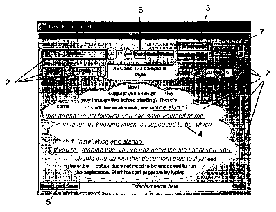
Referring now to Figure 1, everything displayed on the screen 1 by the present
invention is
an "Active Element" 2. The simplest elements can take various shapes and
borders. They can
display a solid color or an image as a background. They can be moved, resized
or configured by
the user; and can store hints used by a parent element, if the element is a
child element of a parent
element, when they are laid out.
In the present invention, there are also some specializations of simple
elements which are
frequently used. The most significant ones are elements capable of displaying
text such as label 3
("12"), text field 4 ("ABC abc . . ."), button 5 ("New") and radio button 6
("Bold") elements, and
elements capable of managing the display of other elements such as parent 7
(the entire "Editor
Tool" display), grid (not shown), button group 8 (the list of font names) and
overlay elements (not
shown).
4
CA 02359997 2001-07-11
WO 01/35217 PCT/US00/31351
The displays of the present invention consist entirely of a single "window,"
i.e. the desktop.
No pieces of the display are independent of that desktop. The desktop is a
Java JPanel, not an
active element. Its functions are to display all the elements the present
invention is currently using,
and to handle element moving and resizing. Typically it is displayed in a full-
screen Java JFrame
as the sole child of the frame. All elements of the present invention are
"Java children" of the
desktop, that is, contained by and displayed by it. No Java layout manager is
used on the desktop,
leaving the present invention parent elements free to manage the sizes and
positions of their
children. This also allows the present invention's "windows" to overlap each
other, slide partially off
screen, etc., behaviors which would be prohibited were the desktop to manage
their layout. Those
skilled in the art, i.e. Java programmers, will recognize and understand the
references made
throughout this preferred embodiment to the Java objects.
Many of the displays present the appearance of sub windows, and can be moved
about
and resized like traditional windows. However, this is an illusion. All the
displays are painted into
the desktop of the present invention.
All active elements of the present invention have at least a shape, which is
initially
transparent. The minimum size of a simple element is 4 pixels in each
dimension plus the size of
its borders all around, if any. If an exact size is specified in its size
hints, this size overrides the
minimum. To construct an element, its name, identifier, and list of properties
and events must be
provided. This information is typically provided by the programmer/developer
as default views or
by a database. Details about properties and events are discussed later.
The shape of an active element defines its active portion. Unlike prior art
graphic user
interfaces, the user can change the shape of any active element of the present
invention. The
present invention provides a variety of shapes from which the user may choose.
These include a
box shape, an oval shape, a cloud shape, a triangle shape, and a custom shape.
Referring to Figure 2, there is illustrated a variety of the shapes an active
element may
have. A box shape 10 is a simple rectangle created using a Java Rectangle2D
object. The oval
shape 20 is an ellipse or circle created using a Java EIIipse2D object. The
cloud shape 30 is a
custom construct, which can be resized without changing its form. No two cloud
shapes will be
exactly alike. The cloud is created by starting with a Java EIIipse2D object,
just like an oval shape,
using a size 200 pixels wide x 100 pixels high. The Java Pathlterator
describing this object
consists of equations for four cubic splines, one for each quadrant. Each
spline consists of three
pairs of coefficients that define the control points for the spline. A random
value D between 30-50
pixels is chosen. Another Java EIIipse2D object of size 2D pixels wide x D
pixels high is centered
at each of the twelve control points. This appears to guarantee "reasonable"
looking clouds. The
cloud shape is the composite of the thirteen ellipses so generated. It is then
resized to fit within the
desired size of the element.
5
CA 02359997 2001-07-11
WO 01/35217 PCT/US00/31351
A triangle shape 40 is a custom construct with its point facing up, down, left
or right. This
shape is very useful as a button control, but is not limited to that
application. In the preferred
embodiment, it is constructed from a Java Polygon object using the following
pre-computed
coordinates:
Up x = { 0, 50, 100 } y = { 100, 0, 100 }
Down x = { 0, 50, 100 } y = { 0, 100, 0 }
Left x = { 100, 0, 100 } y = { 0, 50, 100 }
Right x = { 0, 100, 0 } y = { 0, 50, 100 }
The result is then resized to fit within the desired size of the active
element.
A custom shape (see the up- and down-pointing scroll buttons in Figure 1 ) is
a construct
which starts out as a plain box. Each side of the box can be left plain or
changed by the user to a
slant, point, bevel; semicircle, or rounded plain shape. Two directions are
associated with each
side. For example, the right side can be slanted lower-left to upper-right or
lower-right to upper-left.
It can be pointed right ("out") or left ("in") and so on. In these formulae,
the preferred embodiment
uses the following values:
SIZE = 100
SIZE 2 = SIZE / 2
SIZE 4 = SIZE / 4
SIZE3 4 = SIZE - SIZE 4
SIZE5 4 = SIZE + SIZE 4
BEVEL = round (SIZE / (2 + sqrt
(2)))
Pre-computed coordinates
are used for each
style and direction
on each edge:
U~ Slant Out x = { 0, SIZE, SIZE } y = { 0,
-SIZE 4, 0 }
In x = { 0, SIZE, SIZE } y = { 0,
SIZE 4, 0 }
Point Out x = { 0, SIZE 2, SIZE } y = {
0, -SIZE 4, 0 }
In x = { 0, SIZE 2, SIZE } y = {
0, SIZE 4, 0 }
Bevel Out x = { 0, BEVEL, SIZE - BEVEL,
SIZE }
y = { 0, -BEVEL, -BEVEL, 0 }
In x = { 0, BEVEL, SIZE - BEVEL, SIZE }
y = { 0, BEVEL, BEVEL, 0 }
Circle Arc2D (0, -SIZE 2, SIZE, SIZE, 0, 360, CHORD)
Round RoundRectangle2D (0, -SIZE 4, SIZE, SIZE 2, SIZE 4, SIZE 4)
Down Slant Out x = { 0, 0, SIZE } y = { SIZE5 4, SIZE, SIZE }
In x = { 0, 0, SIZE } y = { SIZE3 4, SIZE, SIZE }
Point Out x = { 0, SIZE 2, SIZE } y = { SIZE, SIZE5 4, SIZE }
In x = { 0, SIZE 2, SIZE } y = { SIZE, SIZE3 4, SIZE }
6
CA 02359997 2001-07-11
WO 01/35217 PCT/US00/31351
Bevel Out x = { 0, BEVEL, SIZE - BEVEL, SIZE }
y = { SIZE, SIZE + BEVEL, SIZE + BEVEL, SIZE
}
In x = { 0, BEVEL, SIZE - BEVEL, SIZE }
y = { SIZE, SIZE - BEVEL, SIZE - BEVEL, SIZE
}
Circle Arc2D (0, SIZE 2, SIZE, SIZE, 0, 360, CHORD)
Round RoundRectangle2D (0, SIZE3 4, SIZE, SIZE
2, SIZE 4, SIZE 4)
Left S lant Out x = { 0, -SIZE 4, 0 } y = { 0, SIZE,
SIZE }
In x = { 0, SIZE 4, 0 } y = { 0, SIZE, SIZE
}
Point Out x = { 0, -SIZE 4, 0 } y = { 0, SIZE 2,
SIZE }
In x = { 0, SIZE 4, 0 } y = { 0, SIZE 2,
SIZE }
Bevel Out x = { 0, -BEVEL, -BEVEL, 0 }
y = { 0, BEVEL, SIZE - BEVEL, SIZE }
In x = { 0, BEVEL, BEVEL, 0 }
y = { 0, BEVEL, SIZE - BEVEL, SIZE }
Circle Arc2D (-SIZE 2, 0, SIZE, SIZE, 0, 360, CHORD)
Round RoundRectangle2D (-SIZE 4, 0, SIZE 2, SIZE,
SIZE 4, SIZE 4)
Right Slant Out x = { SIZE5 4, SIZE, SIZE } y =
{ 0, 0, SIZE }
In x = { SIZE3 4, SIZE, SIZE } y = { 0, 0,
SIZE }
Point Out x = { SIZE, SIZE5 4, SIZE } y = { 0,
SIZE 2, SIZE }
In x = { SIZE, SIZE3 4, SIZE } y = { 0, SIZE
2, SIZE }
Bevel Out x = { SIZE, SIZE + BEVEL, SIZE + BEVEL,
SIZE }
y = { 0, BEVEL, SIZE - BEVEL, SIZE }
In x = { SIZE, SIZE - BEVEL, SIZE - BEVEL,
SIZE }
y = { 0, BEVEL, SIZE - BEVEL, SIZE }
Circle Arc2D (SIZE 2, 0, SIZE, SIZE, 0, 360, CHORD)
Round RoundRectangle2D (SIZE3_4, 0, SIZE 2, SIZE,
SIZE 4, SIZE 4)
A Java Area object is formed as above. Where x and y values are given, a Java
Polygon is used to
form the area. For out-pointing sides, the area is added to a base rectangle
SIZE x SIZE. For in-
pointing sides, the area is subtracted from a base rectangle SIZE x SIZE. The
finished product is
resized to fit within the desired shape of the element.
The number of possible combinations is quite large. In the preferred
embodiment, the
most attractive ones modify only one side or two opposing sides. For example,
a button with one
side pointed or rounded can be used to indicate direction such as the up and
down buttons on a
scroll bar. A text field with a point "out" on the right end and a point "in"
on the left end looks much
like an arrow.
7
CA 02359997 2001-07-11
WO 01/35217 PCT/US00/31351
Shapes frequently require resizing modifications. This happens when the
element itself is
resized and when borders are added to or removed from the element. The
original shape and its
size are stored for reference in the shape object. The new shape is obtained
by scaling the original
shape by a transform based on the new size divided by the original size,
bigger or smaller as
appropriate. The scaling can be different in the horizontal and vertical
directions. If the resizing
results from adding or removing a border, the shape is also translated to lie
within the new borders.
Text layout methods require horizontal rectangles of a given height that lie
within a shape.
In the preferred method, the present invention loops across the width of the
shape's bounding box
looking at rectangles of the given height and 1 pixel wide. If such a
rectangle lies fully within the
shape, and the previous one did not, the method starts tracking a new output
rectangle. If the
previous one lies within the shape, the method of the present invention moves
the right edge of the
output rectangle over another pixel. If the current rectangle does not lie
within the shape and the
previous one did, the method ends the output rectangle and stores it. When the
right edge of the
shape is reached and if an output rectangle is in progress, the method of the
present invention
stores it. The list of rectangles for the shape is returned.
Every active element has an active element configuration that may be changed
by a user
through the active element configuration panel. The preferred embodiment of
the active element
configuration panel is shown in Figure 3. It will be understood by those
skilled in the art that the
active element configuration panel 60 is itself a parent active element 61
having children active
elements 70, 90, 110, 130, and 150, respectively, programmed using the methods
of the present
invention. The configuration panel 60 for the active element contains various
options that allows a
user to configure a particular active element. The user may change or not any
one of the following
by selecting shapes 70, colors 90, borders 110, events 130, or images 150.
As shown in Figure 4, a simple shape selection tool 71 (also configured
according to the
teachings of the present invention) called a shape editor is provided as part
of the active element
configuration panel 60. For the selected active element, the user can select a
box (not shown),
oval 73, cloud 74, triangle 75, or custom shape 76. If triangle 75 is
selected, the user can choose
to point it left 77, right 78, up 79 or down 80. If custom 76 is selected, for
each edge the user can
choose plain 81, slant 82, point 83, bevel 84, circle (not shown) or round
styles (not shown), and
whether the edge is pointed in 87 or out 88. To construct a shape editor, the
list of available styles
such as box, oval, etc. must be provided. For triangles, the list of
directions such as up, down, etc.
must be provided. For custom shapes, the list of edge styles such as point,
slant, etc. and
directions such as in and out must be provided. These lists may be provided by
the programmer
through default views or by the database with which the graphic user interface
will interact. For the
remainder of this detailed description of the preferred embodiment, any
reference made where
information is "to be provided," unless otherwise described, means that the
information is provided
by the programmer/developer or by the database as mentioned above.
8
CA 02359997 2001-07-11
WO 01/35217 PCT/US00/31351
The active portion of each element of the present invention may have zero or
more borders
of various styles. If there are borders, they fit snugly within the box
defined by the size of the
active element. The active shape fits snugly within the borders. The user can
change the style,
color or number of borders of any element. Furthermore, borders can surround
any shape, not just
rectangles.
Border color can have a significant effect on the appearance of the border.
Leaving the
color "null" allows the software to compute appropriate border colors based on
the background
color of the active shape. Such borders are often the most attractive choice.
In some situations, it
is desirable to specify a color explicitly. In that case, border colors are
computed from the specified
color.
A plain border is a simple region of constant pixel width with a single color.
It can be used
as the innermost border around a text field, to provide some margin around the
text, or between
borders of other styles to "widen" them. The plain border has a width and a
color. In the preferred
embodiment, default values for the width and the color are provided as default
one pixel for a width
and null for a color. The plain border pre-computes and stores the area it
needs to fill. The area is
computed by taking the original shape and centering within it a second,
similar shape, smaller all
around by the width of the plain border. The smaller shape is subtracted from
the larger. The
annulus becomes the area of the plain border. The smaller shape is returned,
and will become the
active shape of the element. This technique works for all the shapes used for
active elements and
does not need to know what type of shape is receiving the border.
An etched border can be either raised or lowered. Lowered etched borders are
often used
as the outline for pushbuttons. Raised etched borders commonly delimit groups
of related items in
displays. The etched border has a color (default null). That color (or if
null, the active shape
background color) is used as the basis to compute a lighter and darker variant
using the Java Color
object's brighter() and darker() methods. All etched borders are 2 pixels
wide. The etched border
pre-computes and stores two areas it needs to outline. The upper-left area is
computed by taking
the original shape and reducing its width and height by 1 pixel. The upper-
left corner remains fixed.
The lower-right area is the same size, but its upper-left corner is offset by
one pixel in both
dimensions. The active shape is 4 pixels smaller in both dimensions than the
original shape, and
its upper-left corner is offset by 2 pixels in both dimensions. This technique
works for all the shapes
used for active elements and does not need to know what type of shape is
receiving the border.
Note that the etched border is not a perfect fit around the shape, but it is
close enough for display
purposes.
The only difference between etched raised and lowered borders is in how they
are painted.
A lowered border has areas outlined with colors as follows:
lower-right area highlight color
upper-left area shadow color
9
CA 02359997 2001-07-11
WO 01/35217 PCT/US00/31351
A raised border has the colors reversed, as follows:
lower-right area shadow color
upper-left area highlight color
A beveled border can be either raised or lowered. Lowered beveled borders are
often
used as the outline for text fields. Raised beveled borders can delimit groups
of related items in
displays, or outline buttons for a 3-D effect. The beveled border has a color
(default null). That
color (or, if null, the active shape background color) is used as the basis to
compute two lighter and
two darker variants using the Java Color object's brighter() and darker()
methods. All beveled
borders are 2 pixels wide.
The beveled border stores four areas it needs to fill. The areas involved are
actually the
same as those for the etched border, but each is subsequently split in half at
its lower-left and
upper-right corners. First an upper-left area is computed by taking the
original shape and reducing
its width and height by 1 pixel. The upper-left corner remains fixed. A
similar area 1 pixel smaller
all around is subtracted, leaving an annulus 1 pixel wide. The lower-right
area is computed in a
similar way as the upper-right area, but with the lower-right corner remaining
fixed. Once these
annular shapes have been obtained, they are split at the lower-left and upper-
right corners,
creating four areas to fill. The active shape is 4 pixels smaller in both
dimensions than the original
shape, and its upper-left corner is offset by 2 pixels in both dimensions.
This technique works for
all the shapes used for active elements, and does not need to know what type
of shape is receiving
the border. Note that the beveled border is not a perfect fit around the
shape, but it is close enough
for display purposes.
The only difference between beveled raised and lowered borders is in how they
are
painted. A lowered border has the areas filled with colors as follows:
outer upper area lighter shadow color
outer lower area darker highlight color
inner upper area darker shadow color
inner lower area lighter highlight color
A raised border has the colors reversed, as follows:
outer upper area lighter highlight color
outer lower area darker shadow color
inner upper area darker highlight color
inner lower area lighter shadow color
As shown in Figure 5, a simple border selection tool 111 is provided as part
of the active element
configuration panel. Active elements initially have no border. The tool
displays border "#1" with
style "None." The user can choose from etched, beveled and plain border
styles. For etched and
beveled styles, the user can choose raised or lowered. For the plain style,
the user can choose a
width. If border #1 112 is added to the element, border #2 113 will be
displayed with style "None."
CA 02359997 2001-07-11
WO 01/35217 PCT/US00/31351
As each new border is added, a slot or space will be provided for yet another
border. There is no
limit to how many borders can be applied to an active element.
Many attractive borders depend on a series of simple borders for their effect.
Some
common ones are etched raised followed by etched lowered (sometimes with a
plain border
between them to expand the frame), or beveled raised followed by beveled
lowered. Many more
complicated combinations are possible. To construct a border editor, the list
of available styles
such as plain, etched raised, etc. must be provided.
A color may be used in the active shape. Such colors may be opaque or
partially
transparent. The user can change the color used inside the active shape of any
element.
Colors in the preferred embodiment use the Java Color object, taking advantage
of 24 bits
of color information plus 8 bits of transparency. Note that the effect of
active elements having a
"shape" is achieved by painting the border and/or the active shape background.
The colors) used
in the active shape can be opaque or partly transparent (a fully transparent
color is stored as "null"
and has no hue).
Borders with no color of their own specified derive their colors from the
active shape
background color. Most borders use this method, since this generates an
attractive, coordinated
appearance.
As shown in Figures 5A, 5B, 5C, 5D, 5E and 5F, a color selection/editor tool
is provided as
part of the active element configuration panel. This tool is used throughout
the present invention
whenever a color is needed such as for the element background colors, for text
foreground and
background colors, for border colors, for colors in the drawing tool, etc. It
consists of five different
panels overlaid on each other. Turning to Figure 5A, in addition to the five
different panels there is
a scroller 92 to select the panel of interest and a slider 150 to set the
transparency. The color
editor is capable of displaying and selecting any of about 16 million colors
(256 reds x 256 greens x
256 blues) at any of 255 transparencies for a total of about 4 billion
combinations.
In Figure 5A, the color book tool consists of a panel 100 displaying a variety
of colors, four
radio buttons (red 101, green 102, blue 103 and gray 104) and a page slider
105. Initially, the "red"
button is selected. A red color book has a constant red value everywhere on
the panel. All
possible green and blue combinations appear on the panel. Blue ranges from
full off (0) at the top
to full on (255) at the bottom. Green ranges from full off (0) at the left to
full on (255) at the right.
Changing the page of the color book with the page slider changes the fixed red
value for the panel.
Blue and green always cover the full spectrum. The user chooses a color from
the panel by
clicking on it.
The color book is a display technique for reducing a three-dimensional problem
to two
dimensions. Each page of the book is actually a slice taken from a color cube.
The color cube has
red full-on on one face and full-off on the opposite face. Green is full-on on
another face and full-off
on the one opposite. Blue is full-on on another face and full-off on the
remaining one. The color
11
CA 02359997 2001-07-11
WO 01/35217 PCT/US00/31351
book pages described above are slices taken from the cube parallel to the face
where red is full on.
Likewise, the green color book takes slices parallel to the green full on
face. The blue color book
takes slices parallel to the blue full on face.
The gray color book is just a single page long, and is provided as a
convenience. All the
gray values are available in the other books, but they are hard to pinpoint
exactly. In the color
cube, gray values lie along the line between the corner where all of red,
green and blue are full on
and the diagonally opposite corner where they are all full off. To construct a
color book element,
the current book (red, green, blue or gray) must be provided.
The color palette tool 110 is shown in Figure 5B. It consists of a few dozen
colors 112 pre-
selected for the user. The user chooses a color from the palette by clicking
on it. To construct a
color palette editor, the list of colors to display must be provided.
The red/green/blue tool 120 is shown in Figure 5C. It consists of a red slider
121, a green
slider 122 and a blue slider 123. The red, green and blue sliders allow the
user to adjust the color
components individually. Red, green and blue values range from full off (0) to
full on (255); each
slider adjusts one of the components within this range. The user chooses a
color by clicking on the
slider and dragging it to a new position.
The hue, saturation and brightness tool 130 is shown in Figure 5D. It consists
of a hue
slider 131, a saturation slider 132 and a brightness slider 133. The hue,
saturation and brightness
sliders allow the user to adjust the color components individually. Hue,
saturation and brightness
values range from full off (0) to full on (1 ). Each slider adjusts one of the
components within this
range. The user chooses a color by clicking on the slider and dragging it to a
new position. Note
that brightness must be at least partially on (not full left) for hue or
saturation to respond. Note that
saturation must be at least partially on (not full left) for hue to respond.
The values generated are
converted to and from red, green and blue values using the Java Color object's
RGBtoHSB() and
HSBtoRGB() methods.
The red, green and blue text field tool 140 is shown in Fig. 5E. It consists
of a red text field
141, a green text field 142 and a blue text field 143. The red, green and blue
text fields allow the
user to adjust the color components individually. Integer values between 0 and
255 can be
entered. The user can also choose decimal values between 0 and 1. If any value
exceeds 1, the
tool treats all three values as integers befirveen 0 and 255, truncating any
fractions. To avoid
unnecessary and confusing color changes while the user is still typing, the
color does not change
until "Apply" is selected.
The transparency slider 150, which appears on all of the panels but which is
more clearly
shown in Figure 5F, allows the user to modify a color selected by any of the
five methods described
above to make it partially transparent. Transparency ranges from full off (0)
to full on (255). The
user chooses a transparency by clicking and dragging the slider 152 to a new
position. A fully-
transparent color has no hue and is stored as a "null" value. Moving the
transparency slider 152 to
12
CA 02359997 2001-07-11
WO 01/35217 PCT/US00/31351
full off leaves all color components set to full off (0). When the slider 152
is moved back again, the
color will be black (red, green and blue full off) no matter what color was
there before.
An image may be displayed in the active shape. The user can change the image
displayed
inside the active shape of any element. An image smaller than the active shape
will be tiled to fill
the active shape. An image larger than the active shape will be cropped to fit
from the upper-left
corner.
When an image is used as the background of the active shape, any color
assigned to that
region is no longer visible. However, any borders on the element without their
own color specified
still derive their colors from the active shape background color. When an
image is used, it is
appropriate to choose a complementary background color for the active shape to
ensure smoothly
coordinated borders. The images themselves have no effect on border color.
A simple image selection tool 160 is shown in Fig. 6. The image selection tool
160 is
provided as part of the active element configuration panel. It displays a list
161 showing a small
sample of all the images available to the tool, plus "None". An image is
selected by clicking on it.
When "None" is selected, the element will use its background color instead. To
construct an image
editor, the list of available images must be provided. Images in the JPEG and
GIF formats are
currently supported.
Another important aspect of the present invention is the use of size hints.
Size hints are
used by parent elements to help with the layout of displays. The "end of row
or column" hint, if
true, signals the layout routine to end the current row (in horizontal
layouts) or column (in vertical
layouts) after this element, even if more space is available. The "exact width
or height in pixels"
hint, if the width or height in pixels is provided, signals the desire of this
element to be a specific
size. For example it might be used with an image having a specific size
preference. The "full width
or height" hint, if true, signals the layout routine to make this element
occupy the entire row (full
width) or column (full height). The "maximum number of rows or columns" hint,
if the maximum
number of rows or columns is provided, tells the layout routine that more or
less space is needed
than might otherwise be expected. If a button group will have a scroller,
maximum rows might limit
the items displayed. If a scrolled label has the potential to display several
digits, maximum
columns might ensure enough space is available to view them all. The "uses all
remaining width
or height" hint, if true, signals the layout routine to give this element all
the remaining Width in a row
(for horizontal layouts) or all the remaining height in a column (for vertical
layouts). It does not
mean the row or column ends with this element. It just requests that this
element receive any
excess pixels. The "vertical layout" hint, if true, tells the layout routines
to use a vertical algorithm.
Otherwise, a horizontal algorithm is selected. This hint is only meaningful
when applied to parent
elements. Other elements are atomic.
The active portion of the element can respond to various events initiated by a
pointing
device such as a mouse. The element may be moved or resized and its
configuration controls may
13
CA 02359997 2001-07-11
WO 01/35217 PCT/US00/31351
be launched. The mouse events used to initiate these tasks can be changed by
the user. All
elements currently use the same set of events for moving, resizing and
configuration. Active
elements store their events in a hash table as key/value pairs for easy
retrieval. This also allows
more complex elements, which inherit the basic active element behaviors, to
store their own events
without necessarily adding more data items.
Events are only triggered on the "active" portion of the element, that is,
inside its shape. If
an element is oval, clicking outside the oval does not fire the event. This is
achieved by testing
mouse events to be sure they occur inside the shape before processing them.
Any element can be moved relative to its parent, even outside the parent's
apparent
boundaries. The default control to move an element is holding the control key
(Ctrl) and dragging
the element with the left mouse button depressed.
Any element can be resized, even if the new size extends outside the parent's
apparent
boundaries. The default control to resize an element is holding the shift key
(Shift) and dragging
the element with the left mouse button depressed.
Any element can be configured by the user. The default control to launch the
active element
configuration panel is clicking the right mouse button.
Any element can launch an activity. This behavior is not restricted to
"buttons" or other
special elements. Behaviors that can be started by an element are all lumped
under the term
"activation." Two sorts of activation are possible. Simple activation is a
single event. The default
control to activate a simple behavior is clicking the left mouse button.
Complex activation is a
series of events. An example is making a freestyle drawing in the drawing
tool. The default
controls for the series of events are:
1 ) Pressing the left mouse button to start the activation
2) Dragging the mouse with the left button down to continue the activation
3) Releasing the left mouse button to complete the activation
A simple event editor tool 170 is shown in Fig. 7. The event editor tool 170
is provided as part of
the active element configuration panel. It displays a list 171 showing the
events available for this
element. Alternate mouse events or modifiers can be selected. To construct an
event editor, the
lists of editable events, mouse events and modifiers must be provided.
Each active element has a list of associated properties. In the preferred
embodiment,
these properties are the shape property, the border property, the color
property, the image
property, the size hints property, and the event property. Active elements
store their properties in a
hash table as key/value pairs for easy retrieval. This also allows more
complex elements, which
inherit the basic active element behaviors, to store their own properties
without necessarily adding
more data items. Each property wraps up one or more bits of information.
The shape property stores one shape as described previously. An element has
exactly
one shape property. To construct an element, its shape type must be provided
(box, oval, etc.). If
14
CA 02359997 2001-07-11
WO 01/35217 PCT/US00/31351
the shape is a triangle, its direction must be provided (up, down, etc.). If
the shape is custom, the
style (slant, point, etc.) and direction (in, out) for each edge must be
provided.
The border property stores a list of simple borders as described above. An
element has at
most one border property. If no borders are set, the border property is
removed. The list of
borders is stored outermost first. To construct an element with borders, its
list of border types must
be provided (plain, etched raised, etc.) with a color (or null) for each. For
any plain borders, a width
in pixels must be provided. However, an element need not have any borders. In
fact, the list can
be empty.
The color property stores a single Java Color object, also described above. An
element
has at most one color property for the active shape background. If the color
is null (fully
transparent), the property is removed. To construct an element with background
colors, its
background color must be provided as red, green, blue and transparency values
(0-255). An
element need not have background colors. It can be null.
The image property stores a single Java TexturePaint object plus a name
describing the
image. Images are compared for equality by comparing their names. An element
has at most one
image property for the active shape background. If it displays no image, the
property is removed.
To construct an element with a background image, its background image must be
provided as a file
(or a byte array) in JPEG or GIF format. An element need not have background
images. Either or
both can be null.
The image property also provides the method for converting an image obtained
from a
graphics file to a Java TexturePaint object. The image file is loaded by a
Java Imagelcon object.
GIF and JPEG image files are currently supported. The Imagelcon is painted
into a Java
Bufferedlmage object, which is created to exactly fit the width and height of
the image. Finally, the
TexturePaint object is created from the Bufferedlmage. The TexturePaint object
has the ability to
automatically tile itself to fit any area it is asked to fill. It is ideally
suited for paihting an image into
the background of an element.
The size hints property stores one or more of the size hints. An element has
at most one
size hints property, which can contain any of the hints described above. If
all the hints are false or
zero, the property is removed. To construct an element with size hints, all of
the values (true
Boolean or positive integer values) described under size hints above that are
desired must be
provided. An element need not have size hints. All of them can be false or
zero, as appropriate.
The event property stores a single event. An element has a hash table of
events, including
at least move (move start, move and move end), grow (grow start, grow and grow
end) and
configure. Many elements also have simple (activate) or complex (activate
start, activate and
activate end) activation events. Any elements which can contain text also
define events to get the
focus and perform selection (select start, select and select end). The event
property must store
everything needed by the logic, i.e. software, it invokes.
CA 02359997 2001-07-11
WO 01/35217 PCT/US00/31351
To construct an element with events, at least the following values must be
provided for
each event: its name, key, event identifier and action. It may also have event
modifiers and an
associated object. In the preferred embodiment, every element in the present
invention has
events. The move, grow and configure events are supplied automatically, but
this is not required
by the code.
The event property stores a name, which may be displayed to the user in the
event editor if
the user elects to change the event controls. The event property has a key,
which the present
invention uses to find the event in the element's hash table. The event
property has an event
identifier, stating which of seven mouse actions has occurred. Event
properties can be used to
sense when the mouse is clicked, pressed or released and when the mouse is
dragged (movement
with a button depressed). The event property has an event identifier, stating
any control keys) that
must accompany the event. Control keys include shift, control and alt. Some
systems also provide
meta and/or altgraph.
The event property stores which active element owns the event, since that
information is
often needed by the logic the event launches. For example, when a button is
clicked, its color is
briefly changed as feedback to the user. The code needs the button's identity
so that this can
occur. The event property stores the name of an action (the logic) to perform
if the event occurs.
The input to such a logic is always the event property. The logic must obtain
any other information
it needs from items stored in the event property or directly available from
the database (system-
wide values).
The event property also stores an associated object. Not all events use this
item. For
example, when a button is clicked to close a window, the logic must have
access to both the button
itself (to change its color, as above) and to the identity of the window to be
closed. The window
identity is stored as the associated object.
The event property stores the Java MouseEvent that triggered the event. In
some cases,
such as moving an element, freestyle drawing or marking a text selection, the
exact coordinates at
which the mouse was last placed are used by the code in responding to the
event. These can be
obtained from the MouseEvent.
Active elements which can display text are separated from simple active
elements. These
are called label active elements. They possess all the properties of simple
active elements, plus a
few new ones. The reason for the separation is that text processing is
expensive, and it makes
sense to streamline the process as much as possible. There is no other reason
than speed for
separating elements capable of displaying text from other elements. The text
is managed by a
property, and the property is stored in the same hash table as all the other
properties discussed
above. The distinction between simple and text-capable elements is used only
to better explain the
present invention and can be eliminated, if desired.
16
CA 02359997 2001-07-11
WO 01/35217 PCT/US00/31351
The minimum size of a label element must be calculated. The one-line size of
the prompt
text is obtained. This is the size of the entire text up to the first "hard"
line break, if any. If multiple
lines are specified in its size hints, a multi-line size is then estimated.
The width of the element's
borders is added all around. A "hard" upper limit, currently set at 250
pixels, is used to constrain
this size. Any exact size specified in the element's size hints overrides this
minimum. The label
element can have a "prompt," which contains text to be displayed to the user.
The text is not
editable under normal conditions, but becomes editable if the user launches
the element
configuration panel. The text in the prompt can be in any style or combination
of styles, and can be
long or short. The label element can have a justification, which can be
leading, trailing or centered.
Label elements have some additional events to which they respond. The set of
mouse events is
expanded, and keystroke events are added.
Prompts are only editable when the element configuration panel is displayed.
Label elements require a Java listener to await keystrokes. Keystrokes are
only processed
if the label is currently editable. However, the listener remains engaged all
the time. Events are
captured when a key is "typed" or "released." Key "press" events are ignored.
When a typing, or
printable, key is typed, the computer generates one or more key pressed
events, a key typed
event, and a key released event. When a key combination, such as Shift-A (for
capital 'a') is typed,
the computer generates one or more key pressed events for each key, a key
typed event and a key
released event for each key. The actual character typed is trapped from the
key typed event, using
the Java KeyEvent object's getKeyChar() method. It is stored in a holding
buffer for a moment.
When key released events are received, if the key released is waiting in the
typing buffer, it
is processed, along with any keys ahead of it in the buffer. During rapid
typing, it is possible to get
a confusing series of key released events. This technique ensures that
keystrokes are not lost and
that they come out in the order they went in. Otherwise, key released events
are treated as part of
a keystroke-driven selection process.
Text can be selected using keyboard keys, if desired. The arrow keys, home and
end keys
and page up and down keys are used to navigate around text. To move the text
cursor, starting
from the current cursor position:
Left arrow moves back 1 character
Right arrow moves ahead 1 character
Up arrow moves back 1 line
Down arrow moves forward 1 line
Page up moves back 1 page
Page down moves forward 1 page
Home moves to the beginning of the page
End moves to the end of the page
Control-home moves to the beginning of the text
17
CA 02359997 2001-07-11
WO 01/35217 PCT/US00/31351
Control-end moves to the end of the text
No keys move the cursor past the end of the document or prior to the
beginning. To mark text using
these motion keys, the user holds down the shift key and navigates using the
motion keys. The
selection is highlighted in a pale color (by default, a pale magenta). When
the shift key is released,
the selection is "completed." Any further operation of arrow keys deselects
the current selection
and just repositions the cursor.
Text can also be selected using a pointing device such as a mouse. For many
users, this
is the normal method. Label elements have complex activation events called
select start, select
and select end (driven by default by left mouse press, left mouse drag and
left mouse release).
Text is highlighted in a pale color. When the mouse is released, the selection
is "completed".
Label elements use two new property types, plus several helper classes used to
style text
and store layout information. Label elements have at most one justification
property, which stores
whether the text will be justified to the leading edge, trailing edge or
center. Center justification is
the default. If this value is chosen, the property is removed. "Leading" and
"trailing" are sensitive to
the preferred direction of the text. In right-to-left languages, "leading"
will justify to the right edge
and "trailing" will justify to the left edge. To construct an element with
justification, the edge to use
(center, leading, trailing) must be provided. In the preferred embodiment, an
element need not
have a justification. Center is used by default.
A simple justification editor is provided as part of the active element
configuration panel. It
allows the user to select leading, trailing or centered justification for the
label element. To construct
a justification editor, the list of available justifications (center, leading,
trailing) must be provided.
Label elements have exactly one text property, which by default contains an
empty text
string used as the prompt. To construct an element with a prompt, the text
string to display must
be provided. Often, the text style for each character is also supplied. The
details for text styles are
discussed later. An element need not have a prompt. An empty string is used by
default. A text
property with no text styles provided, or with text styles for only some of
its characters, is still valid.
The system default text style is used for any characters lacking text style
values.
The text, when selected, in label active elements and text active elements can
be
manipulated and various characteristics of the text determined by the present
invention. A supplied
style can be applied to each character in the current text selection. The
character position of every
"hard" line break in a text string can be identified by searching through the
string for '\n' characters.
The size of a box needed to layout the given text in N lines, where N is
provided, can be
computed. It uses the one-line layout size as a basis and iterates on
successively larger box sizes
until all the text fits. The layout actually has to be performed to do this.
The size of a box needed
to layout given text in one line can be computed. The layout stops at the
first "hard" line break, if
any are encountered. The layout actually has to be performed to do this. Style
ranges can be
computed by organizing sequential runs of the same text style into style range
objects. Only styles
18
CA 02359997 2001-07-11
WO 01/35217 PCT/US00/31351
that differ from the default style are stored. This is done as a convenient
space-saving measure.
Word breaks can also be computed using a Java Breaklterator object to obtain
the positions of
every word break in a text string.
The visible characters can be counted. This method counts all the characters
in a list of
layouts. This count of characters visible can be used to estimate how far to
scroll on page up or up
arrow commands. Styled text can be created. This method creates a Java
AttributedString from
the given text string, replacing all "hard" line breaks with a single space
each. The locations of the
line breaks are stored. The original text is not modified. The text styles
appropriate to each
character then are applied. There is a major speed efficiency available by
applying one style to a
group of sequential characters, rather than repeatedly applying it to each
individual character. A
style list can be created from a list of style ranges. This method converts a
list of style ranges into
a list of text styles, one per character. All character positions not covered
by one of the style
ranges are supplied with the default style. Characters can also be deleted.
This method deletes
one character from the text. It also removes the style for that character from
the style list, advises
the undo logger of the change in that text property, and, if a text stroller
is in use, adjusts the size
of its slider. Further, a selection can be deleted. The delete selection
method deletes one or more
characters from the text, using the current text selection. It also removes
the styles) for those
characters) from the style list, advises the undo logger of the change in that
text property, and, if a
text stroller is in use, adjusts the size of its slider. Finding a caret
layout given a caret position can
also be performed. This method finds which of a list of layouts a given
character position
(measured from the beginning of the text) lies in. If a point is given then a
caret can also be found.
This method finds which of a list of layouts a given x, y point lies in.
Finding a caret position is also possible. This method finds which character
position a
given x, y point lies over. It uses FindCaretLayoutGivenPoint in the process
to obtain the layout
containing the point, and returns both the layout number and the character
position. The software
can also find a caret position given an x-coordinate. This method finds which
character position a
given x-coordinate lies over, given the layout in which the x-coordinate lies.
The present invention
also allows the software to find carets after layout. After text has been laid
out, this method uses
FindCaretLayoutGivenCaretPos to discover which layout the caret position (and,
if there is a
selection, the other end of the selection) lies in.
Text in the present invention can also be acted upon using various keys from
the keyboard
defining their operation. For the backspace key if there is a current
selection, this method deletes it
using DeleteSelection. The cursor is placed where the selection used to begin.
Otherwise, if the
cursor is not at the beginning of the text, this method backs the cursor up
one character and
deletes a character using DeleteCharacter. The control-end key scrolls the
text so the end of the
text is visible on screen. This is estimated in the present invention,
otherwise the process would be
iterative. The control-home key scrolls the text so the beginning of the text
is visible on screen.
19
CA 02359997 2001-07-11
WO 01/35217 PCT/US00/31351
The delete key deletes a current selection, if there is a current selection,
using DeleteSelection.
The cursor is placed where the selection used to begin. Otherwise, if the
cursor is not at the end of
the text, this method deletes a character using DeleteCharacter.
The down arrow key moves the cursor, if the cursor is not on the last line of
the text, down
to the next line at approximately the same horizontal position. If the next
line of text is currently off
screen, it is scrolled on screen first. If the element's shape is non-
rectangular, the text is shifted
down by the number of characters in an average line. The end key moves the
cursor to the end of
the text on screen. The home key moves the cursor to the beginning of the text
on screen. The
left arrow key moves the cursor to the previous character if the cursor is not
at the beginning of the
text. If the cursor is at the beginning of a line, it moves to the end of the
preceding line. If the
preceding line is off screen, it is scrolled on screen first. If the element's
shape is non-rectangular,
the text is shifted up by the number of characters in an average line.
The page down key scrolls the text down by a page if the end of the text is
not visible on
screen. The first character of the new page will be the character after the
last character displayed
on the previous screen. The page up key scrolls the text up by approximately a
page if the
beginning of the text is not visible on screen. The last character of the new
page will be near the
character before the first character displayed on the previous screen. This is
estimated in the
present invention, otherwise the process would be iterative. The right arrow
key moves the cursor
to the next character if the cursor is not at the end of the text. If the
cursor is at the end of a line, it
moves to the beginning of the next line. If the next line is off screen, it is
scrolled on screen first. If
the element's shape is non-rectangular, the text is shifted down by the number
of characters in an
average line.
The scroll down one line method handles scrolling down by a line in the
general case,
where the text may be laid out in an arbitrary shape. It uses the mean
characters on screen per
line (total characters / total lines) to decide how far to scroll. The scroll
up one line method handles
scrolling up by a line in the general case, where the text may be laid out in
an arbitrary shape. It
uses the mean characters on screen per line (total characters / total lines)
to decide how far to
scroll.
The up arrow key moves the cursor up to the previous line at approximately the
same horizontal
position, if the cursor is not on the first line of the text. If the previous
line of text is currently off
screen, it is scrolled on screen first. If the element's shape is non-
rectangular, the text is shifted up
by the number of characters in an average line. The insert character method
inserts one character
from the text. It also inserts the style for that character into the style
list, advises the undo logger of
the change in that text property, and, if a text scroller is in use, adjusts
the size of its slider.
Layout text across a shape, referred to earlier, is a helper method that lays
out one line of
text across an arbitrary shape. Rectangular shapes do not need to invoke it.
The following values
are provided: the text property, the shape, a Java LineBreakMeasurer object
holding the styled
CA 02359997 2001-07-11
WO 01/35217 PCT/US00/31351
text, a Java Rectangle object specifying how tall the next bit of text is, a
list of line break positions,
which of those line segments is currently in progress, and the justification
to apply.
Using the height provided, a list of rectangles across the shape is obtained
from the
shape's getHorizRects() method. For each rectangle, an attempt is made to
layout some text in it.
This is done by using the Java LineBreakMeasurer object's nextLayout() method
with the width of
the rectangle and the position of the next line break. Only layouts containing
at least one full word
are used.
If a layout is obtained, it is stored as a TextLayoutStore, which also keeps
track of
character positions and physical display coordinates. The tallest layout is
tracked to know how far
to advance when all the rectangles are completed. If a line break has been
reached, the counter
advances to the next text segment. When all rectangles are complete, the y-
value is moved to
below the tallest layout obtained. If no layouts are obtained, it moves down
one pixel. The list of
layouts and current line segment number are returned.
Layout text within a given shape method turns styled text into a list of
layouts which fit
within the given shape. The text property, shape and justification are
provided. A Java
AttributedCharacterlterator is obtained containing the styled text. A Java
LineBreakMeasurer is
created from it. A rectangle describing the bounds of the shape is obtained.
The text property is
asked for a list of its line breaks. Text is laid out a line at a time,
looping through the line breaks. It
is important to note that it is normal for one "line" of text (commonly a
single paragraph) to span
many "lines" of layout. The next layout is obtained from the Java
LineBreakMeasurer object's
nextLayout() method using the width of the bounding rectangle and the position
of the next line
break. The layout must contain at least one word.
If the layout "hangs ofF' the bottom of the bounding rectangle by more than
half its height,
then the method is done. If the shape is itself rectangular, the layout can be
stored as is, using a
TextLayoutStore object to keep track of its starting position and coordinates.
The character
position is updated and then the method goes on to the next line. If the shape
is non-rectangular,
the existing layout is used to estimate the height required, the Java
LineBreakMeasurer is backed
up to its previous starting point, and the LayoutTextAcrossShape method is
used to obtain layouts)
across the shape. All TextLayoutStore objects created and stored are returned.
Multi-line selection is also possible with the graphic user interface of the
present invention.
This method marks a multi-line selection, using repeated calls to
MarkSingIeLineSelection to do
the work. It marks from the start position to the end of the layout in which
the start lies, any full
lines, and from the end position to the beginning of the layout in which the
end lies.
A single-line selection can also be marked. This method builds a rectangle
which
surrounds all the characters in a single layout marked for selection. When the
text is painted, the
rectangle will be filled with the selection color. Text can also be painted.
This method draws the
text. First it loops through all the layouts stored, drawing them at the
stored coordinates (the Java
21
CA 02359997 2001-07-11
WO 01/35217 PCT/US00/31351
TextLayout object can be drawn directly). If the element is editable and there
is a text selection,
the selection is filled with the selection color. Finally, if the element is
editable, its text cursor is
painted (in bi-directional languages such as Arabic, there may be two cursors
under some
conditions).
The present invention also allows for examining a current keystroke received.
If the
current keystroke received is a backspace, it is handled using
HandIeBackspaceKey. If not, and
there is any text selection, the selection is deleted using DeleteSelection.
Then the character is
inserted using InsertCharacter. Because it is possible to get backlogged
during rapid typing, this
method processes everything in its typing buffer up to and including the
current keystroke received.
A key code processing method handles processing of the arrow keys, home and
end keys and
page up and down keys, by invoking the appropriate method above. When text is
scrolled by a line
or a page, a "start on word boundary" method moves the starting character
position at the top of
the page (if necessary) to ensure it lies at the beginning of a word.
A particular helper class called "text layout store" stores a single Java
TextLayout object
plus additional information needed to display it. The TextLayout object
contains a single line of
text. A multi-line document requires a list of TextLayout objects to display
itself. The layout store
keeps track of the coordinates at which the layout should be displayed, the
width and height of the
actual text, the character position within the whole text at which this layout
starts. This class can
also figure out the x-coordinates of each character in the text it has laid
out. This information is
only computed if needed. Handling up and down arrow keys and marking
selections require this
level of detail. The layout is used to obtain the cursor shape at each
character position in turn.
The x-coordinates of the positions are saved.
The text style helper class stores the information needed to create a single
text style, in the
form of a hash table of key/value pairs. The keys are Java TextAttribute
constants. The values are
of various types, as appropriate for each attribute. The text style object is
in a form which can be
used directly by the Java AttributedString object, which can apply the style
to one or more
sequential characters. To construct a text style, at least the font family
(Arial, Courier, etc.) and
size (in points) must be provided. As necessary, the font weight (bold or
not), posture (italic or not),
strike through (on or off), underline style (one of six, or off), superscript
or subscript level,
foreground and background colors may also be provided.
The font family is supplied as a string, such as "Arial" or "Courier." Since
the list of font
faces available varies from computer to computer, the present invention
obtains the list of available
fonts from the computer. The family attribute expects a Java String value. A
text style must have a
family attribute. Java expresses font size as a decimal value in points (a
point is 1/72 inch). Most
font faces support variable size. Some only support specific integer font
sizes (for example, 8-, 10-
12- and 16-point are common). The size attribute expects a positive Java Float
value. A text
style must have a size attribute.
22
CA 02359997 2001-07-11
WO 01/35217 PCT/US00/31351
Java expresses font weight as a decimal value with a practical range of 0.25
to 2.75.
Traditional "bold" is assigned the value 2Ø "Normal" is assigned the value
1Ø Values less than
1.0 would appear "lighter" than normal. The present invention treats boldness
as a Boolean
attribute (on for bold, off for normal). The text style object converts the
value. The weight attribute
expects a Java Float value between 0.25 and 2.75. If the value is 1.0, the
attribute is removed.
Java expresses font posture as the arc tangent of the skew angle from +90
degrees (tilted
right, value +infinity) to 0 degrees (normal) to -90 degrees (tilted left,
value -infinity). Traditional
"italic" is assigned the value 0.2. "Normal" is assigned the value 0Ø Values
less than 0.0 would
appear "tilted" to the left. The present invention treats italics as a Boolean
attribute (on for italic, off
for normal). The text style object converts the value. The posture attribute
expects a Java Float
value. If the value is 0.0, the attribute is removed.
Java expresses strike through as a Boolean attribute, true if on, false if
off. The strike
through attribute expects a Java Boolean value. If the value is false, the
attribute is removed. Java
expresses underline as an integer attribute. There are six styles of underline
provided by Java:
standard (at the Roman baseline), single (1-pixel, below the descenders),
double (2-pixel), gray,
dashed and dotted. The underline attribute expects a Java Integer value (the
TextAttribute class
provides constants for the six values). If the value is not among the six
constants, the attribute is
removed.
Java expresses superscript and subscript as a single integer attribute, using
positive
values for superscripts, negative values for subscripts and zero for normal
positioning.
Unfortunately, the Java mechanism does not currently either scale or offset
the text to create a
superscript or subscript. The text style class of the present invention
provides a work around to
create superscripts and subscripts. However, it is not completely
satisfactory. For example, the
text background color does not track with it properly. Future development will
probably resolve this
problem.
The scale factor to apply to the font size is 2/3 raised to the "level" power,
where level is
the magnitude of the superscript or subscript value (i.e. 1, 2, 3, etc.,
values above 3 generally result
in superscripts too small to read). The offset to use for translation is
computed iteratively:
factor = 1
offset = 0
size = font size/2
level = magnitude of superscript or subscript
repeat level times
factor = 2/3 x factor
offset = offset x 3/2 + size x factor
end repeat
23
CA 02359997 2001-07-11
WO 01/35217 PCT/US00/31351
Finally, the font is transformed by scaling it by a factor in both dimensions
and translating it by
offset in height (use -offset for superscripts).
Java uses Java Color objects for the foreground and background color
attributes. If the
color is fully transparent (null), the attribute is removed.
The style range helper class stores a text style and a starting and ending
character
position. The start position is the first character to which the style
applies. The end position is one
past the last character to which the style applies. Style ranges are used when
a text property is
stored, to compact the style information.
A simple text style editor 180, shown in Figure 8A, is provided as part of the
active element
configuration panel. It allows the user to change all the attributes of the
font and to view a sample
of the result. To construct a text style editor, lists of options such as font
family, font size, font
weight, font posture, underlining, strike through, superscript and subscript,
and foreground and
background colors. as described below must be provided.
The text style editor 180 provides a Font family selection list 182. A list of
the available font
families is provided. The user can select one by clicking on the desired font.
To construct a font
family list, names of all the available fonts must be provided. A scroller 183
for font size allows the
user to adjust the font size up or down a point at a time using buttons. The
user can toggle the font
weight, i.e. bold, on or off by clicking on a "bold" radio button 184. For
italics, the user can toggle
the font posture, i.e. italics, on or off by clicking on an "italic" radio
button 185. Underlining is also
provided. The user can select one of six underlining styles or no underline by
clicking on the
desired style shown at 186. To construct an underlining list, names of the
styles of underlining,
plus "None," must be provided. For strike through, the user can toggle strike
through on or off by
clicking on a "strike through" radio button 187.
Superscripts and subscripts can also be designated by the text editor 180. The
user can
select normal, superscript or subscript positioning by clicking on the
position desired at 188. Text
editor 180 also provides the user with the option to modify the font
foreground or background color.
The buttons 189 and 190 for these colors launch the color editor described
earlier.
Text elements extend label elements by adding the concept of an editable text
field to the
label element's prompt. Text elements thus have two text properties available
in which to store
text. In text elements, the "prompt" takes the role of providing feedback to
the user about what is
desired and the text field receives typing input from the user or displays a
value for editing. The
text field and prompt interact with each other. When any text is available in
the text field, the text
field is displayed. When the text field is empty, the prompt is displayed.
Under normal conditions,
the text field is editable by the user, the prompt is not.
The minimum size of a text element must be calculated. The longer of the text
field and
the prompt text is used, as an approximation, to avoid doing this twice. The
one-line size of the
text is obtained. If multiple lines are specified in its size hints, a multi-
line size is then estimated.
24
CA 02359997 2001-07-11
WO 01/35217 PCT/US00/31351
The width of the element's borders is added all around. Any exact size
specified in its size hints
overrides this minimum.
The text element has a "text field," which contains text to be edited by the
user. If the user
launches the element configuration panel, the prompt becomes editable and is
displayed instead of
the text field. The text field will reappear when configuration is completed.
The text in the text field
can be in any style or combination of styles, and can be long or short.
To construct an element with a text field, at least the text string to display
must be
provided. Often, the text style for each character is also supplied. The
details for text styles are
covered below. An element need not have a text field. An empty string is used
by default. A text
property with no text styles provided, or with text styles for only some of
its characters, is still valid.
The system default text style is used for any characters lacking text style
values.
Button elements are specializations of label elements. They are typically used
to launch
various activities. Like label elements, they can display text but they are
not required to. The
minimum size of a button is based on the minimum size calculated by its label
ancestor, which
ensures any text can be displayed. It cannot be less than a fixed minimum,
currently 16 pixels, in
each dimension. This ensures the button is big enough to operate. The border
width is added all
around. Any exact size specified in its size hints overrides this minimum.
Simple buttons add the concept of an "armed" state to the behaviors of their
label ancestor.
A button is armed when the user presses it and disarmed when the user releases
it. This state is
monitored by the button's paint method. The background is changed to a
slightly darker color
when the button is armed, and restored when it is disarmed. If the button's
background is painted
with an image, no visual feedback is currently provided. Simple buttons use
the activate start and
activate end events to invoke arm and disarm behavior and the associated
repainting. With rare
exceptions, simple buttons also have an activate event, specified by the
programmer, to indicate
what action to take when they are pressed. By default, button activation uses
a left mouse click.
Radio buttons extend simple buttons by adding an on/off selection state. In
the present
invention, these buttons serve several purposes. In groups, they provide
traditional "radio button"
functionality, i.e. exactly one button in the group can be on at any time.
Such groups are used for
offering a set of mutually exclusive choices. Standing alone, a radio button
serves the purposes of
a traditional "check box," displaying different borders when selected and
unselected. Finally, in a
group with a scroller, they provide "combo box" or "scrolled list"
functionality.
Currently, radio buttons use an underlying Java JRadioButton object (not
displayed) to
store the selection state. This allows the use of the Java ButtonGroup object
to manage exclusivity
in groups of buttons.
Parent elements have the responsibility of managing one or more child
elements. Parent
elements extend simple active elements. Their children can be any simple
element, or any element
CA 02359997 2001-07-11
WO 01/35217 PCT/US00/31351
that extends simple element behavior. So parents can have other parents as
their children. This is
the basis for the hierarchy of elements that builds up application screens.
Unlike the practice in traditional windowing frameworks, the parent-child
relationship in the
present invention does not imply containment. A child can be moved, by the
user or the developer,
outside the boundaries of its parent. Children move and grow with their
parent, but do not need to
be contained by it (some of this behavior is constrained by the layout
algorithms). Children can
also overlap each other. This behavior is also somewhat constrained by the
layout algorithms. To
construct a parent element, the list of its children must be provided. A
parent does not need to
have any children. This list can be empty.
Parent elements keep a list of their children. Each child has a name, used by
its immediate
parent for identification purposes. The developer must ensure the names for
all children of one
parent are unique. No "global" uniqueness is required. The purpose of the
names is to allow code
to address a specific child in a maintainable, human-readable way. The list of
children controls the
order in which they get painted. This is only important if the children
overlap, in which case the
last ones will appear "on top." There is also a hash table of children, keyed
to their names, to allow
the code to rapidly locate children by name.
The layout of the children involves several steps. The first step is finding
out how big the
entire hierarchy of elements "wants" to be. In practice, this involves
evaluating the minimum size
required for each element and piecing the whole together. Good values can be
obtained for most
simple elements, including labels and text fields with a small amount of text.
Problems arise with
"large" text fields. There is no "right" answer for what size they need to be.
It is possible to have a
one-line high layout, very, very wide, or a one-word wide layout, very, very
tall, or anything in
between. When there is only one such field, size hints can handle the problem.
They allow the
developer to allocate "all remaining" space to a particular element.
Once the required size is known, the actual layout is performed. Often,
displays are laid
out to their minimum size. For simple editors and control panels, this usually
looks pretty good. If
more space than the minimum is to be used, the excess can be distributed
across all elements or
concentrated in just one. Size hints decide which approach is taken. The
general layout strategy,
using horizontal layout as an example, is:
1. See how many elements fit on the next row, observing any size hints
2. Center the row in the space available, in both dimensions
3. Set the position and size for each element in the row
4. Move down to a point below the tallest element in the row
5. Repeat for the next row
The strategy for a vertical layout is similar. Error checking of the size
hints and conflict resolution in
general may be incorporated as the developer sees fit for the intended
application.
26
CA 02359997 2001-07-11
WO 01/35217 PCT/US00/31351
Grid layouts are used for automatically generating "table" views in the
present invention,
and are useful in a number of custom layouts as well. Grid layouts organize
their children into a
two-dimensional "list of lists." Size hints determine whether the sublists are
rows or columns (i.e. is
the layout horizontal or vertical), and which element is at the end of each
row or column. The rows
or columns do not need to have the same number of elements, nor does the size
of the grid need
to be specified in advance.
The layout strategy is that all elements in the same column will be the same
width. All
elements in the same row will be the same height. This is true in either
horizontal or vertical
layouts. The only difference between them is whether sequential elements go in
the same row
(horizontal) or column (vertical). Arrays of column widths and row heights are
calculated, using the
desired minimum size of each element as a basis and finding the widest element
in each column
and the tallest element in each row. The columns will commonly each have a
different width. The
rows will sometimes each have a different height. Size hints can designate one
column to absorb
all excess width if desired, and one row to absorb all excess height. The
actual layout is
straightforward once the column widths and row heights have been calculated.
The grid is
intended to allow widths exceeding the available screen space by wrapping each
row onto two or
more lines, retaining all other grid behaviors described above.
Button groups extend grid elements to provide exclusivity. All children of a
button group
must be radio button elements. Exactly one child must be selected all the
time. There is no state
with all children deselected. To implement this sort of behavior, radio
buttons in a plain grid layout
are used. The developer must then manage both selection and deselection.
Overlays provide a way of displaying several alternatives in series. Exactly
one of the
alternatives is displayed at a time. Typically the children of an overlay
element are each parent
elements of some sort, but that is not a requirement. The overlay provides
methods to set which
child is currently in view. Controls which allow the user to select from the
available alternatives
must be provided externally. Overlay elements can provide "wizard" or "tabbed
panel" behavior.
The minimum size of an overlay will be the size of the largest of its
children. To construct an
overlay element, the current child to display must be provided.
Scrollers serve two purposes. One is to allow traversal of material too large
to fit in the
available space. The present invention has vertical scroll bars for grid
elements and for label or
text elements to fill that need. The second is to allow the user to choose
from a range of numeric
values without typing. The present invention uses both horizontal and vertical
sliders and scrolled
labels for that purpose.
Scrollers are customized parent elements whose children work together to
create the
appearance of a traditional scroll bar, slider, etc. Unlike traditional
windowing environments,
scrollers of the present invention can be freely changed by the user. The
individual pieces 201-204
(shown in Fig. 8A), which are each active elements, can be moved, reshaped,
painted, etc., as
27
CA 02359997 2001-07-11
WO 01/35217 PCT/US00/31351
shown in Fig. 8B as 201'-204', respectively. The stroller can be dragged away
from the item it
controls and still function. Some of these behaviors are affected by the
layout algorithms.
The vertical grid stroller creates the appearance of a traditional scroll bar.
It has up and
down buttons, a slider, and a trough in which the slider appears to sit. To be
useful, it must be
associated with a grid element whose size hints indicate how many rows are to
be displayed, and
the grid must contain more than that many rows. On layout, the stroller can
collapse its slider and
trough if the available height is insufficient. Only the up and down buttons
remain. For example, a
list restricted to one item in height paired with a collapsed stroller works
something like a standard
combo box.
Assuming these conditions are met, the stroller allows the user to slide the
grid view up
and down, bringing rows into the view from off screen. Clicking the up or down
buttons scrolls the
grid by one row, until the beginning or end of the grid is reached. Dragging
the slider with the
mouse button depressed scrolls the grid freely between its limits. The trough
is not active at this
time. Clicking in it has no effect.
Shown in Figure 8A, the vertical text stroller 200 creates the appearance of a
traditional
scroll bar. It has up and down buttons 201 and 202, a slider 203, and a trough
204 in which the
slider appears to sit. To be useful, it must be associated with a label or
text element containing
more text than will fit within its boundaries. On layout, the stroller can
collapse its slider and trough
if the available height is insufficient, only the up and down buttons remain.
Assuming these conditions are met, the stroller allows the user to slide the
text view up
and down, bringing lines into the view from off screen. Clicking the up or
down buttons scrolls the
text by one line, until the beginning or end of the text is reached. Dragging
the slider with the
mouse button depressed scrolls the text freely between its limits. Like the
horizontal text stroller,
the trough is not active at this time. Clicking in it has no effect.
Horizontal and vertical sliders allow the user to adjust numeric values
between fixed limits
without typing, and without knowing the actual values. The numeric limits are
assigned to the ends
of the slider. The user drags the slider between them using the mouse. Values
range linearly
between the limits. The slider is composed of a trough and a knob. Only the
knob is active. To
construct a slider, its minimum, maximum and current values must be provided.
Scrolled labels behave like a list of values with up and down buttons. The
value is changed
each time a button is clicked. They are suitable for fixed ranges of integer
values. To construct a
scrolled label, its minimum, maximum and current values must be provided.
The Drawina Tool
Turning now to Figure 9, the drawing tool 210 of the present invention is
constructed using
the methods previously described, i.e. creating active elements for each
component of the drawing
tool. The drawing tool 210 allows the user to assemble a collection of shapes.
Individual shapes
28
CA 02359997 2001-07-11
WO 01/35217 PCT/US00/31351
can be easily manipulated in various ways. The collection of shapes can also
be moved and
resized. A finished drawing can be named and saved. When the drawing is
reloaded, the shapes
can again be manipulated individually. The save format is very compact
(equations for the shapes,
plus color and border width information) and does not lose accuracy compared
to the original
drawing. To construct a drawing tool, no special information is required. To
reconstruct a drawing,
the list of shapes to display must be provided. Details for the shapes are
discussed below.
Several styles of shape are available: box 212, oval 213, rounded box 214, and
right
triangle 215. The user can also draw straight lines and freestyle lines
(scribbles). Shapes are
stored in the drawing tool as Java Shape objects. They are stored in the
database as coordinates
from the Java Pathlterator associated with the shape. To reconstruct a shape,
the following
information must be provided: the type of shape (oval, triangle, etc.), its
border width, its rotation
angle, its center and border colors, its Java winding rule, and the list of
Java segment types and
coordinates which define the shape.
Each shape has a border around it, initially one pixel wide. The current width
of the border
is stored for each shape. Each "solid" shape has a center color and a border
color. They may be
the same if desired. Lines and scribbles only have the border color. The color
editor tool used
here was described earlier. Like other colors in the present invention, colors
in the drawing tool
can be opaque or partially transparent. To set the center color, use the color
editor to select the
color desired, then click on the box 215 labeled "center." The border color is
set similarly by
clicking on the box 216 labeled "border." The border and center colors are
stored for each shape.
A simple click or click-and-drag model is used for all the actions in the
drawing tool, which
makes it fairly easy to use. To set the colors of a shape in the drawing tool,
the user selects the
"set colors" button 217. When the user then clicks on a shape, its center and
border colors are
changed to the currently selected center and border colors. To get the colors
used by a shape, the
user selects the "get colors" button 218. When the user then clicks on a
shape, its center and
border colors become the currently selected center and border colors. A pop to
front action button
219 allows the user to pop a selected shape in front of all other overlapping
shapes. This is
implemented in the code by moving the shape to the end of the shape list. A
push to back button
220 allows the user to push the shape in back of all other overlapping shapes.
This is implemented
in the code by moving the shape to the beginning of the shape list.
A delete button 221 is coded so that when a user selects button 221 and then
selects a
shape, the shape is deleted from the drawing. A move button 222 is coded to
allow the use to
move a shape around the screen. Button 222 is coded to cause a shape to follow
a pointing device
cursor on which the user clicks and drags. When the user clicks and drags a
shape, it follows the
mouse cursor around the screen. Drawing tool shapes are confined to the
drawing tool center area
221, but can be dragged off the edge of it and out of sight. The "pan" feature
described below can
29
CA 02359997 2001-07-11
WO 01/35217 PCT/US00/31351
be used to shift the shapes until the missing one reappears. Once it
reappears, then it can be
moved back where it belongs.
A resize button 223 is included to allow the user to resize a shape. When the
user clicks
and drags a shape, it is resized following the mouse cursor around the screen.
If the shape has
been rotated, the direction of resize may not be very intuitive. Resize is
implemented along the
axes of the shape itself, independent of rotation, so as not to skew the
angles in box, rounded box
or right triangle shapes.
A shape can be rotated using a rotate button 224. The code is written such
that when the
user clicks and drags a shape, it spins around its approximate center. The
user can rotate it freely
in either direction as much as desired. The rotation angle is stored with each
shape.
The border width of each shape can also be changed with button 225. When the
user
clicks and drags a shape after selecting button 225, its border width can grow
or shrink. The
current border width is stored with each shape. Borders are drawn centered on
the outline of the
shape.
In the drawing tool of the present invention, several actions affect all the
shapes at once.
The pan all button 226, when activated, causes all the shapes to follow the
pointing device cursor
around the screen when the user clicks anywhere in the drawing area. The
initial click does not
have to be anywhere particular. The zoom button 227, when activated, causes
all the shapes to
grow or shrink together following the pointing device cursor around the screen
when the user clicks
anywhere in the drawing area. The initial click does not have to be anywhere
particular. To keep
the angles in box, rounded box and triangle shapes from skewing, the resize is
identical in both
directions.
When the user selects button 228 for a new drawing, the old drawing is erased.
To load a
drawing to the screen, the user must supply a drawing name to text field 240
and then selects
button 229. When the drawing name is supplied, the drawing is loaded into the
drawing area 211
of drawing tool 210 and is added to whatever appears on the screen. If the old
drawing is to be
removed first, select new drawing before loading. To save a drawing, the user
must supply a
drawing name to text field 240 and then selects button 230. When the user
supplies a drawing
name and saves it, the drawing will be stored.
Automatic View Generation
The present invention can generate a single-record view of an object, or a
multi-record
tabular view of a group of like objects semi-automatically.
Turning now to Figure 10, a multi-record view 250 is like a table. Each object
occupies one
row 252. Each field 254 within the object occupies one column. A header row
256 lists the field
names. To construct a multi-record view, the list of records to display must
be provided. For each
CA 02359997 2001-07-11
WO 01/35217 PCT/US00/31351
record, the fields to display and their formatted values must be provided.
Sorting takes place on
the field contents themselves, noYthe formatted values which may actually be
displayed.
The multi-record view allows a user to sort on any column. The header row 256
consists
of active buttons 257 labeling each column. Clicking one of the buttons sorts
the table according to
the contents of that column. The sorts are "intelligent." Since the underlying
data are true Java
objects, numbers and dates sort just as correctly as text strings. Clicking
the same button again
reverses the sense of the sort, from increasing to decreasing or back again.
The multi-record view also provides the ability to display single-record view
of any row.
The left-most column contains a button 258 for each row. Clicking the button
opens a single-record
display of the object in that row.
Turning now to Figure 11, a single-record view 270 is like a two-column table.
The left
column 272 contains the field names and the right column 274 contains the
data. Simple fields
containing text strings, numbers, dates, etc. are displayed as text fields for
editing. The single-
record views also contain buttons to display related objects. To construct a
single-record view, the
list of fields to display and their formatted values must be provided. If any
of the fields are
themselves objects within the present invention, a method exists to request
the list of fields for that
embedded object in turn. If the displayed object is itself a field within
objects of other types, those
object types must be provided to construct the single-record view. The single-
record view displays
push button connections to them, as shown in Fig. 11 as A, B and C.
Any embedded object can be expanded. Fields that contain other objects are
displayed as
radio buttons 280 and 300. Pressing such a button 300 expands the embedded
field as a single-
record view 302 contained within and indented relative to the initial single-
record view. If the
expanded field itself contains other objects 304, those objects can also be
expanded. Both
indentation and slight color coding help to isolate such expanded fields.
One button in the single-record view allows the user to display a multi-record
view of all
objects of the same type as the current object. Other buttons 306 may appear
in the single-record
view if the current object is a field within other objects. All "related"
objects can be displayed, i.e.
objects which contain this specific object in one of their fields. This
recursive ability to drill down
through the data is very powerful.
In addition, the present invention uses certain "constants" that may be made
available to
the user to configure, depending on the developer's inclination and the
application. The
TIMER DELAY "constant" is the delay time used by label elements for the layout
and repaint timer.
Its default value is 250 milliseconds. The timer keeps layout and repaint
activities from bogging
down a rapid typist. No matter how rapidly changes are supplied, layout only
occurs every 250
milliseconds. The EMBEDDED-INDENT "constant" is how far embedded objects are
indented
from their parent in single-record views. The default value is 20 pixels per
level. So if a
MoneyMovement object contains an Account object, the Account object will be
indented by 20
31
CA 02359997 2001-07-11
WO 01/35217 PCT/US00/31351
pixels. If that Account itself contains a Currency object, the Currency object
will be indented 40
pixels, and so forth.
The FACTOR PER PIXEL "constant" is the logarithmic scale factor used for the
drawing
tool "zoom all" capability. The default value is 0.01/pixel. As the user drags
the pointer device in
the "bigger" direction during zoom (east and/or south, the +x and +y
directions), the sizes of the
shapes double after the first 100 pixels. After the next 100 pixels they
double again, and so on. If
the pointing device moves in the "smaller" direction (west and/or north), the
sizes halve after the
first 100 pixels.
The BORDER FACTOR PER PIXEL "constant" is the linear border scale factor used
to
change the drawing tool edge width. Its default value is 0.1/pixel. As the
user drags the pointing
device in the "bigger" direction (east and/or south, the +x and +y
directions), the border width
increases by 10 pixels for every 100 pixels of drag. If the pointing device
moves in the "smaller"
direction (west and/or north), the width decreases by 10 pixels for every 100
pixels of drag.
The DRAWING COLOR "constant" is the color displayed by the drawing tool when
it first
starts up. The default value is opaque black (RGBA = 0, 0, 0, 255). The TEXT
CARET COLOR
"constant" is the color used to display the caret in editable text. The
default value is opaque black
(RGBA = 0, 0, 0, 255). The MAX LABEL WIDTH "constant" is the maximum size the
layout
algorithm is willing to assign to a text field or label. The default value is
250 pixels. The upper limit
avoids problems with large text, which has no natural default size.
The MIN BTN SIZE "constant" is the minimum size allowed for a button element.
The
default value is 16 pixels. The lower limit ensures buttons are "big enough"
to push. The
MIN BORDER "constant" is the minimum size border that parent elements leave
around their
children during layout. The default value is 2 pixels. The MIN INNER
"constant" is the minimum
size allowed for the interior, active shape of an element. The default value
is 4 pixels.
The SELECT COLOR "constant" is the color used to highlight text when it has
been
selected. The default is a mostly-transparent medium magenta (RBGA = 192, 0,
192, 32). The
BUTTON COLOR "constant" is the color used to outline radio buttons when they
are "on" or
selected. The default value is opaque red (RGBA = 255, 0, 0, 255). The DEFAULT
STYLE
"constant" is the default text style used when no specific style is provided.
The default value uses
font family "Dialog", size 12 points, bold on, with an opaque dark navy
foreground (RGBA = 102,
102, 153, 255).
Those skilled in the art will recognize that the method and apparatus of the
present
invention can be used for many applications. Moreover, the scope of the
present invention covers
conventionally known variations and modifications to the system components
described herein,
and such variations and modifications are intended to be within the scope and
spirit of the present
invention as defined by the following claims.
32